UI / UX Design
TradePulse
A clean, light-theme trading platform delivering live NIFTY updates, personalized portfolio tracking, category shortcuts, and trending stock insights for confident investing.
Year :
2025
Industry :
Stock Market
Client :
Investor
Project Duration :
2 weeks

Phase 1
Project Overview
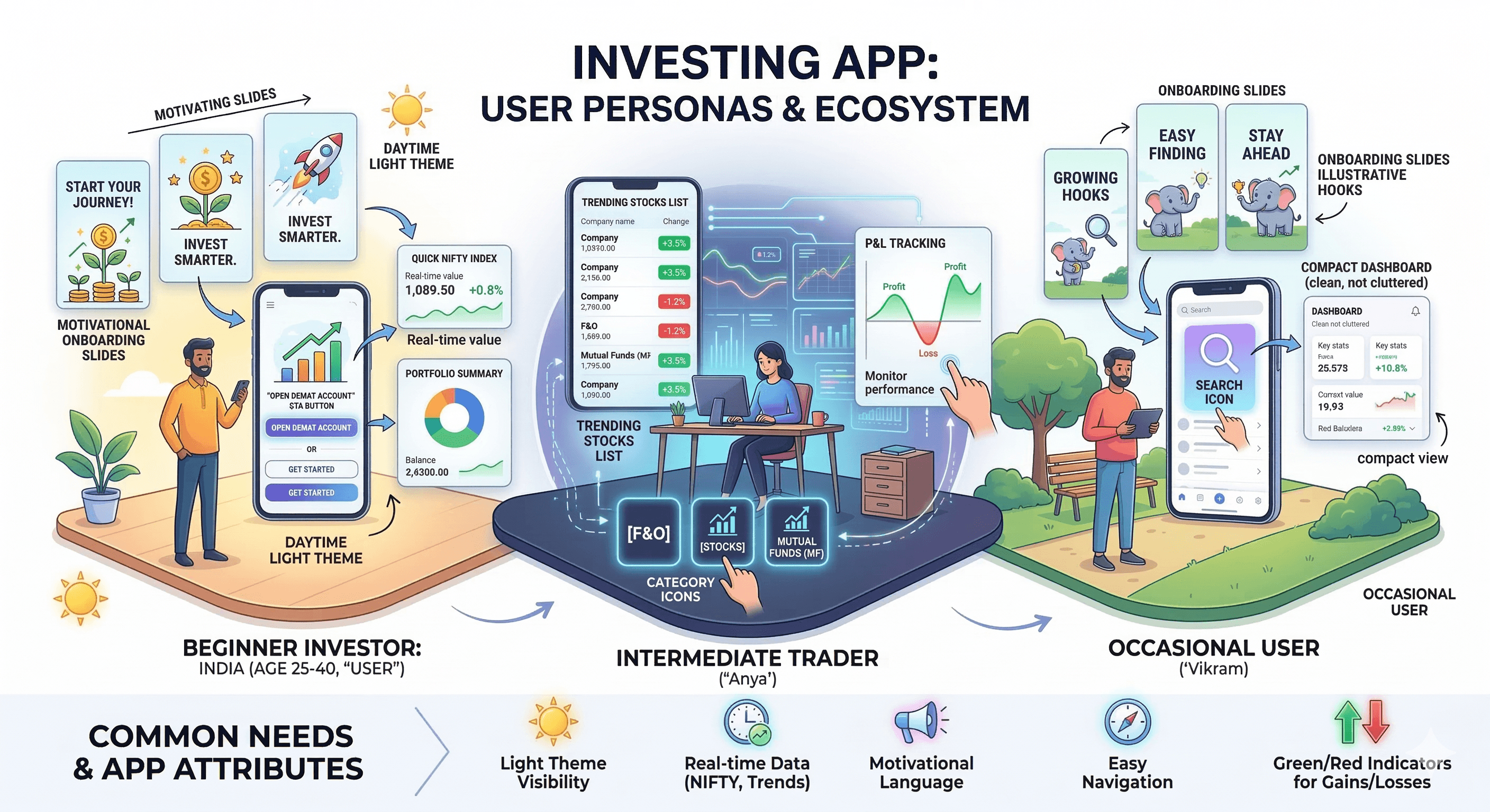
The Trading and Investing App is a mobile UI/UX design aimed at simplifying stock market analysis, trading, and portfolio management for users in markets like India (e.g., NIFTY indices). It uses a light theme (white background with purple/blue accents for indices, green/red for gains/losses) for clean readability in well-lit environments, black text for contrast, and colorful illustrations (people with charts, lightbulbs, coins) to make onboarding motivational. Key screens include multiple onboarding slides ("Invest Smarter, Not Harder", "Earn Profits That Grow", "Stay Ahead of the Market") with SKIP/NEXT buttons, and a home/dashboard with welcome message, NIFTY values, category icons, portfolio summary, and trending stocks list. As a solo designer, I created this in Figma, focusing on real-time data display, motivational messaging, easy navigation, and accessibility for novice to intermediate investors.
Problem Statement
Many trading apps have overwhelming dashboards with too much data at once, dark themes that reduce visibility in daylight, impersonal welcomes, hidden performance tracking, and lack of motivational onboarding, leading to user confusion, low engagement, and high drop-off during initial setup. Users struggle with quick market overviews (e.g., NIFTY changes), category access (F&O, Stocks, MF), portfolio P&L visibility, and trending stock discovery without scrolling endlessly. This app addresses these by using light theme for clarity, immediate user welcome with Demat call-to-action, structured onboarding with illustrative hooks, prominent index values with % changes, icon-based categories, and compact trending lists with values/%.
Objectives
Provide engaging onboarding with multiple slides featuring bold headlines, subtexts, illustrations, and SKIP/NEXT buttons to educate and motivate users.
Display real-time market indices (NIFTY 50, NIFTY BANK) with values, % changes (green/red), and dropdown for more.
Offer personalized welcome ("Welcome, User") with Demat account CTA and search icon.
Enable quick category access via rounded icon grid (F&O, Stocks, MF, IPO, Advisory, MTF, Commodity, News, Chart 360, More).
Summarize portfolio with Positions/Holdings, Today's P&L/Return (with 0.00 defaults).
List trending stocks (IDEA, YESBANK, RELIANCE, etc.) with exchange (NSE), values, % changes (green/red).
Use purple/blue for indices, orange for some CTAs, light background for readability.
Include bottom nav (Home, Watchlist, Portfolio, Funds) for seamless switching.
Motivate with illustrations (person with laptop/lightbulb, presenting chart/coins, magnifying glass on graph).
Ensure compact layout with rounded elements, white cards, and high contrast.
Phase 2
Target Users
User Journey Map
Step 1: Launch → onboarding slide 1 ("Invest Smarter" illustration + subtext + SKIP/NEXT) → slide 2 ("Earn Profits" chart/coins illustration) → slide 3 ("Stay Ahead" magnifying glass illustration).
Step 2: Skip or complete onboarding → home dashboard with welcome + Demat CTA.
Step 3: Market overview → NIFTY values + % changes.
Step 4: Category tap → access F&O/Stocks/MF etc.
Step 5: Portfolio check → Positions/Holdings/P&L/Return sections.
Step 6: Trending scroll → stock list with values/%.
Supporting: Search icon tap, bottom nav switch (Watchlist, Portfolio, Funds).
Design Principles
Light theme priority → white base for daytime clarity.
Illustrative motivation → cartoon people with symbols (lightbulb, chart, coins, magnifying glass) for engaging onboarding.
Color coding → purple/blue for indices, green/red for % changes, orange for CTAs.
Data hierarchy → large values, bold text, rounded cards for quick reading.
Simplicity → minimal text density, icon-first categories, compact lists.
Action focus → SKIP/NEXT in black/white, Demat CTA prominent.
Consistency → rounded corners, white cards, black text across screens.
Visual balance → illustrations on onboarding, data tables on dashboard.
Phase 3
Screens Breakdown – Onboarding Screens
Slide 1: Purple background gradient, headline "Invest Smarter, Not Harder", illustration (person with laptop/lightbulb), subtext "Our tools and insights help you analyze trends and trade confidently.", SKIP/NEXT buttons.
Slide 2: Green background gradient, headline "Earn Profits That Grow", illustration (person presenting chart/coins), subtext "Track your performance, set targets and watch your wealth compound.", SKIP/NEXT.
Slide 3: Pink background gradient, headline "Stay Ahead of the Market", illustration (person with magnifying glass on chart), subtext "Get real-time market data and insights, all in one powerful trading platform.", SKIP/NEXT.
Purpose: Educate on app benefits, motivate with visuals, allow quick skip.
Screens Breakdown – Home / Dashboard Screen
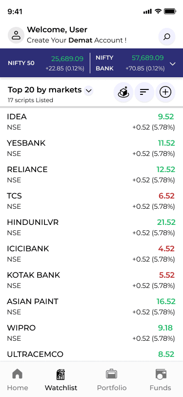
Header: Welcome "User" with avatar, Demat CTA "Create Your Demat Account!".
Market indices: NIFTY 50 (25,689.09 +0.12% green), NIFTY BANK (57,689.09 +0.12% green) in blue bars.
Category grid: Rounded icons (up arrow, bar chart, leaf, people, brain, document, globe, chart, more) for F&O, Stocks, MF, IPO, Advisory, MTF, Commodity, News, Chart 360.
Portfolio: Positions/Holdings cards, Today's P&L (0.00), Return (0.00 0.00%).
Trending: List of stocks (IDEA NSE 9.52 +0.52 5.78% green, YESBANK, etc.).
Bottom nav: Home, Watchlist (eye), Portfolio (briefcase), Funds (card).
Purpose: Quick market/portfolio overview, category entry, trending discovery.
Watchlist Screen / Feature Explanation (Added Section)
Purpose The Watchlist is the user's personal tracking hub — a place to save and monitor stocks, indices, or symbols they are interested in without cluttering the main dashboard or portfolio. It allows quick access to price changes, % gains/losses, and basic details for favorite assets, helping users stay updated on potential opportunities or risks without constant searching.
Key Design Choices & Features
Dedicated bottom nav icon: Eye symbol (watchlist icon) in the persistent bottom bar (Home, Watchlist, Portfolio, Funds) → one-tap access from anywhere in the app, ensuring it's always reachable with thumb movement.
Visual consistency: Dark/light theme match with the rest of the app, green/red color coding for % changes (same as trending list), rounded cards or list rows for each watched item.
Core content (typical layout based on your app style):
List of saved symbols (e.g., IDEA, RELIANCE, TCS) with NSE/BSE tag.
Current price/value.
Daily % change (green up arrow for positive, red down for negative).
Optional: small sparkline chart, volume, or 52-week high/low if expanded.
Actions per item:
Tap to view full stock detail/chart.
Swipe to remove from watchlist.
Sort/filter options (alphabetical, % gainers, value).
Add button (likely + icon in top right or floating action) to search and add new symbols.
Empty state: Motivational message like "Add stocks to track your favorites" + search bar or trending suggestions to encourage usage.
Rationale: In trading apps, watchlists are high-frequency features — users check them multiple times a day. Making it bottom-nav accessible reduces friction. Green/red % changes provide instant emotional feedback (excitement on gains, caution on losses). Rounded cards maintain visual consistency with trending/portfolio sections.
UX Value
Reduces cognitive load — no need to search repeatedly for favorite stocks.
Builds habit — quick glance at watchlist → higher daily app opens.
Supports decision-making — real-time % changes + easy add/remove → faster buy/sell signals.
Motivation loop — seeing green gains reinforces positive behavior, red losses prompts analysis.
Where it fits in the user journey
After onboarding/home: User adds a stock from trending list → taps Watchlist icon → sees it saved.
Daily use: Morning check → Watchlist first → monitor changes → tap into detail → trade via Portfolio/Funds.
Future enhancements (from learnings)
Add price alerts/notifications (bell icon integration).
Watchlist groups/folders (e.g., "Tech Stocks", "Banking").
Mini-charts or 1-day sparkline per row.
Sync with portfolio (auto-add held stocks).
Phase 4
UI Design & Visual System
Background: White/light gray → clean, readable.
Accents: Purple/green for gradients, green/red for %, orange for some CTAs.
Text: Black bold for headlines, gray for subtext.
Images: Cartoon illustrations (people with symbols) for onboarding.
Typography: Sans-serif bold for headlines, regular for lists/values.
Components: Rounded bars for indices, icon grid for categories, list rows for trending.
Spacing: Generous, card-based for separation.
Prototype & Interactions
Onboarding: Slide swipe/NEXT tap, SKIP jump to dashboard.
Dashboard: Tap indices dropdown, category icon switch, trending scroll, portfolio expand.
Bottom nav: Highlight on tap.
General: % change color toggle (green/red), search focus.
Technical & Accessibility Considerations
Light theme → high visibility.
Contrast ≥4.5:1.
Touch targets ≥48px.
Alt text for icons/illustrations.
Responsive scaling.
UX Outcomes & Value
Onboarding illustrations → higher completion rates.
Quick data views → faster decisions.
Color coding → easy gain/loss scan.
Category icons → intuitive navigation.
Overall: Clean, motivational trading tool.
Reflection & Learnings
Gradient backgrounds add vibrancy to light theme.
Illustrations motivate better than text.
Index bars + % → effective snapshot.
Trending list → useful discovery.
Future: Add charts, real-time updates, alerts.
More Projects


UI / UX Design
TradePulse
A clean, light-theme trading platform delivering live NIFTY updates, personalized portfolio tracking, category shortcuts, and trending stock insights for confident investing.
Year :
2025
Industry :
Stock Market
Client :
Investor
Project Duration :
2 weeks
Phase 1
Project Overview
The Trading and Investing App is a mobile UI/UX design aimed at simplifying stock market analysis, trading, and portfolio management for users in markets like India (e.g., NIFTY indices). It uses a light theme (white background with purple/blue accents for indices, green/red for gains/losses) for clean readability in well-lit environments, black text for contrast, and colorful illustrations (people with charts, lightbulbs, coins) to make onboarding motivational. Key screens include multiple onboarding slides ("Invest Smarter, Not Harder", "Earn Profits That Grow", "Stay Ahead of the Market") with SKIP/NEXT buttons, and a home/dashboard with welcome message, NIFTY values, category icons, portfolio summary, and trending stocks list. As a solo designer, I created this in Figma, focusing on real-time data display, motivational messaging, easy navigation, and accessibility for novice to intermediate investors.
Problem Statement
Many trading apps have overwhelming dashboards with too much data at once, dark themes that reduce visibility in daylight, impersonal welcomes, hidden performance tracking, and lack of motivational onboarding, leading to user confusion, low engagement, and high drop-off during initial setup. Users struggle with quick market overviews (e.g., NIFTY changes), category access (F&O, Stocks, MF), portfolio P&L visibility, and trending stock discovery without scrolling endlessly. This app addresses these by using light theme for clarity, immediate user welcome with Demat call-to-action, structured onboarding with illustrative hooks, prominent index values with % changes, icon-based categories, and compact trending lists with values/%.
Objectives
Provide engaging onboarding with multiple slides featuring bold headlines, subtexts, illustrations, and SKIP/NEXT buttons to educate and motivate users.
Display real-time market indices (NIFTY 50, NIFTY BANK) with values, % changes (green/red), and dropdown for more.
Offer personalized welcome ("Welcome, User") with Demat account CTA and search icon.
Enable quick category access via rounded icon grid (F&O, Stocks, MF, IPO, Advisory, MTF, Commodity, News, Chart 360, More).
Summarize portfolio with Positions/Holdings, Today's P&L/Return (with 0.00 defaults).
List trending stocks (IDEA, YESBANK, RELIANCE, etc.) with exchange (NSE), values, % changes (green/red).
Use purple/blue for indices, orange for some CTAs, light background for readability.
Include bottom nav (Home, Watchlist, Portfolio, Funds) for seamless switching.
Motivate with illustrations (person with laptop/lightbulb, presenting chart/coins, magnifying glass on graph).
Ensure compact layout with rounded elements, white cards, and high contrast.
Phase 2
Target Users
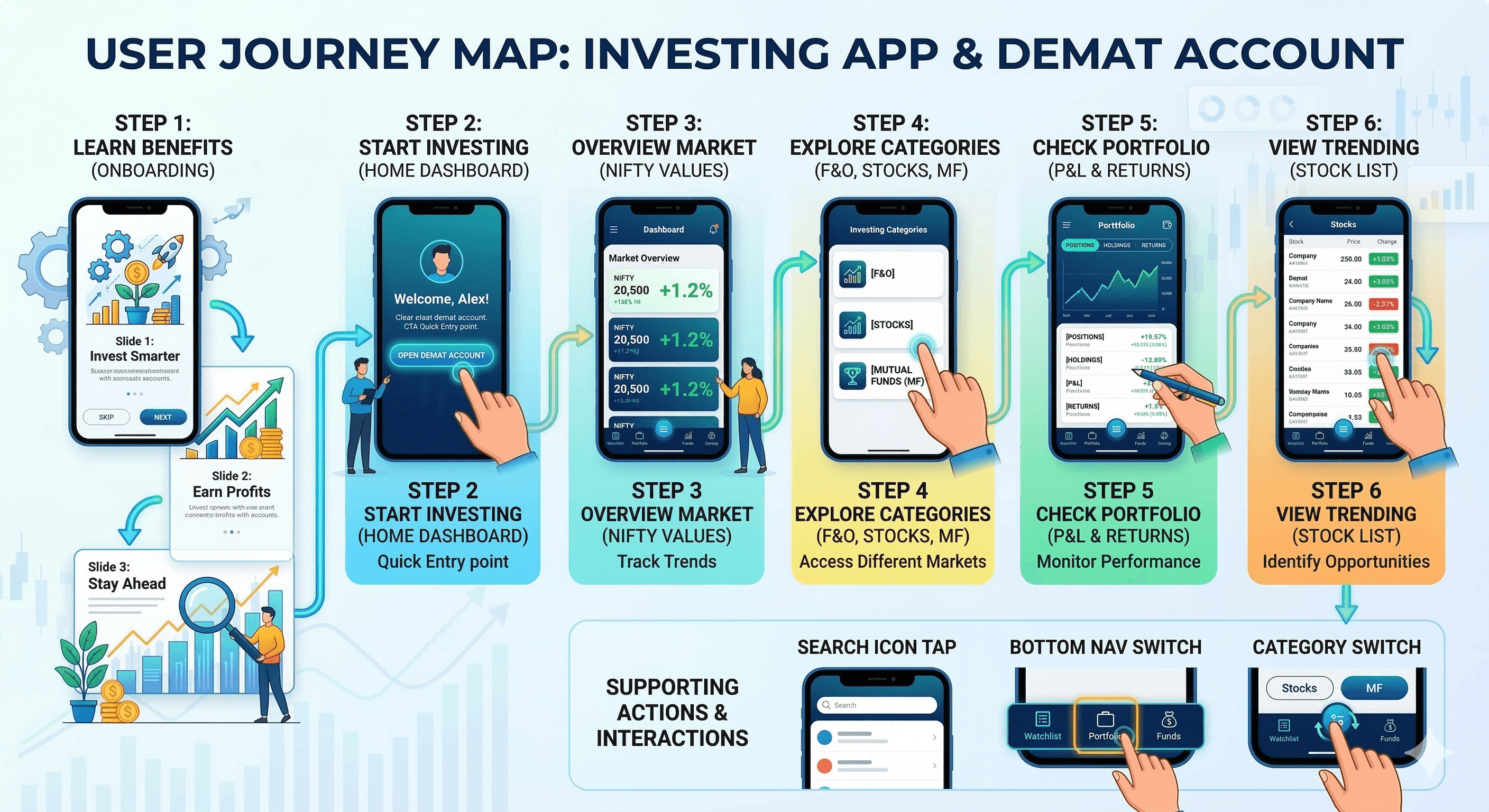
User Journey Map
Step 1: Launch → onboarding slide 1 ("Invest Smarter" illustration + subtext + SKIP/NEXT) → slide 2 ("Earn Profits" chart/coins illustration) → slide 3 ("Stay Ahead" magnifying glass illustration).
Step 2: Skip or complete onboarding → home dashboard with welcome + Demat CTA.
Step 3: Market overview → NIFTY values + % changes.
Step 4: Category tap → access F&O/Stocks/MF etc.
Step 5: Portfolio check → Positions/Holdings/P&L/Return sections.
Step 6: Trending scroll → stock list with values/%.
Supporting: Search icon tap, bottom nav switch (Watchlist, Portfolio, Funds).
Design Principles
Light theme priority → white base for daytime clarity.
Illustrative motivation → cartoon people with symbols (lightbulb, chart, coins, magnifying glass) for engaging onboarding.
Color coding → purple/blue for indices, green/red for % changes, orange for CTAs.
Data hierarchy → large values, bold text, rounded cards for quick reading.
Simplicity → minimal text density, icon-first categories, compact lists.
Action focus → SKIP/NEXT in black/white, Demat CTA prominent.
Consistency → rounded corners, white cards, black text across screens.
Visual balance → illustrations on onboarding, data tables on dashboard.
Phase 3
Screens Breakdown – Onboarding Screens
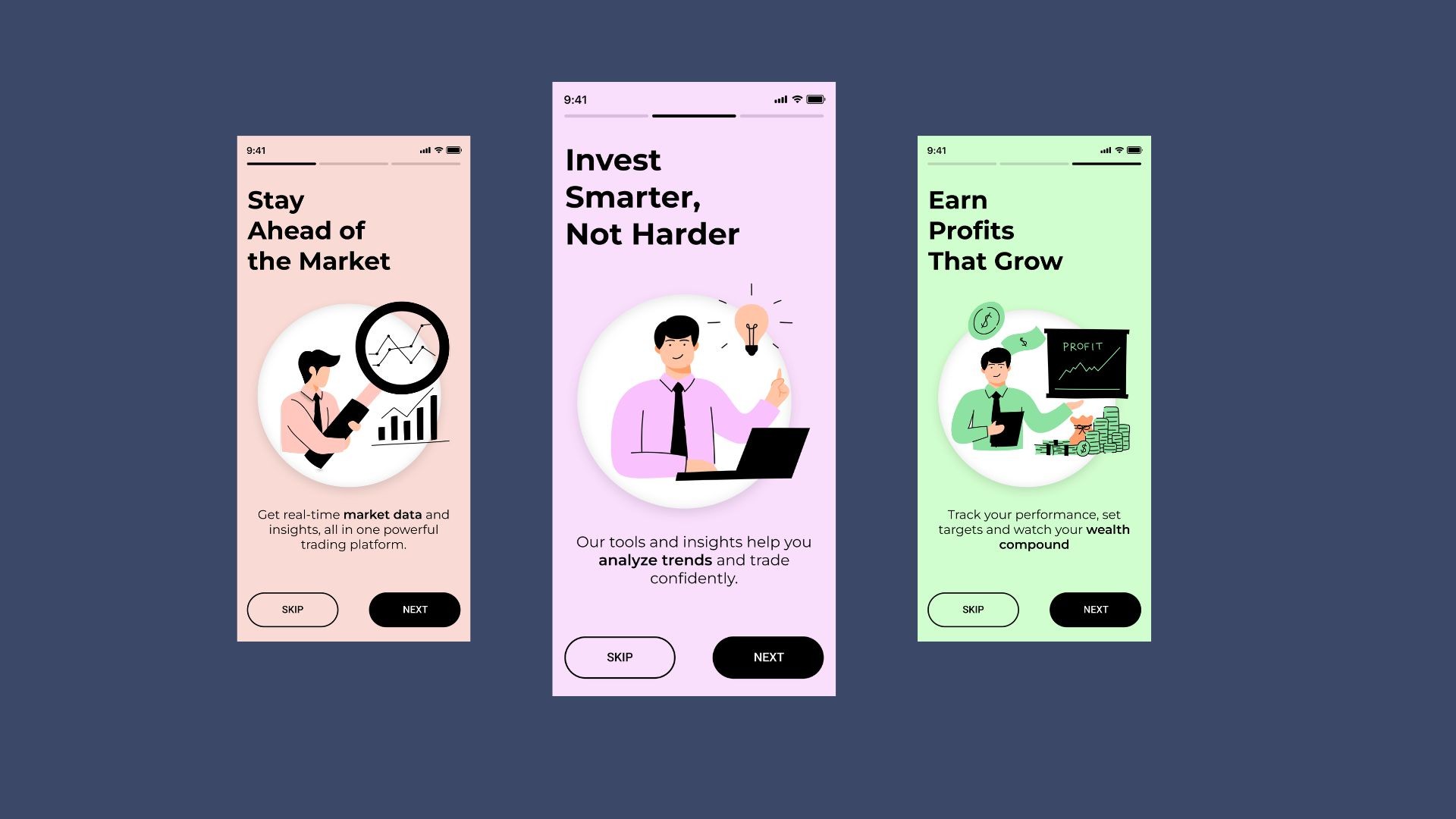
Slide 1: Purple background gradient, headline "Invest Smarter, Not Harder", illustration (person with laptop/lightbulb), subtext "Our tools and insights help you analyze trends and trade confidently.", SKIP/NEXT buttons.
Slide 2: Green background gradient, headline "Earn Profits That Grow", illustration (person presenting chart/coins), subtext "Track your performance, set targets and watch your wealth compound.", SKIP/NEXT.
Slide 3: Pink background gradient, headline "Stay Ahead of the Market", illustration (person with magnifying glass on chart), subtext "Get real-time market data and insights, all in one powerful trading platform.", SKIP/NEXT.
Purpose: Educate on app benefits, motivate with visuals, allow quick skip.
Screens Breakdown – Home / Dashboard Screen
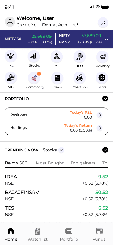
Header: Welcome "User" with avatar, Demat CTA "Create Your Demat Account!".
Market indices: NIFTY 50 (25,689.09 +0.12% green), NIFTY BANK (57,689.09 +0.12% green) in blue bars.
Category grid: Rounded icons (up arrow, bar chart, leaf, people, brain, document, globe, chart, more) for F&O, Stocks, MF, IPO, Advisory, MTF, Commodity, News, Chart 360.
Portfolio: Positions/Holdings cards, Today's P&L (0.00), Return (0.00 0.00%).
Trending: List of stocks (IDEA NSE 9.52 +0.52 5.78% green, YESBANK, etc.).
Bottom nav: Home, Watchlist (eye), Portfolio (briefcase), Funds (card).
Purpose: Quick market/portfolio overview, category entry, trending discovery.
Watchlist Screen / Feature Explanation (Added Section)
Purpose The Watchlist is the user's personal tracking hub — a place to save and monitor stocks, indices, or symbols they are interested in without cluttering the main dashboard or portfolio. It allows quick access to price changes, % gains/losses, and basic details for favorite assets, helping users stay updated on potential opportunities or risks without constant searching.
Key Design Choices & Features
Dedicated bottom nav icon: Eye symbol (watchlist icon) in the persistent bottom bar (Home, Watchlist, Portfolio, Funds) → one-tap access from anywhere in the app, ensuring it's always reachable with thumb movement.
Visual consistency: Dark/light theme match with the rest of the app, green/red color coding for % changes (same as trending list), rounded cards or list rows for each watched item.
Core content (typical layout based on your app style):
List of saved symbols (e.g., IDEA, RELIANCE, TCS) with NSE/BSE tag.
Current price/value.
Daily % change (green up arrow for positive, red down for negative).
Optional: small sparkline chart, volume, or 52-week high/low if expanded.
Actions per item:
Tap to view full stock detail/chart.
Swipe to remove from watchlist.
Sort/filter options (alphabetical, % gainers, value).
Add button (likely + icon in top right or floating action) to search and add new symbols.
Empty state: Motivational message like "Add stocks to track your favorites" + search bar or trending suggestions to encourage usage.
Rationale: In trading apps, watchlists are high-frequency features — users check them multiple times a day. Making it bottom-nav accessible reduces friction. Green/red % changes provide instant emotional feedback (excitement on gains, caution on losses). Rounded cards maintain visual consistency with trending/portfolio sections.
UX Value
Reduces cognitive load — no need to search repeatedly for favorite stocks.
Builds habit — quick glance at watchlist → higher daily app opens.
Supports decision-making — real-time % changes + easy add/remove → faster buy/sell signals.
Motivation loop — seeing green gains reinforces positive behavior, red losses prompts analysis.
Where it fits in the user journey
After onboarding/home: User adds a stock from trending list → taps Watchlist icon → sees it saved.
Daily use: Morning check → Watchlist first → monitor changes → tap into detail → trade via Portfolio/Funds.
Future enhancements (from learnings)
Add price alerts/notifications (bell icon integration).
Watchlist groups/folders (e.g., "Tech Stocks", "Banking").
Mini-charts or 1-day sparkline per row.
Sync with portfolio (auto-add held stocks).
Phase 4
UI Design & Visual System
Background: White/light gray → clean, readable.
Accents: Purple/green for gradients, green/red for %, orange for some CTAs.
Text: Black bold for headlines, gray for subtext.
Images: Cartoon illustrations (people with symbols) for onboarding.
Typography: Sans-serif bold for headlines, regular for lists/values.
Components: Rounded bars for indices, icon grid for categories, list rows for trending.
Spacing: Generous, card-based for separation.
Prototype & Interactions
Onboarding: Slide swipe/NEXT tap, SKIP jump to dashboard.
Dashboard: Tap indices dropdown, category icon switch, trending scroll, portfolio expand.
Bottom nav: Highlight on tap.
General: % change color toggle (green/red), search focus.
Technical & Accessibility Considerations
Light theme → high visibility.
Contrast ≥4.5:1.
Touch targets ≥48px.
Alt text for icons/illustrations.
Responsive scaling.
UX Outcomes & Value
Onboarding illustrations → higher completion rates.
Quick data views → faster decisions.
Color coding → easy gain/loss scan.
Category icons → intuitive navigation.
Overall: Clean, motivational trading tool.
Reflection & Learnings
Gradient backgrounds add vibrancy to light theme.
Illustrations motivate better than text.
Index bars + % → effective snapshot.
Trending list → useful discovery.
Future: Add charts, real-time updates, alerts.
More Projects
UI / UX Design
TradePulse
A clean, light-theme trading platform delivering live NIFTY updates, personalized portfolio tracking, category shortcuts, and trending stock insights for confident investing.
Year :
2025
Industry :
Stock Market
Client :
Investor
Project Duration :
2 weeks
Phase 1
Project Overview
The Trading and Investing App is a mobile UI/UX design aimed at simplifying stock market analysis, trading, and portfolio management for users in markets like India (e.g., NIFTY indices). It uses a light theme (white background with purple/blue accents for indices, green/red for gains/losses) for clean readability in well-lit environments, black text for contrast, and colorful illustrations (people with charts, lightbulbs, coins) to make onboarding motivational. Key screens include multiple onboarding slides ("Invest Smarter, Not Harder", "Earn Profits That Grow", "Stay Ahead of the Market") with SKIP/NEXT buttons, and a home/dashboard with welcome message, NIFTY values, category icons, portfolio summary, and trending stocks list. As a solo designer, I created this in Figma, focusing on real-time data display, motivational messaging, easy navigation, and accessibility for novice to intermediate investors.
Problem Statement
Many trading apps have overwhelming dashboards with too much data at once, dark themes that reduce visibility in daylight, impersonal welcomes, hidden performance tracking, and lack of motivational onboarding, leading to user confusion, low engagement, and high drop-off during initial setup. Users struggle with quick market overviews (e.g., NIFTY changes), category access (F&O, Stocks, MF), portfolio P&L visibility, and trending stock discovery without scrolling endlessly. This app addresses these by using light theme for clarity, immediate user welcome with Demat call-to-action, structured onboarding with illustrative hooks, prominent index values with % changes, icon-based categories, and compact trending lists with values/%.
Objectives
Provide engaging onboarding with multiple slides featuring bold headlines, subtexts, illustrations, and SKIP/NEXT buttons to educate and motivate users.
Display real-time market indices (NIFTY 50, NIFTY BANK) with values, % changes (green/red), and dropdown for more.
Offer personalized welcome ("Welcome, User") with Demat account CTA and search icon.
Enable quick category access via rounded icon grid (F&O, Stocks, MF, IPO, Advisory, MTF, Commodity, News, Chart 360, More).
Summarize portfolio with Positions/Holdings, Today's P&L/Return (with 0.00 defaults).
List trending stocks (IDEA, YESBANK, RELIANCE, etc.) with exchange (NSE), values, % changes (green/red).
Use purple/blue for indices, orange for some CTAs, light background for readability.
Include bottom nav (Home, Watchlist, Portfolio, Funds) for seamless switching.
Motivate with illustrations (person with laptop/lightbulb, presenting chart/coins, magnifying glass on graph).
Ensure compact layout with rounded elements, white cards, and high contrast.
Phase 2
Target Users
User Journey Map
Step 1: Launch → onboarding slide 1 ("Invest Smarter" illustration + subtext + SKIP/NEXT) → slide 2 ("Earn Profits" chart/coins illustration) → slide 3 ("Stay Ahead" magnifying glass illustration).
Step 2: Skip or complete onboarding → home dashboard with welcome + Demat CTA.
Step 3: Market overview → NIFTY values + % changes.
Step 4: Category tap → access F&O/Stocks/MF etc.
Step 5: Portfolio check → Positions/Holdings/P&L/Return sections.
Step 6: Trending scroll → stock list with values/%.
Supporting: Search icon tap, bottom nav switch (Watchlist, Portfolio, Funds).
Design Principles
Light theme priority → white base for daytime clarity.
Illustrative motivation → cartoon people with symbols (lightbulb, chart, coins, magnifying glass) for engaging onboarding.
Color coding → purple/blue for indices, green/red for % changes, orange for CTAs.
Data hierarchy → large values, bold text, rounded cards for quick reading.
Simplicity → minimal text density, icon-first categories, compact lists.
Action focus → SKIP/NEXT in black/white, Demat CTA prominent.
Consistency → rounded corners, white cards, black text across screens.
Visual balance → illustrations on onboarding, data tables on dashboard.
Phase 3
Screens Breakdown – Onboarding Screens
Slide 1: Purple background gradient, headline "Invest Smarter, Not Harder", illustration (person with laptop/lightbulb), subtext "Our tools and insights help you analyze trends and trade confidently.", SKIP/NEXT buttons.
Slide 2: Green background gradient, headline "Earn Profits That Grow", illustration (person presenting chart/coins), subtext "Track your performance, set targets and watch your wealth compound.", SKIP/NEXT.
Slide 3: Pink background gradient, headline "Stay Ahead of the Market", illustration (person with magnifying glass on chart), subtext "Get real-time market data and insights, all in one powerful trading platform.", SKIP/NEXT.
Purpose: Educate on app benefits, motivate with visuals, allow quick skip.
Screens Breakdown – Home / Dashboard Screen
Header: Welcome "User" with avatar, Demat CTA "Create Your Demat Account!".
Market indices: NIFTY 50 (25,689.09 +0.12% green), NIFTY BANK (57,689.09 +0.12% green) in blue bars.
Category grid: Rounded icons (up arrow, bar chart, leaf, people, brain, document, globe, chart, more) for F&O, Stocks, MF, IPO, Advisory, MTF, Commodity, News, Chart 360.
Portfolio: Positions/Holdings cards, Today's P&L (0.00), Return (0.00 0.00%).
Trending: List of stocks (IDEA NSE 9.52 +0.52 5.78% green, YESBANK, etc.).
Bottom nav: Home, Watchlist (eye), Portfolio (briefcase), Funds (card).
Purpose: Quick market/portfolio overview, category entry, trending discovery.
Watchlist Screen / Feature Explanation (Added Section)
Purpose The Watchlist is the user's personal tracking hub — a place to save and monitor stocks, indices, or symbols they are interested in without cluttering the main dashboard or portfolio. It allows quick access to price changes, % gains/losses, and basic details for favorite assets, helping users stay updated on potential opportunities or risks without constant searching.
Key Design Choices & Features
Dedicated bottom nav icon: Eye symbol (watchlist icon) in the persistent bottom bar (Home, Watchlist, Portfolio, Funds) → one-tap access from anywhere in the app, ensuring it's always reachable with thumb movement.
Visual consistency: Dark/light theme match with the rest of the app, green/red color coding for % changes (same as trending list), rounded cards or list rows for each watched item.
Core content (typical layout based on your app style):
List of saved symbols (e.g., IDEA, RELIANCE, TCS) with NSE/BSE tag.
Current price/value.
Daily % change (green up arrow for positive, red down for negative).
Optional: small sparkline chart, volume, or 52-week high/low if expanded.
Actions per item:
Tap to view full stock detail/chart.
Swipe to remove from watchlist.
Sort/filter options (alphabetical, % gainers, value).
Add button (likely + icon in top right or floating action) to search and add new symbols.
Empty state: Motivational message like "Add stocks to track your favorites" + search bar or trending suggestions to encourage usage.
Rationale: In trading apps, watchlists are high-frequency features — users check them multiple times a day. Making it bottom-nav accessible reduces friction. Green/red % changes provide instant emotional feedback (excitement on gains, caution on losses). Rounded cards maintain visual consistency with trending/portfolio sections.
UX Value
Reduces cognitive load — no need to search repeatedly for favorite stocks.
Builds habit — quick glance at watchlist → higher daily app opens.
Supports decision-making — real-time % changes + easy add/remove → faster buy/sell signals.
Motivation loop — seeing green gains reinforces positive behavior, red losses prompts analysis.
Where it fits in the user journey
After onboarding/home: User adds a stock from trending list → taps Watchlist icon → sees it saved.
Daily use: Morning check → Watchlist first → monitor changes → tap into detail → trade via Portfolio/Funds.
Future enhancements (from learnings)
Add price alerts/notifications (bell icon integration).
Watchlist groups/folders (e.g., "Tech Stocks", "Banking").
Mini-charts or 1-day sparkline per row.
Sync with portfolio (auto-add held stocks).
Phase 4
UI Design & Visual System
Background: White/light gray → clean, readable.
Accents: Purple/green for gradients, green/red for %, orange for some CTAs.
Text: Black bold for headlines, gray for subtext.
Images: Cartoon illustrations (people with symbols) for onboarding.
Typography: Sans-serif bold for headlines, regular for lists/values.
Components: Rounded bars for indices, icon grid for categories, list rows for trending.
Spacing: Generous, card-based for separation.
Prototype & Interactions
Onboarding: Slide swipe/NEXT tap, SKIP jump to dashboard.
Dashboard: Tap indices dropdown, category icon switch, trending scroll, portfolio expand.
Bottom nav: Highlight on tap.
General: % change color toggle (green/red), search focus.
Technical & Accessibility Considerations
Light theme → high visibility.
Contrast ≥4.5:1.
Touch targets ≥48px.
Alt text for icons/illustrations.
Responsive scaling.
UX Outcomes & Value
Onboarding illustrations → higher completion rates.
Quick data views → faster decisions.
Color coding → easy gain/loss scan.
Category icons → intuitive navigation.
Overall: Clean, motivational trading tool.
Reflection & Learnings
Gradient backgrounds add vibrancy to light theme.
Illustrations motivate better than text.
Index bars + % → effective snapshot.
Trending list → useful discovery.
Future: Add charts, real-time updates, alerts.