Web Design
NXTLVL
A calm, light yoga studio website. Aspirational hero, essential class cards, real student testimonials, studio photo grid, and easy subscribe flow make discovering and joining yoga feel peaceful and motivating.
Year :
2025
Industry :
E-Commerce
Client :
Conceptual
Project Duration :
3 weeks

Phase 1
Project Overview
NXTLVL is an e-commerce and wellness platform focused on yoga classes, wellness plans, and related products, designed to help users find peace, flexibility, and balance through guided practice. The design adopts a serene, nature-inspired aesthetic (dark gradient backgrounds with sunset/orange tones, black/gray/white text, high-resolution yoga imagery) to create a calming, aspirational, and immersive experience. The layout is a single-page scroll optimized for desktop and mobile: fixed header navigation, hero banner with motivational tagline and CTAs, essentials/courses section with cards, real voices testimonials carousel, "Our Studio" glimpse photo grid, newsletter subscribe form, and multi-column footer. As a solo UI/UX designer, I developed this in Figma over [X weeks], prioritizing emotional connection through serene visuals, clear practice guidance, trust-building testimonials, and responsive elements to make starting or deepening a yoga journey feel approachable, inspiring, and peaceful.
Problem Statement
Many yoga and wellness websites suffer from overly busy interfaces with too many options, cold or clinical aesthetics that fail to evoke calm, lack of motivational onboarding, generic testimonials that don’t feel authentic, no clear path to begin practice, and complicated navigation that discourages daily engagement. Users (especially beginners or busy individuals) often feel intimidated by jargon-heavy content, overwhelmed by course lists without clear starting points, doubtful about instructor quality without real student voices, and disconnected from the emotional benefits of yoga (peace, flexibility, mindfulness). This design counters these by starting with a serene hero banner to immediately inspire calm, organizing essentials/courses in a scannable card grid with clear benefits, featuring authentic testimonials from real students, providing a visual "Our Studio" glimpse to build trust in the environment, offering a simple newsletter form for ongoing connection, and using a structured footer with categorized links for easy access to all essential info.
Objectives
Develop a serene, nature-inspired theme using dark sunset gradients and high-resolution yoga imagery to evoke peace and aspiration.
Create a fixed header with essential navigation (Home, Products, Wellness dropdown, search bar) for persistent access.
Design a hero banner with powerful tagline ("FIND YOUR PEACE ON THE MAT"), subtext on stillness and nature, and clear CTAs ("Get Started", "Learn more") to motivate immediate action.
Organize essential starting information in a "Essentials" card grid with 3 items (Yoga classes for every level, Need to know before you start, Pricing that makes sense) including photos and "Explore" links.
Feature a testimonials carousel ("REAL VOICES") with 3 student quotes, ratings (★★★★★), names, and locations for authentic social proof.
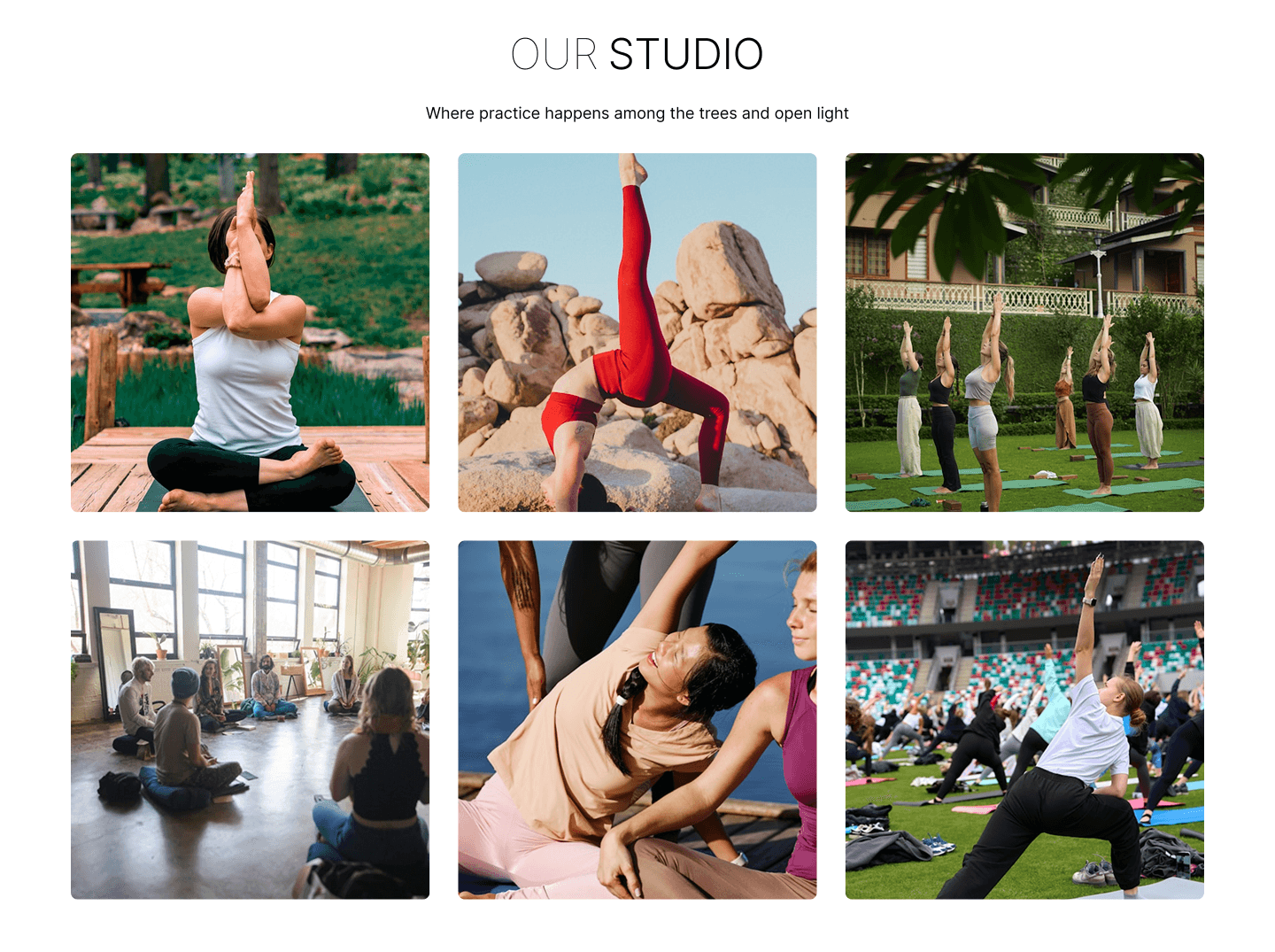
Include a "Our Studio" glimpse section with 6–9 high-resolution photos of yoga practice settings (forest, rocks, group classes) to show real-world environment.
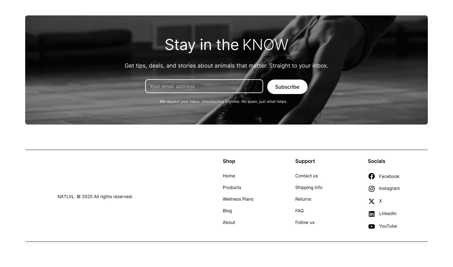
Implement a newsletter subscribe form with headline ("Stay in the KNOW"), subtext on tips/deals/stories, email input, and "Subscribe" button to capture leads.
Design a multi-column footer with categorized links (Shop, Support, Socials) for comprehensive navigation and support.
Ensure mobile-first responsiveness with stacked cards, centered text, and collapsible footers.
Balance inspirational visuals (hero, studio photos) with functional elements (courses cards, subscribe) to increase engagement and sign-ups.
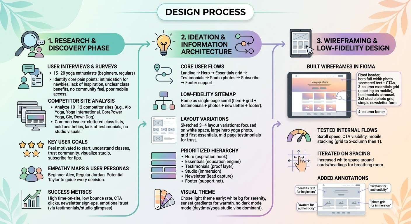
Design Process
1. Research & Discovery Phase
Conducted user interviews and surveys with 15–20 yoga enthusiasts (beginners, regulars) to identify core pain points: intimidation for newbies, lack of inspiration, unclear class benefits, no community feel, poor mobile access.
Analyzed 10–12 competitor sites (e.g., Alo Yoga, Yoga International, CorePower Yoga, Glo, Down Dog) → common issues: cluttered class lists, cold aesthetics, lack of testimonials, no studio visuals.
Defined key user goals: feel motivated to start, understand classes, trust community, visualize studio, subscribe for tips.
Created empathy maps and user personas (beginner Alex, regular Jordan, potential Taylor) to guide every decision.
Established success metrics: high time-on-site, low bounce rate, CTA clicks, newsletter sign-ups, emotional trust (via testimonials/studio glimpses).
2. Ideation & Information Architecture
Defined core user flows: Landing → Hero → Essentials grid → Testimonials → Studio photos → Subscribe → Footer support.
Created low-fidelity sitemap: Home as single-page scroll (hero + grid + testimonials + photos + newsletter + footer).
Sketched 3–4 layout variations: focused on white space, large hero yoga photo, grid-first essentials, mid-page testimonials for trust.
Prioritized hierarchy: Hero (aspiration hook), Essentials (education engine), Testimonials (proof layer), Studio (immersion), Newsletter (lead capture), Footer (support net).
Chose light theme early → white bg for serenity, sunset gradients for warmth, no dark mode (daytime/yoga studio vibe dominant).
3. Wireframing & Low-Fidelity Design
Built wireframes in Figma: fixed header, hero full-width photo + centered text + CTAs, 3-column essentials grid (stacking on mobile), testimonials carousel, 3x3 studio photo grid, simple newsletter form, 4-column footer.
Tested internal flows: scroll speed, CTA visibility, mobile stacking (grid to 2-column then 1).
Iterated on spacing: increased white space around cards/headings for breathing room.
Added annotations: "benefits text for beginners", "avatars for authenticity", "photo grid for immersion".
Phase 2
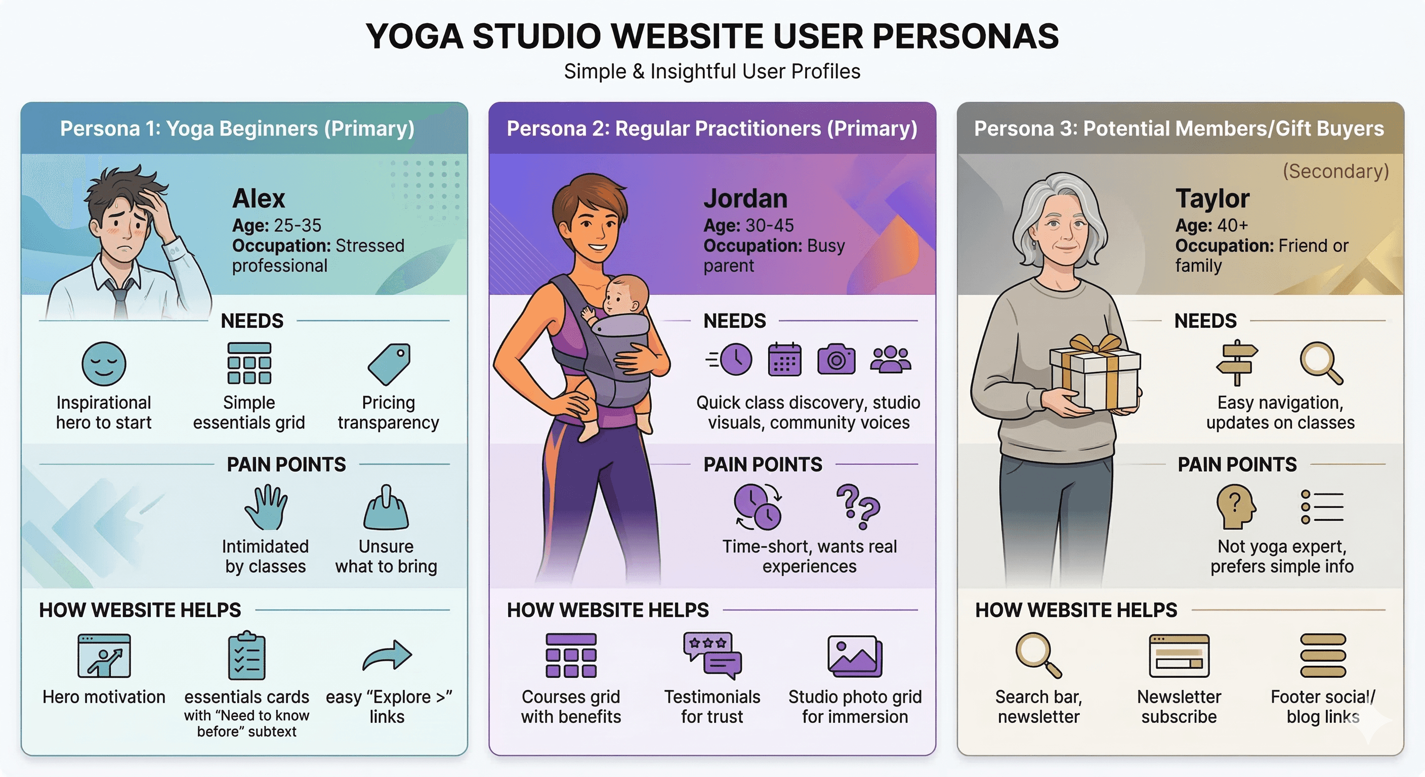
Target Users / Personas
Persona 1: Yoga Beginners (Primary) – Name: Alex, Age: 25–35, Occupation: Stressed professional. Needs: Inspirational hero to start, simple essentials grid, pricing transparency. Pain points: Intimidated by classes, unsure what to bring. How website helps: Hero motivation, essentials cards with "Need to know before" subtext, easy "Explore >" links.
Persona 2: Regular Practitioners (Primary) – Name: Jordan, Age: 30–45, Occupation: Busy parent. Needs: Quick class discovery, studio visuals, community voices. Pain points: Time-short, wants real experiences. How website helps: Courses grid with benefits, testimonials for trust, studio photo grid for immersion.
Persona 3: Potential Members/Gift Buyers (Secondary) – Name: Taylor, Age: 40+, Occupation: Friend or family. Needs: Easy navigation, updates on classes. Pain points: Not yoga expert, prefers simple info. How website helps: Search bar, newsletter subscribe, footer social/blog links.
Color Palette
Primary: White (#FFFFFF) – background for serenity and openness.
Secondary: Black (#000000) – headlines, CTAs, text for strong contrast.
Accent: Gray (#4A4A4A–#808080) – subtext, links for subtlety.
Vibrant tones: Sunset orange/pink (#FF6B6B to #F8B500) for hero gradients, teal (#00A896) for card accents, natural colors from yoga photos (green mats, blue skies).
Rationale: Light, serene palette evokes calm and aspiration; orange/pink gradients add warmth; high contrast ensures readability.
Typography
Headings: Bold sans-serif (e.g., Montserrat or similar) – large (48–72pt) for hero/headlines, black for impact.
Subheadings: Regular sans-serif for section labels ("Real Voices", "Our Studio") – 24–32pt, black/gray.
Body text: Regular sans-serif (e.g., Open Sans) – 16–18pt, gray for subtexts/descriptions, black for CTAs/links.
Rationale: Clean sans-serif for modern readability; bold for hierarchy; consistent sizing to guide eye flow.
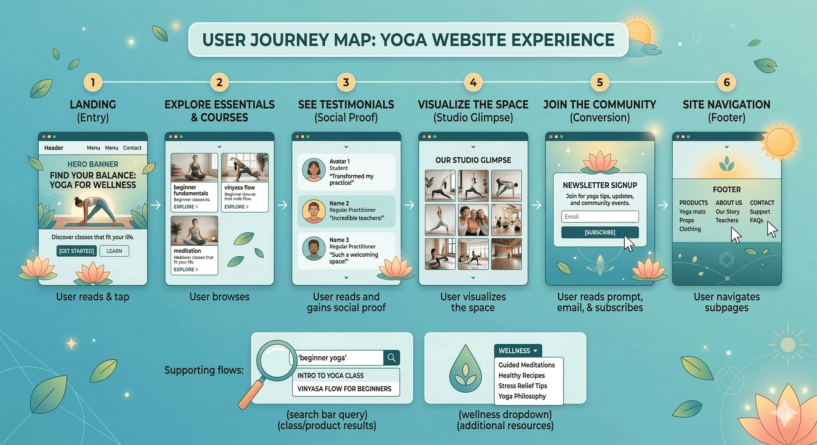
User Journey Map
Step 1: Landing → view header + hero banner → read tagline/subtext, see yoga photo → tap "Get Started" for classes or "Learn" for essentials.
Step 2: Scroll to essentials/courses grid → browse 3 cards with photos/headlines/subtexts → tap "Explore >" for more.
Step 3: Scroll to testimonials → read 3 quotes/names/roles/avatars → gain social proof.
Step 4: Scroll to our studio glimpse → view 3x3 photo grid of yoga poses/studio → visualize space.
Step 5: Newsletter form → read prompt, enter email, subscribe.
Step 6: Footer → select links (e.g., Products > Yoga mats, Contact > Support) → navigate subpages.
Supporting: Search bar query → class/product results; Wellness dropdown → additional resources.
Design Principles
Light serene theme → white bg for openness, sunset gradients for aspiration.
Yoga-focused visuals → high-res poses in natural light to inspire.
Educational grid → essentials section for beginner guidance.
Social proof → testimonials for community feel.
Visual immersion → studio photo grid for real-space preview.
Low-friction subscribe → single-field form.
Comprehensive footer → categorized links for support.
Responsiveness → mobile stacking for on-the-go users.
Hierarchy → large headlines, subtle subtext.
Accessibility → high contrast, alt text for photos.
Phase 3
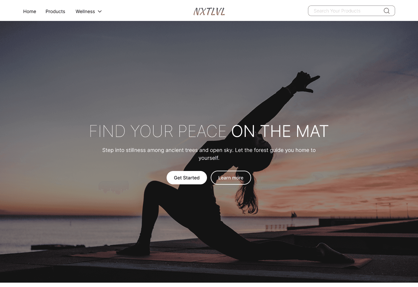
Sections Breakdown – Header + Banner/Hero
Header: Logo "NXTLYL", menu (Home, Products, Wellness ▼), search bar.
Banner: Sunset gradient background with yoga silhouette, headline "FIND YOUR PEACE ON THE MAT", subtext on stillness/nature, "Get Started" + "Learn more" CTAs.
Choices: Fixed header, centered text.
Purpose: Immediate inspiration, action guidance.
Sections Breakdown – Courses / Essentials
Headline "Essentials" + subtext "WHAT YOU NEED TO BEGIN YOUR PRACTICE".
3 cards: Yoga classes for every level (group photo + text), Need to know before you start (solo pose photo + text), Pricing that makes sense (pricing text + "Explore >").
Choices: Card grid, "Explore" links.
Purpose: Clear starting guidance, reduce intimidation.
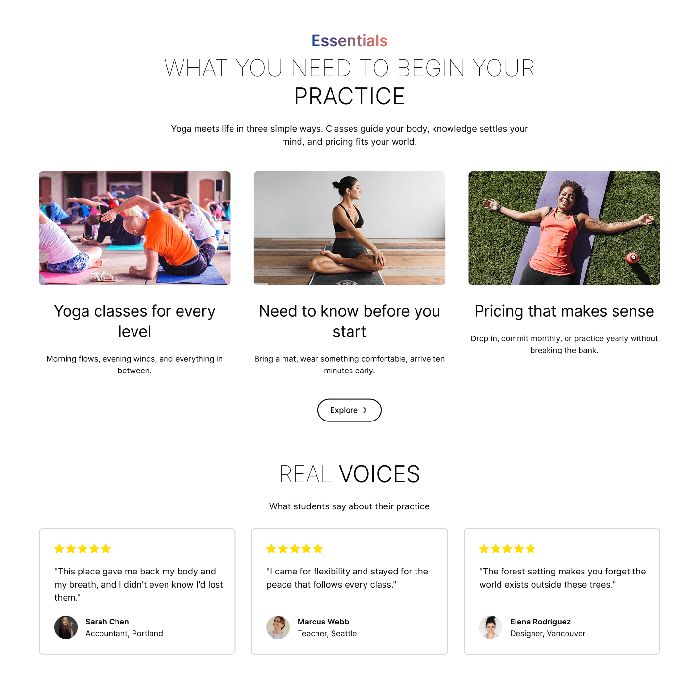
Sections Breakdown – Testimonials / Real Voices
Headline "REAL VOICES" + subtext "What students say about their practice".
Carousel with 3 testimonials: 5-star ratings, quotes ("This place gave me back my body...", "I came for flexibility..."), names/locations (Sarah Chen, Accountant, Portland; Marcus Webb, Teacher, Seattle; Elena Rodriguez, Designer, Vancouver).
Choices: Circular avatars, star ratings.
Purpose: Authentic social proof, emotional validation.
Sections Breakdown – Our Studio Glimpse Images
Headline "OUR STUDIO" + subtext "Where practice happens among the trees and open light".
9-photo grid: Various yoga settings (forest, rocks, group classes indoors/outdoors, different poses/styles).
Choices: High-res, nature-integrated photos.
Purpose: Build trust in real practice environment.
Sections Breakdown – Newsletter + Footer
Newsletter: Headline "Stay in the KNOW", subtext "Get tips, deals, and stories... to your inbox.", email field, "Subscribe" button, privacy note.
Footer: Columns – Shop (Home, Products, Wellness Plans, Blog, About), Support (Contact us, Shipping info, Returns, FAQ), Socials (Facebook, Instagram, X, LinkedIn, YouTube).
Copyright: © 2025 NXTLYL. All rights reserved.
Choices: Simple form, categorized columns.
Purpose: Lead capture, full support.
Phase 4
Prototyping & Testing
Built interactive prototype in Figma: clickable CTAs (Get Started → essentials, Learn → testimonials), grid "Explore >" links, carousel swipe, photo grid zoom, form submit mock.
Conducted 5 usability tests (yoga users via friends/family): tasks like "find a beginner class", "read testimonials", "subscribe to updates".
Key findings: Hero CTAs clear, grid intuitive, studio photos immersive, newsletter form low friction.
Minor iterations: increased font size on subtext, added subtle hover scale on cards/buttons, ensured mobile CTAs large enough.
Technical & Accessibility Considerations
Final Polish & Handoff
Optimized images for load speed (compressed high-res yoga photos).
Added accessibility checks: contrast ≥4.5:1, alt text for photos ("Yoga pose at sunset", "Studio class"), keyboard nav support.
Prepared style guide: colors, typography, spacing rules, button styles.
Exported assets: desktop/mobile mockups, style guide PDF, interactive prototype link.
Planned future phases: class booking, product detail pages, cart/checkout, filters (level, duration).
UX Outcomes & Value
Sunset gradients → instant calm.
Hero + essentials → clear starting path.
Testimonials → trust.
Studio photos → real-world connection.
Newsletter/footer → leads/support.
Key Learnings from the Process
Sunset gradients + yoga photos → strong aspirational pull.
Essentials grid → effective for beginner education.
Testimonials with avatars → high authenticity.
3x3 photo grid → immersive without overload.
Light theme → feels peaceful for yoga.
More Projects


Web Design
NXTLVL
A calm, light yoga studio website. Aspirational hero, essential class cards, real student testimonials, studio photo grid, and easy subscribe flow make discovering and joining yoga feel peaceful and motivating.
Year :
2025
Industry :
E-Commerce
Client :
Conceptual
Project Duration :
3 weeks
Phase 1
Project Overview
NXTLVL is an e-commerce and wellness platform focused on yoga classes, wellness plans, and related products, designed to help users find peace, flexibility, and balance through guided practice. The design adopts a serene, nature-inspired aesthetic (dark gradient backgrounds with sunset/orange tones, black/gray/white text, high-resolution yoga imagery) to create a calming, aspirational, and immersive experience. The layout is a single-page scroll optimized for desktop and mobile: fixed header navigation, hero banner with motivational tagline and CTAs, essentials/courses section with cards, real voices testimonials carousel, "Our Studio" glimpse photo grid, newsletter subscribe form, and multi-column footer. As a solo UI/UX designer, I developed this in Figma over [X weeks], prioritizing emotional connection through serene visuals, clear practice guidance, trust-building testimonials, and responsive elements to make starting or deepening a yoga journey feel approachable, inspiring, and peaceful.
Problem Statement
Many yoga and wellness websites suffer from overly busy interfaces with too many options, cold or clinical aesthetics that fail to evoke calm, lack of motivational onboarding, generic testimonials that don’t feel authentic, no clear path to begin practice, and complicated navigation that discourages daily engagement. Users (especially beginners or busy individuals) often feel intimidated by jargon-heavy content, overwhelmed by course lists without clear starting points, doubtful about instructor quality without real student voices, and disconnected from the emotional benefits of yoga (peace, flexibility, mindfulness). This design counters these by starting with a serene hero banner to immediately inspire calm, organizing essentials/courses in a scannable card grid with clear benefits, featuring authentic testimonials from real students, providing a visual "Our Studio" glimpse to build trust in the environment, offering a simple newsletter form for ongoing connection, and using a structured footer with categorized links for easy access to all essential info.
Objectives
Develop a serene, nature-inspired theme using dark sunset gradients and high-resolution yoga imagery to evoke peace and aspiration.
Create a fixed header with essential navigation (Home, Products, Wellness dropdown, search bar) for persistent access.
Design a hero banner with powerful tagline ("FIND YOUR PEACE ON THE MAT"), subtext on stillness and nature, and clear CTAs ("Get Started", "Learn more") to motivate immediate action.
Organize essential starting information in a "Essentials" card grid with 3 items (Yoga classes for every level, Need to know before you start, Pricing that makes sense) including photos and "Explore" links.
Feature a testimonials carousel ("REAL VOICES") with 3 student quotes, ratings (★★★★★), names, and locations for authentic social proof.
Include a "Our Studio" glimpse section with 6–9 high-resolution photos of yoga practice settings (forest, rocks, group classes) to show real-world environment.
Implement a newsletter subscribe form with headline ("Stay in the KNOW"), subtext on tips/deals/stories, email input, and "Subscribe" button to capture leads.
Design a multi-column footer with categorized links (Shop, Support, Socials) for comprehensive navigation and support.
Ensure mobile-first responsiveness with stacked cards, centered text, and collapsible footers.
Balance inspirational visuals (hero, studio photos) with functional elements (courses cards, subscribe) to increase engagement and sign-ups.
Design Process
1. Research & Discovery Phase
Conducted user interviews and surveys with 15–20 yoga enthusiasts (beginners, regulars) to identify core pain points: intimidation for newbies, lack of inspiration, unclear class benefits, no community feel, poor mobile access.
Analyzed 10–12 competitor sites (e.g., Alo Yoga, Yoga International, CorePower Yoga, Glo, Down Dog) → common issues: cluttered class lists, cold aesthetics, lack of testimonials, no studio visuals.
Defined key user goals: feel motivated to start, understand classes, trust community, visualize studio, subscribe for tips.
Created empathy maps and user personas (beginner Alex, regular Jordan, potential Taylor) to guide every decision.
Established success metrics: high time-on-site, low bounce rate, CTA clicks, newsletter sign-ups, emotional trust (via testimonials/studio glimpses).
2. Ideation & Information Architecture
Defined core user flows: Landing → Hero → Essentials grid → Testimonials → Studio photos → Subscribe → Footer support.
Created low-fidelity sitemap: Home as single-page scroll (hero + grid + testimonials + photos + newsletter + footer).
Sketched 3–4 layout variations: focused on white space, large hero yoga photo, grid-first essentials, mid-page testimonials for trust.
Prioritized hierarchy: Hero (aspiration hook), Essentials (education engine), Testimonials (proof layer), Studio (immersion), Newsletter (lead capture), Footer (support net).
Chose light theme early → white bg for serenity, sunset gradients for warmth, no dark mode (daytime/yoga studio vibe dominant).
3. Wireframing & Low-Fidelity Design
Built wireframes in Figma: fixed header, hero full-width photo + centered text + CTAs, 3-column essentials grid (stacking on mobile), testimonials carousel, 3x3 studio photo grid, simple newsletter form, 4-column footer.
Tested internal flows: scroll speed, CTA visibility, mobile stacking (grid to 2-column then 1).
Iterated on spacing: increased white space around cards/headings for breathing room.
Added annotations: "benefits text for beginners", "avatars for authenticity", "photo grid for immersion".
Phase 2
Target Users / Personas
Persona 1: Yoga Beginners (Primary) – Name: Alex, Age: 25–35, Occupation: Stressed professional. Needs: Inspirational hero to start, simple essentials grid, pricing transparency. Pain points: Intimidated by classes, unsure what to bring. How website helps: Hero motivation, essentials cards with "Need to know before" subtext, easy "Explore >" links.
Persona 2: Regular Practitioners (Primary) – Name: Jordan, Age: 30–45, Occupation: Busy parent. Needs: Quick class discovery, studio visuals, community voices. Pain points: Time-short, wants real experiences. How website helps: Courses grid with benefits, testimonials for trust, studio photo grid for immersion.
Persona 3: Potential Members/Gift Buyers (Secondary) – Name: Taylor, Age: 40+, Occupation: Friend or family. Needs: Easy navigation, updates on classes. Pain points: Not yoga expert, prefers simple info. How website helps: Search bar, newsletter subscribe, footer social/blog links.
Color Palette
Primary: White (#FFFFFF) – background for serenity and openness.
Secondary: Black (#000000) – headlines, CTAs, text for strong contrast.
Accent: Gray (#4A4A4A–#808080) – subtext, links for subtlety.
Vibrant tones: Sunset orange/pink (#FF6B6B to #F8B500) for hero gradients, teal (#00A896) for card accents, natural colors from yoga photos (green mats, blue skies).
Rationale: Light, serene palette evokes calm and aspiration; orange/pink gradients add warmth; high contrast ensures readability.
Typography
Headings: Bold sans-serif (e.g., Montserrat or similar) – large (48–72pt) for hero/headlines, black for impact.
Subheadings: Regular sans-serif for section labels ("Real Voices", "Our Studio") – 24–32pt, black/gray.
Body text: Regular sans-serif (e.g., Open Sans) – 16–18pt, gray for subtexts/descriptions, black for CTAs/links.
Rationale: Clean sans-serif for modern readability; bold for hierarchy; consistent sizing to guide eye flow.
User Journey Map
Step 1: Landing → view header + hero banner → read tagline/subtext, see yoga photo → tap "Get Started" for classes or "Learn" for essentials.
Step 2: Scroll to essentials/courses grid → browse 3 cards with photos/headlines/subtexts → tap "Explore >" for more.
Step 3: Scroll to testimonials → read 3 quotes/names/roles/avatars → gain social proof.
Step 4: Scroll to our studio glimpse → view 3x3 photo grid of yoga poses/studio → visualize space.
Step 5: Newsletter form → read prompt, enter email, subscribe.
Step 6: Footer → select links (e.g., Products > Yoga mats, Contact > Support) → navigate subpages.
Supporting: Search bar query → class/product results; Wellness dropdown → additional resources.
Design Principles
Light serene theme → white bg for openness, sunset gradients for aspiration.
Yoga-focused visuals → high-res poses in natural light to inspire.
Educational grid → essentials section for beginner guidance.
Social proof → testimonials for community feel.
Visual immersion → studio photo grid for real-space preview.
Low-friction subscribe → single-field form.
Comprehensive footer → categorized links for support.
Responsiveness → mobile stacking for on-the-go users.
Hierarchy → large headlines, subtle subtext.
Accessibility → high contrast, alt text for photos.
Phase 3
Sections Breakdown – Header + Banner/Hero
Header: Logo "NXTLYL", menu (Home, Products, Wellness ▼), search bar.
Banner: Sunset gradient background with yoga silhouette, headline "FIND YOUR PEACE ON THE MAT", subtext on stillness/nature, "Get Started" + "Learn more" CTAs.
Choices: Fixed header, centered text.
Purpose: Immediate inspiration, action guidance.
Sections Breakdown – Courses / Essentials
Headline "Essentials" + subtext "WHAT YOU NEED TO BEGIN YOUR PRACTICE".
3 cards: Yoga classes for every level (group photo + text), Need to know before you start (solo pose photo + text), Pricing that makes sense (pricing text + "Explore >").
Choices: Card grid, "Explore" links.
Purpose: Clear starting guidance, reduce intimidation.
Sections Breakdown – Testimonials / Real Voices
Headline "REAL VOICES" + subtext "What students say about their practice".
Carousel with 3 testimonials: 5-star ratings, quotes ("This place gave me back my body...", "I came for flexibility..."), names/locations (Sarah Chen, Accountant, Portland; Marcus Webb, Teacher, Seattle; Elena Rodriguez, Designer, Vancouver).
Choices: Circular avatars, star ratings.
Purpose: Authentic social proof, emotional validation.
Sections Breakdown – Our Studio Glimpse Images
Headline "OUR STUDIO" + subtext "Where practice happens among the trees and open light".
9-photo grid: Various yoga settings (forest, rocks, group classes indoors/outdoors, different poses/styles).
Choices: High-res, nature-integrated photos.
Purpose: Build trust in real practice environment.
Sections Breakdown – Newsletter + Footer
Newsletter: Headline "Stay in the KNOW", subtext "Get tips, deals, and stories... to your inbox.", email field, "Subscribe" button, privacy note.
Footer: Columns – Shop (Home, Products, Wellness Plans, Blog, About), Support (Contact us, Shipping info, Returns, FAQ), Socials (Facebook, Instagram, X, LinkedIn, YouTube).
Copyright: © 2025 NXTLYL. All rights reserved.
Choices: Simple form, categorized columns.
Purpose: Lead capture, full support.
Phase 4
Prototyping & Testing
Built interactive prototype in Figma: clickable CTAs (Get Started → essentials, Learn → testimonials), grid "Explore >" links, carousel swipe, photo grid zoom, form submit mock.
Conducted 5 usability tests (yoga users via friends/family): tasks like "find a beginner class", "read testimonials", "subscribe to updates".
Key findings: Hero CTAs clear, grid intuitive, studio photos immersive, newsletter form low friction.
Minor iterations: increased font size on subtext, added subtle hover scale on cards/buttons, ensured mobile CTAs large enough.
Technical & Accessibility Considerations
Final Polish & Handoff
Optimized images for load speed (compressed high-res yoga photos).
Added accessibility checks: contrast ≥4.5:1, alt text for photos ("Yoga pose at sunset", "Studio class"), keyboard nav support.
Prepared style guide: colors, typography, spacing rules, button styles.
Exported assets: desktop/mobile mockups, style guide PDF, interactive prototype link.
Planned future phases: class booking, product detail pages, cart/checkout, filters (level, duration).
UX Outcomes & Value
Sunset gradients → instant calm.
Hero + essentials → clear starting path.
Testimonials → trust.
Studio photos → real-world connection.
Newsletter/footer → leads/support.
Key Learnings from the Process
Sunset gradients + yoga photos → strong aspirational pull.
Essentials grid → effective for beginner education.
Testimonials with avatars → high authenticity.
3x3 photo grid → immersive without overload.
Light theme → feels peaceful for yoga.
More Projects
Web Design
NXTLVL
A calm, light yoga studio website. Aspirational hero, essential class cards, real student testimonials, studio photo grid, and easy subscribe flow make discovering and joining yoga feel peaceful and motivating.
Year :
2025
Industry :
E-Commerce
Client :
Conceptual
Project Duration :
3 weeks
Phase 1
Project Overview
NXTLVL is an e-commerce and wellness platform focused on yoga classes, wellness plans, and related products, designed to help users find peace, flexibility, and balance through guided practice. The design adopts a serene, nature-inspired aesthetic (dark gradient backgrounds with sunset/orange tones, black/gray/white text, high-resolution yoga imagery) to create a calming, aspirational, and immersive experience. The layout is a single-page scroll optimized for desktop and mobile: fixed header navigation, hero banner with motivational tagline and CTAs, essentials/courses section with cards, real voices testimonials carousel, "Our Studio" glimpse photo grid, newsletter subscribe form, and multi-column footer. As a solo UI/UX designer, I developed this in Figma over [X weeks], prioritizing emotional connection through serene visuals, clear practice guidance, trust-building testimonials, and responsive elements to make starting or deepening a yoga journey feel approachable, inspiring, and peaceful.
Problem Statement
Many yoga and wellness websites suffer from overly busy interfaces with too many options, cold or clinical aesthetics that fail to evoke calm, lack of motivational onboarding, generic testimonials that don’t feel authentic, no clear path to begin practice, and complicated navigation that discourages daily engagement. Users (especially beginners or busy individuals) often feel intimidated by jargon-heavy content, overwhelmed by course lists without clear starting points, doubtful about instructor quality without real student voices, and disconnected from the emotional benefits of yoga (peace, flexibility, mindfulness). This design counters these by starting with a serene hero banner to immediately inspire calm, organizing essentials/courses in a scannable card grid with clear benefits, featuring authentic testimonials from real students, providing a visual "Our Studio" glimpse to build trust in the environment, offering a simple newsletter form for ongoing connection, and using a structured footer with categorized links for easy access to all essential info.
Objectives
Develop a serene, nature-inspired theme using dark sunset gradients and high-resolution yoga imagery to evoke peace and aspiration.
Create a fixed header with essential navigation (Home, Products, Wellness dropdown, search bar) for persistent access.
Design a hero banner with powerful tagline ("FIND YOUR PEACE ON THE MAT"), subtext on stillness and nature, and clear CTAs ("Get Started", "Learn more") to motivate immediate action.
Organize essential starting information in a "Essentials" card grid with 3 items (Yoga classes for every level, Need to know before you start, Pricing that makes sense) including photos and "Explore" links.
Feature a testimonials carousel ("REAL VOICES") with 3 student quotes, ratings (★★★★★), names, and locations for authentic social proof.
Include a "Our Studio" glimpse section with 6–9 high-resolution photos of yoga practice settings (forest, rocks, group classes) to show real-world environment.
Implement a newsletter subscribe form with headline ("Stay in the KNOW"), subtext on tips/deals/stories, email input, and "Subscribe" button to capture leads.
Design a multi-column footer with categorized links (Shop, Support, Socials) for comprehensive navigation and support.
Ensure mobile-first responsiveness with stacked cards, centered text, and collapsible footers.
Balance inspirational visuals (hero, studio photos) with functional elements (courses cards, subscribe) to increase engagement and sign-ups.
Design Process
1. Research & Discovery Phase
Conducted user interviews and surveys with 15–20 yoga enthusiasts (beginners, regulars) to identify core pain points: intimidation for newbies, lack of inspiration, unclear class benefits, no community feel, poor mobile access.
Analyzed 10–12 competitor sites (e.g., Alo Yoga, Yoga International, CorePower Yoga, Glo, Down Dog) → common issues: cluttered class lists, cold aesthetics, lack of testimonials, no studio visuals.
Defined key user goals: feel motivated to start, understand classes, trust community, visualize studio, subscribe for tips.
Created empathy maps and user personas (beginner Alex, regular Jordan, potential Taylor) to guide every decision.
Established success metrics: high time-on-site, low bounce rate, CTA clicks, newsletter sign-ups, emotional trust (via testimonials/studio glimpses).
2. Ideation & Information Architecture
Defined core user flows: Landing → Hero → Essentials grid → Testimonials → Studio photos → Subscribe → Footer support.
Created low-fidelity sitemap: Home as single-page scroll (hero + grid + testimonials + photos + newsletter + footer).
Sketched 3–4 layout variations: focused on white space, large hero yoga photo, grid-first essentials, mid-page testimonials for trust.
Prioritized hierarchy: Hero (aspiration hook), Essentials (education engine), Testimonials (proof layer), Studio (immersion), Newsletter (lead capture), Footer (support net).
Chose light theme early → white bg for serenity, sunset gradients for warmth, no dark mode (daytime/yoga studio vibe dominant).
3. Wireframing & Low-Fidelity Design
Built wireframes in Figma: fixed header, hero full-width photo + centered text + CTAs, 3-column essentials grid (stacking on mobile), testimonials carousel, 3x3 studio photo grid, simple newsletter form, 4-column footer.
Tested internal flows: scroll speed, CTA visibility, mobile stacking (grid to 2-column then 1).
Iterated on spacing: increased white space around cards/headings for breathing room.
Added annotations: "benefits text for beginners", "avatars for authenticity", "photo grid for immersion".
Phase 2
Target Users / Personas
Persona 1: Yoga Beginners (Primary) – Name: Alex, Age: 25–35, Occupation: Stressed professional. Needs: Inspirational hero to start, simple essentials grid, pricing transparency. Pain points: Intimidated by classes, unsure what to bring. How website helps: Hero motivation, essentials cards with "Need to know before" subtext, easy "Explore >" links.
Persona 2: Regular Practitioners (Primary) – Name: Jordan, Age: 30–45, Occupation: Busy parent. Needs: Quick class discovery, studio visuals, community voices. Pain points: Time-short, wants real experiences. How website helps: Courses grid with benefits, testimonials for trust, studio photo grid for immersion.
Persona 3: Potential Members/Gift Buyers (Secondary) – Name: Taylor, Age: 40+, Occupation: Friend or family. Needs: Easy navigation, updates on classes. Pain points: Not yoga expert, prefers simple info. How website helps: Search bar, newsletter subscribe, footer social/blog links.
Color Palette
Primary: White (#FFFFFF) – background for serenity and openness.
Secondary: Black (#000000) – headlines, CTAs, text for strong contrast.
Accent: Gray (#4A4A4A–#808080) – subtext, links for subtlety.
Vibrant tones: Sunset orange/pink (#FF6B6B to #F8B500) for hero gradients, teal (#00A896) for card accents, natural colors from yoga photos (green mats, blue skies).
Rationale: Light, serene palette evokes calm and aspiration; orange/pink gradients add warmth; high contrast ensures readability.
Typography
Headings: Bold sans-serif (e.g., Montserrat or similar) – large (48–72pt) for hero/headlines, black for impact.
Subheadings: Regular sans-serif for section labels ("Real Voices", "Our Studio") – 24–32pt, black/gray.
Body text: Regular sans-serif (e.g., Open Sans) – 16–18pt, gray for subtexts/descriptions, black for CTAs/links.
Rationale: Clean sans-serif for modern readability; bold for hierarchy; consistent sizing to guide eye flow.
User Journey Map
Step 1: Landing → view header + hero banner → read tagline/subtext, see yoga photo → tap "Get Started" for classes or "Learn" for essentials.
Step 2: Scroll to essentials/courses grid → browse 3 cards with photos/headlines/subtexts → tap "Explore >" for more.
Step 3: Scroll to testimonials → read 3 quotes/names/roles/avatars → gain social proof.
Step 4: Scroll to our studio glimpse → view 3x3 photo grid of yoga poses/studio → visualize space.
Step 5: Newsletter form → read prompt, enter email, subscribe.
Step 6: Footer → select links (e.g., Products > Yoga mats, Contact > Support) → navigate subpages.
Supporting: Search bar query → class/product results; Wellness dropdown → additional resources.
Design Principles
Light serene theme → white bg for openness, sunset gradients for aspiration.
Yoga-focused visuals → high-res poses in natural light to inspire.
Educational grid → essentials section for beginner guidance.
Social proof → testimonials for community feel.
Visual immersion → studio photo grid for real-space preview.
Low-friction subscribe → single-field form.
Comprehensive footer → categorized links for support.
Responsiveness → mobile stacking for on-the-go users.
Hierarchy → large headlines, subtle subtext.
Accessibility → high contrast, alt text for photos.
Phase 3
Sections Breakdown – Header + Banner/Hero
Header: Logo "NXTLYL", menu (Home, Products, Wellness ▼), search bar.
Banner: Sunset gradient background with yoga silhouette, headline "FIND YOUR PEACE ON THE MAT", subtext on stillness/nature, "Get Started" + "Learn more" CTAs.
Choices: Fixed header, centered text.
Purpose: Immediate inspiration, action guidance.
Sections Breakdown – Courses / Essentials
Headline "Essentials" + subtext "WHAT YOU NEED TO BEGIN YOUR PRACTICE".
3 cards: Yoga classes for every level (group photo + text), Need to know before you start (solo pose photo + text), Pricing that makes sense (pricing text + "Explore >").
Choices: Card grid, "Explore" links.
Purpose: Clear starting guidance, reduce intimidation.
Sections Breakdown – Testimonials / Real Voices
Headline "REAL VOICES" + subtext "What students say about their practice".
Carousel with 3 testimonials: 5-star ratings, quotes ("This place gave me back my body...", "I came for flexibility..."), names/locations (Sarah Chen, Accountant, Portland; Marcus Webb, Teacher, Seattle; Elena Rodriguez, Designer, Vancouver).
Choices: Circular avatars, star ratings.
Purpose: Authentic social proof, emotional validation.
Sections Breakdown – Our Studio Glimpse Images
Headline "OUR STUDIO" + subtext "Where practice happens among the trees and open light".
9-photo grid: Various yoga settings (forest, rocks, group classes indoors/outdoors, different poses/styles).
Choices: High-res, nature-integrated photos.
Purpose: Build trust in real practice environment.
Sections Breakdown – Newsletter + Footer
Newsletter: Headline "Stay in the KNOW", subtext "Get tips, deals, and stories... to your inbox.", email field, "Subscribe" button, privacy note.
Footer: Columns – Shop (Home, Products, Wellness Plans, Blog, About), Support (Contact us, Shipping info, Returns, FAQ), Socials (Facebook, Instagram, X, LinkedIn, YouTube).
Copyright: © 2025 NXTLYL. All rights reserved.
Choices: Simple form, categorized columns.
Purpose: Lead capture, full support.
Phase 4
Prototyping & Testing
Built interactive prototype in Figma: clickable CTAs (Get Started → essentials, Learn → testimonials), grid "Explore >" links, carousel swipe, photo grid zoom, form submit mock.
Conducted 5 usability tests (yoga users via friends/family): tasks like "find a beginner class", "read testimonials", "subscribe to updates".
Key findings: Hero CTAs clear, grid intuitive, studio photos immersive, newsletter form low friction.
Minor iterations: increased font size on subtext, added subtle hover scale on cards/buttons, ensured mobile CTAs large enough.
Technical & Accessibility Considerations
Final Polish & Handoff
Optimized images for load speed (compressed high-res yoga photos).
Added accessibility checks: contrast ≥4.5:1, alt text for photos ("Yoga pose at sunset", "Studio class"), keyboard nav support.
Prepared style guide: colors, typography, spacing rules, button styles.
Exported assets: desktop/mobile mockups, style guide PDF, interactive prototype link.
Planned future phases: class booking, product detail pages, cart/checkout, filters (level, duration).
UX Outcomes & Value
Sunset gradients → instant calm.
Hero + essentials → clear starting path.
Testimonials → trust.
Studio photos → real-world connection.
Newsletter/footer → leads/support.
Key Learnings from the Process
Sunset gradients + yoga photos → strong aspirational pull.
Essentials grid → effective for beginner education.
Testimonials with avatars → high authenticity.
3x3 photo grid → immersive without overload.
Light theme → feels peaceful for yoga.