UI / UX Design
CoveStay
A premium hotel and villa booking app with dark-mode elegance, immersive hero photos, transparent pricing, agent contact, and one-tap booking for unforgettable escapes.
Year :
2025
Industry :
Hotel Management
Client :
Hotel
Project Duration :
2 weeks
Phase 1
Introduction
This app redefines hotel booking by turning what is often a tedious task into an exciting journey of discovery. It opens with a warm personalized greeting ("Hello, Jai") and tagline ("Discover your perfect place to stay"), guiding users through category exploration (Hotel, Villa, Resort), smart search inputs, popular curated carousels, and deep property views featuring stunning hero photos, detailed descriptions, agent contacts, facility icons, and prominent booking CTAs. The dark theme reduces eye strain during evening planning, while teal highlights draw attention to actions like "Take a tour" or "Book Now". My goal was to create a premium feel through big visuals, minimal clutter, and thoughtful personalization that makes users feel the app understands their travel desires.
Problem Statement
Existing hotel booking apps frequently use bright white/light interfaces → high glare and eye fatigue during evening or low-light travel planning sessions.
Impersonal launch screens → no user recognition, no immediate emotional connection, feels transactional.
Search and discovery often start with generic lists → users feel lost among hundreds of options without quick curation.
Pricing frequently hidden or shown late → causes distrust and abandonment at checkout stage.
Property detail pages overloaded with text → users skip reading and rely only on photos (or leave).
Lack of direct human support → users hesitate when questions arise (e.g., special requests, availability).
Photo galleries often small/thumbnail-heavy → fails to convey luxury/scale of property.
No quick categorization → users must scroll endlessly to find villa/resort vs standard hotel.
Bottom navigation missing or inconsistent → increases cognitive load when switching contexts.
Onboarding often skippable but boring → misses chance to set aspirational tone early.
Resulting user behavior: High bounce rates, low session duration, low conversion, especially on mobile at night.
Objectives
Implement full dark-mode interface optimized for OLED/AMOLED screens and evening usage.
Achieve immediate user recognition with personalized greeting + avatar + notification indicator.
Enable one-tap category switching (Hotel, Villa, Resort, More) with visual feedback (teal highlight).
Provide large, centered search field with placeholder text that invites input without pressure.
Offer quick-access date picker and guest counter fields with rounded, touch-friendly design.
Include motivational primary CTA (“Take a tour”) in teal to encourage deeper engagement.
Curate visual-first discovery through “Popular Categories” and “Recommendations” carousels.
Ensure full nightly rate transparency ($750 /night) shown immediately on property card.
Present expandable description with “Read more” link to avoid overwhelming initial view.
Display multiple interior/exterior photos via swipeable carousel with “+5” counter.
Provide direct agent contact (avatar, verified badge, name, chat/phone icons) for trust and support.
Show key facilities via clean icon grid (Bedroom, Bathroom, Garage, Wi-Fi) for at-a-glance info.
Anchor conversion with large, fixed-position teal “Book Now” button on detail screen.
Maintain persistent bottom navigation for seamless flow between discovery and saved items.
Use high-resolution hero imagery to create instant emotional desire before any text reading.
Balance minimal text with visual hierarchy so users can decide in seconds.
Phase 2
Target Users
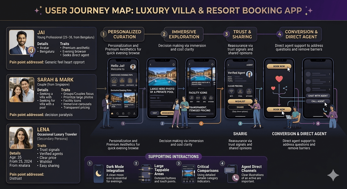
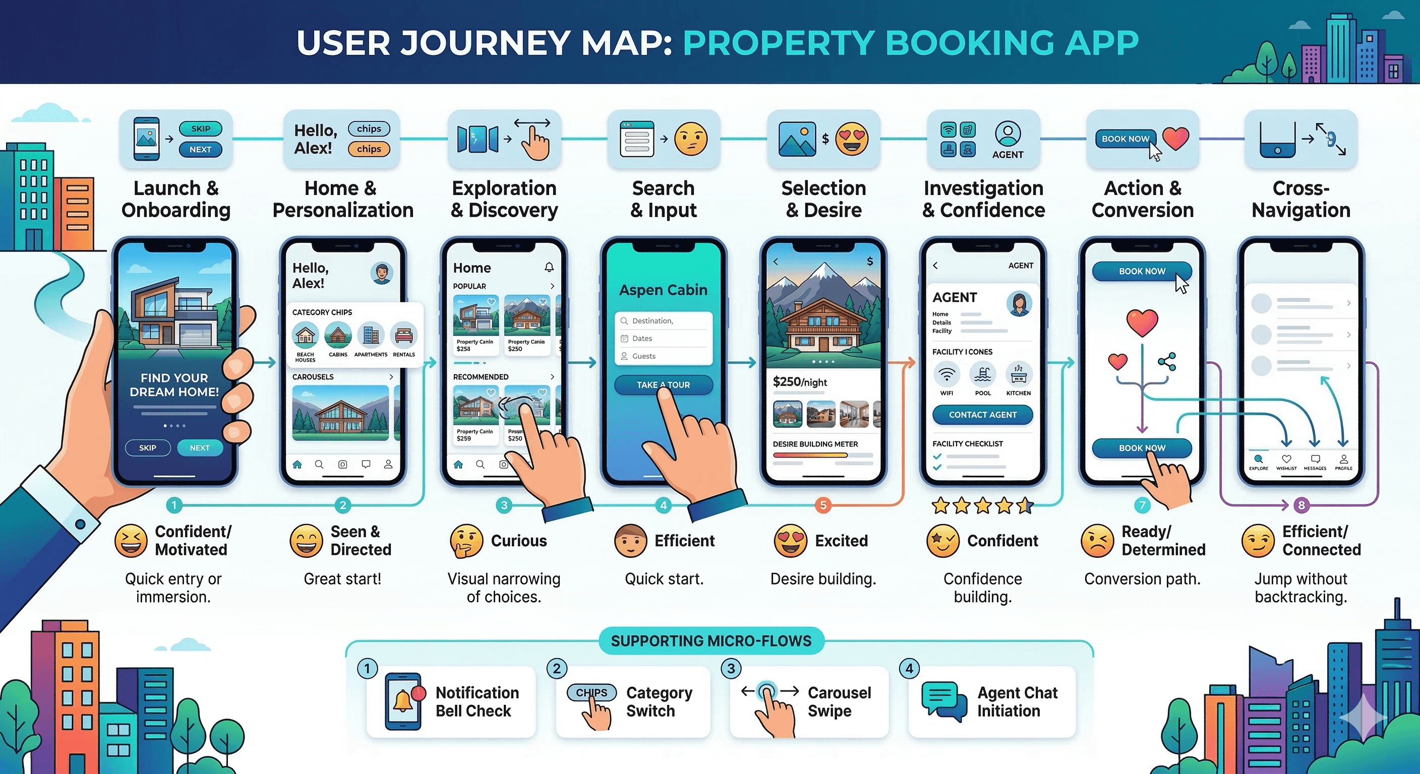
User Journey Map
Step 1: Launch → full-screen onboarding image + overlay text + skip/next buttons → quick entry or motivational immersion.
Step 2: Home → personalized greeting + category chips → user feels seen and directed.
Step 3: Category tap or scroll → popular/recommended carousels → visual narrowing of choices.
Step 4: Search input or “Take a tour” → quick destination/date/guest entry → efficient start.
Step 5: Property selection → hero image + price + description + photos carousel → desire building.
Step 6: Detail exploration → read more, view facilities icons, contact agent → confidence building.
Step 7: Action → wishlist heart, share, or tap “Book Now” → conversion path.
Step 8: Cross-navigation → bottom bar allows jump to Wishlist/Message/Explore without backtracking.
Supporting micro-flows: Notification bell check, category switch, carousel swipe, agent chat initiation.
Design Principles
Dark elegance as default → navy base reduces glare, conveys luxury.
Visual dominance → hero images and carousels occupy majority of screen space.
Teal action hierarchy → used only for CTAs, chips, buttons → guides eye without clutter.
Transparency first → price, facilities, agent info visible without scrolling/tapping.
Personalization layer → greeting/avatar/notification creates ownership feel.
Simplicity & restraint → minimal text density, generous spacing, rounded soft edges.
Thumb ergonomics → bottom nav, large CTAs, centered search fields.
Trust signals → verified agent badge, upfront nightly rate, direct chat/call icons.
Visual storytelling → high-res photography + subtle shadows → premium perception.
Consistency → same rounded style, teal accents, dark background across all screens.
Phase 3
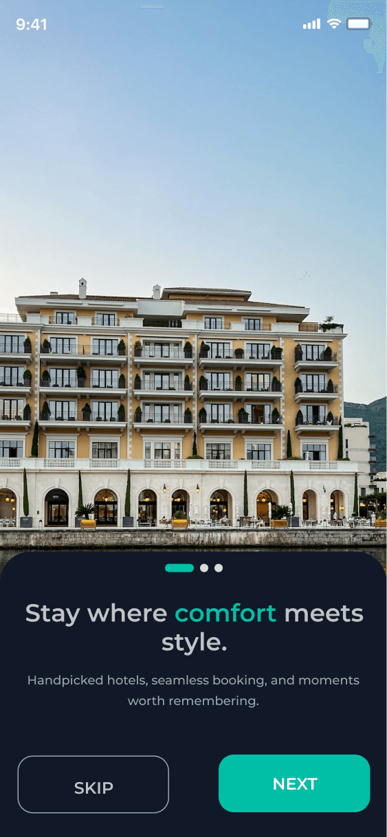
Onboarding / Get Started Screen
Background: Full-bleed high-resolution hotel building image (seaside at dusk) to set immediate aspirational tone.
Overlay: Semi-transparent dark layer ensures text legibility.
Headline: Bold white “Stay where comfort meets style.” – large, centered, impactful.
Subheadline: White text explaining value proposition (handpicked hotels, seamless booking, memorable moments).
CTAs: Teal “SKIP” (left) and “NEXT” (right) buttons at bottom – large, rounded, high contrast.
Purpose: Deliver brand promise in <5 seconds, allow power users to bypass, build excitement for engaged users.
Homepage / Discovery Screen
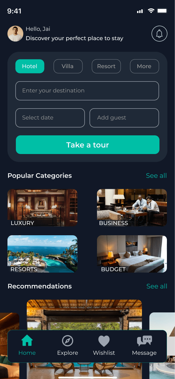
Header: Circular avatar + “Hello, Jai” greeting + notification bell icon → personalization + alerts.
Tagline: Centered white text “Discover your perfect place to stay” → clear purpose.
Category selector: Horizontal chips (teal active “Hotel”, dark outlines for Villa/Resort/More) → fast filtering.
Search zone: Large rounded search bar with placeholder “Enter your destination”.
Input fields: Rounded date picker + guest counter below search → grouped logically.
Primary CTA: Large teal “Take a tour” button → encourages deeper interaction.
Content sections: “Popular Categories” carousel with photo cards (Luxury, Business, Resorts, Budget) + “See all” link; “Recommendations” teaser below.
Footer: Bottom nav bar (Home active with teal indicator, Explore compass, Wishlist heart, Message bubble) → persistent access.
Purpose: Immediate personalization + visual curation + fast entry points → reduce bounce, increase exploration time.
Property Detail Screen
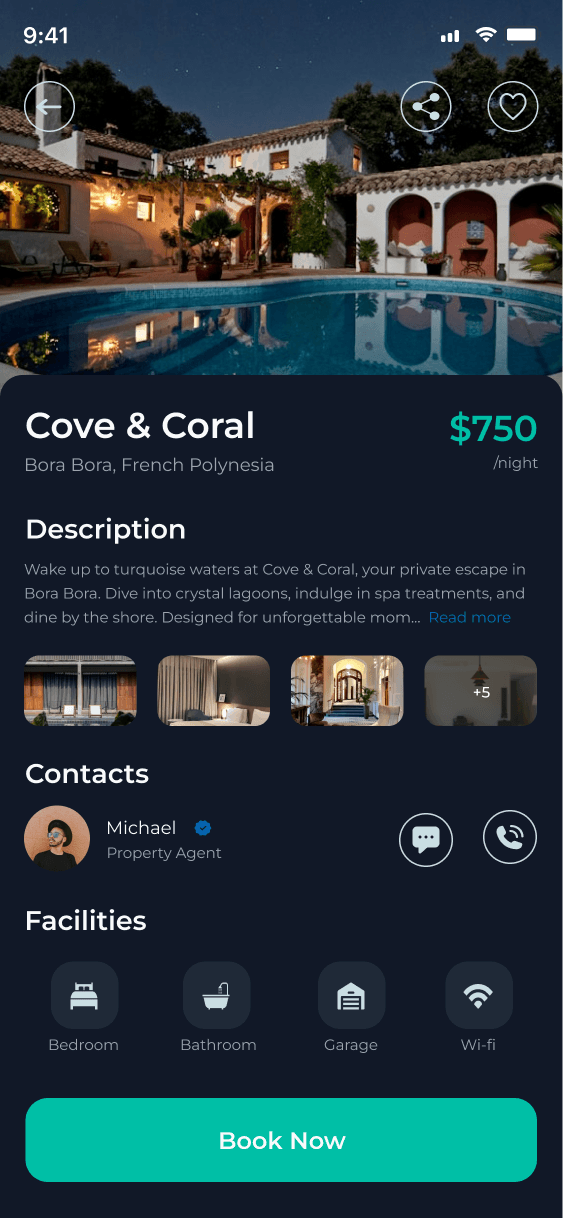
Hero: Full-bleed high-res villa/pool image at night → immersive first impression.
Top bar: Back arrow (left), share icon, heart wishlist icon (right) → standard actions.
Title block: White bold hotel name “Cove & Coral”, gray location “Bora Bora, French Polynesia”, teal price “$750 /night”.
Description: Dark card with teaser text + “Read more” link → expandable content.
Gallery: Horizontal photo thumbnails carousel with “+5” indicator → quick visual scan.
Contacts: Circular agent avatar (Michael), verified checkmark, name/role “Property Agent”, chat bubble + phone icons → human support.
Facilities: 4 icon tiles (Bedroom, Bathroom, Garage, Wi-Fi) in grid → glanceable amenities.
CTA: Large fixed teal “Book Now” button at bottom → conversion anchor.
Purpose: Build desire (hero + gallery), provide trust (price + agent), enable decision (facilities), drive action (CTA).
Phase 4
UI Design & Visual System – Components
Primary background: Dark navy/black → eye comfort, premium feel.
Accent color: Teal → reserved for interactive elements (CTAs, active chips, price).
Text colors: White for headings/titles, light gray for subtext/descriptions → high contrast.
Image treatment: High-resolution, warm-toned photography → luxury perception.
Typography: Sans-serif family – bold/large for titles (hotel names, greetings), regular/medium for body.
Spacing: Generous padding (24–32px between sections) → breathing room on dark background.
Rounding: Consistent 16–24px radius on cards, buttons, search fields → soft modern look.
Shadows: Subtle elevation on cards/nav → depth without harshness.
Icons: Line-style, white/teal, consistent size → facilities, nav, actions.
Components library: Reusable search bar, category chip, photo carousel, icon button, bottom nav.
Prototype & Interactions
Onboarding: Fade transitions between slides, tap on SKIP/NEXT.
Homepage: Category chip tap highlights in teal + content update (if dynamic).
Carousel: Horizontal swipe on photos/categories, snap to center.
Wishlist: Heart icon fill animation (teal on tap).
Read more: Tap expands description with smooth height transition.
Agent contact: Tap chat/phone opens native messaging/call.
Book Now: Button scale down on press, potential loading state.
Bottom nav: Icon highlight in teal on active section.
General: Subtle micro-interactions (button glow, card lift on hover/tap).
Technical Considerations
Dark mode native → low power on OLED, reduced blue light.
Contrast ratios: ≥4.5:1 for text/icons on dark bg.
Touch targets: All CTAs/buttons ≥48×48px.
Image optimization: Compressed high-res photos, lazy loading implied.
Accessibility labels: Alt text for images, semantic icons.
Scalability: Text scales with system font size, layout adapts to different screen widths.
Performance: Minimal animations, no heavy transitions → smooth on mid-range devices.
UX Outcomes & Value
Dark mode → lower eye strain, longer session times at night.
Personal greeting → higher emotional connection, reduced bounce.
Category chips + carousels → faster relevant discovery.
Transparent price + facilities → increased trust, lower abandonment.
Agent contact → quicker resolution of doubts.
Large hero + gallery → stronger desire/emotional pull.
Teal CTAs → clear action guidance.
Overall: Cleaner, more premium feel than competitors, higher perceived quality.
Reflection & Learnings
Dark mode significantly improves comfort for travel planning apps.
Personalization (greeting/avatar) creates instant “this is for me” feeling.
Limiting accents to teal prevents visual noise on dark background.
Hero images + carousels outperform text-heavy descriptions.
Facilities icons allow scanning in seconds.
Agent contact section adds real-world trust layer.
Bottom nav reduces disorientation in multi-screen flows.
Future improvements: Add price range slider, ratings filter, map view, saved filters, multi-currency toggle, offline wishlist caching.
More Projects


UI / UX Design
CoveStay
A premium hotel and villa booking app with dark-mode elegance, immersive hero photos, transparent pricing, agent contact, and one-tap booking for unforgettable escapes.
Year :
2025
Industry :
Hotel Management
Client :
Hotel
Project Duration :
2 weeks
Phase 1
Introduction
This app redefines hotel booking by turning what is often a tedious task into an exciting journey of discovery. It opens with a warm personalized greeting ("Hello, Jai") and tagline ("Discover your perfect place to stay"), guiding users through category exploration (Hotel, Villa, Resort), smart search inputs, popular curated carousels, and deep property views featuring stunning hero photos, detailed descriptions, agent contacts, facility icons, and prominent booking CTAs. The dark theme reduces eye strain during evening planning, while teal highlights draw attention to actions like "Take a tour" or "Book Now". My goal was to create a premium feel through big visuals, minimal clutter, and thoughtful personalization that makes users feel the app understands their travel desires.
Problem Statement
Existing hotel booking apps frequently use bright white/light interfaces → high glare and eye fatigue during evening or low-light travel planning sessions.
Impersonal launch screens → no user recognition, no immediate emotional connection, feels transactional.
Search and discovery often start with generic lists → users feel lost among hundreds of options without quick curation.
Pricing frequently hidden or shown late → causes distrust and abandonment at checkout stage.
Property detail pages overloaded with text → users skip reading and rely only on photos (or leave).
Lack of direct human support → users hesitate when questions arise (e.g., special requests, availability).
Photo galleries often small/thumbnail-heavy → fails to convey luxury/scale of property.
No quick categorization → users must scroll endlessly to find villa/resort vs standard hotel.
Bottom navigation missing or inconsistent → increases cognitive load when switching contexts.
Onboarding often skippable but boring → misses chance to set aspirational tone early.
Resulting user behavior: High bounce rates, low session duration, low conversion, especially on mobile at night.
Objectives
Implement full dark-mode interface optimized for OLED/AMOLED screens and evening usage.
Achieve immediate user recognition with personalized greeting + avatar + notification indicator.
Enable one-tap category switching (Hotel, Villa, Resort, More) with visual feedback (teal highlight).
Provide large, centered search field with placeholder text that invites input without pressure.
Offer quick-access date picker and guest counter fields with rounded, touch-friendly design.
Include motivational primary CTA (“Take a tour”) in teal to encourage deeper engagement.
Curate visual-first discovery through “Popular Categories” and “Recommendations” carousels.
Ensure full nightly rate transparency ($750 /night) shown immediately on property card.
Present expandable description with “Read more” link to avoid overwhelming initial view.
Display multiple interior/exterior photos via swipeable carousel with “+5” counter.
Provide direct agent contact (avatar, verified badge, name, chat/phone icons) for trust and support.
Show key facilities via clean icon grid (Bedroom, Bathroom, Garage, Wi-Fi) for at-a-glance info.
Anchor conversion with large, fixed-position teal “Book Now” button on detail screen.
Maintain persistent bottom navigation for seamless flow between discovery and saved items.
Use high-resolution hero imagery to create instant emotional desire before any text reading.
Balance minimal text with visual hierarchy so users can decide in seconds.
Phase 2
Target Users
User Journey Map
Step 1: Launch → full-screen onboarding image + overlay text + skip/next buttons → quick entry or motivational immersion.
Step 2: Home → personalized greeting + category chips → user feels seen and directed.
Step 3: Category tap or scroll → popular/recommended carousels → visual narrowing of choices.
Step 4: Search input or “Take a tour” → quick destination/date/guest entry → efficient start.
Step 5: Property selection → hero image + price + description + photos carousel → desire building.
Step 6: Detail exploration → read more, view facilities icons, contact agent → confidence building.
Step 7: Action → wishlist heart, share, or tap “Book Now” → conversion path.
Step 8: Cross-navigation → bottom bar allows jump to Wishlist/Message/Explore without backtracking.
Supporting micro-flows: Notification bell check, category switch, carousel swipe, agent chat initiation.
Design Principles
Dark elegance as default → navy base reduces glare, conveys luxury.
Visual dominance → hero images and carousels occupy majority of screen space.
Teal action hierarchy → used only for CTAs, chips, buttons → guides eye without clutter.
Transparency first → price, facilities, agent info visible without scrolling/tapping.
Personalization layer → greeting/avatar/notification creates ownership feel.
Simplicity & restraint → minimal text density, generous spacing, rounded soft edges.
Thumb ergonomics → bottom nav, large CTAs, centered search fields.
Trust signals → verified agent badge, upfront nightly rate, direct chat/call icons.
Visual storytelling → high-res photography + subtle shadows → premium perception.
Consistency → same rounded style, teal accents, dark background across all screens.
Phase 3
Onboarding / Get Started Screen
Background: Full-bleed high-resolution hotel building image (seaside at dusk) to set immediate aspirational tone.
Overlay: Semi-transparent dark layer ensures text legibility.
Headline: Bold white “Stay where comfort meets style.” – large, centered, impactful.
Subheadline: White text explaining value proposition (handpicked hotels, seamless booking, memorable moments).
CTAs: Teal “SKIP” (left) and “NEXT” (right) buttons at bottom – large, rounded, high contrast.
Purpose: Deliver brand promise in <5 seconds, allow power users to bypass, build excitement for engaged users.
Homepage / Discovery Screen
Header: Circular avatar + “Hello, Jai” greeting + notification bell icon → personalization + alerts.
Tagline: Centered white text “Discover your perfect place to stay” → clear purpose.
Category selector: Horizontal chips (teal active “Hotel”, dark outlines for Villa/Resort/More) → fast filtering.
Search zone: Large rounded search bar with placeholder “Enter your destination”.
Input fields: Rounded date picker + guest counter below search → grouped logically.
Primary CTA: Large teal “Take a tour” button → encourages deeper interaction.
Content sections: “Popular Categories” carousel with photo cards (Luxury, Business, Resorts, Budget) + “See all” link; “Recommendations” teaser below.
Footer: Bottom nav bar (Home active with teal indicator, Explore compass, Wishlist heart, Message bubble) → persistent access.
Purpose: Immediate personalization + visual curation + fast entry points → reduce bounce, increase exploration time.
Property Detail Screen
Hero: Full-bleed high-res villa/pool image at night → immersive first impression.
Top bar: Back arrow (left), share icon, heart wishlist icon (right) → standard actions.
Title block: White bold hotel name “Cove & Coral”, gray location “Bora Bora, French Polynesia”, teal price “$750 /night”.
Description: Dark card with teaser text + “Read more” link → expandable content.
Gallery: Horizontal photo thumbnails carousel with “+5” indicator → quick visual scan.
Contacts: Circular agent avatar (Michael), verified checkmark, name/role “Property Agent”, chat bubble + phone icons → human support.
Facilities: 4 icon tiles (Bedroom, Bathroom, Garage, Wi-Fi) in grid → glanceable amenities.
CTA: Large fixed teal “Book Now” button at bottom → conversion anchor.
Purpose: Build desire (hero + gallery), provide trust (price + agent), enable decision (facilities), drive action (CTA).
Phase 4
UI Design & Visual System – Components
Primary background: Dark navy/black → eye comfort, premium feel.
Accent color: Teal → reserved for interactive elements (CTAs, active chips, price).
Text colors: White for headings/titles, light gray for subtext/descriptions → high contrast.
Image treatment: High-resolution, warm-toned photography → luxury perception.
Typography: Sans-serif family – bold/large for titles (hotel names, greetings), regular/medium for body.
Spacing: Generous padding (24–32px between sections) → breathing room on dark background.
Rounding: Consistent 16–24px radius on cards, buttons, search fields → soft modern look.
Shadows: Subtle elevation on cards/nav → depth without harshness.
Icons: Line-style, white/teal, consistent size → facilities, nav, actions.
Components library: Reusable search bar, category chip, photo carousel, icon button, bottom nav.
Prototype & Interactions
Onboarding: Fade transitions between slides, tap on SKIP/NEXT.
Homepage: Category chip tap highlights in teal + content update (if dynamic).
Carousel: Horizontal swipe on photos/categories, snap to center.
Wishlist: Heart icon fill animation (teal on tap).
Read more: Tap expands description with smooth height transition.
Agent contact: Tap chat/phone opens native messaging/call.
Book Now: Button scale down on press, potential loading state.
Bottom nav: Icon highlight in teal on active section.
General: Subtle micro-interactions (button glow, card lift on hover/tap).
Technical Considerations
Dark mode native → low power on OLED, reduced blue light.
Contrast ratios: ≥4.5:1 for text/icons on dark bg.
Touch targets: All CTAs/buttons ≥48×48px.
Image optimization: Compressed high-res photos, lazy loading implied.
Accessibility labels: Alt text for images, semantic icons.
Scalability: Text scales with system font size, layout adapts to different screen widths.
Performance: Minimal animations, no heavy transitions → smooth on mid-range devices.
UX Outcomes & Value
Dark mode → lower eye strain, longer session times at night.
Personal greeting → higher emotional connection, reduced bounce.
Category chips + carousels → faster relevant discovery.
Transparent price + facilities → increased trust, lower abandonment.
Agent contact → quicker resolution of doubts.
Large hero + gallery → stronger desire/emotional pull.
Teal CTAs → clear action guidance.
Overall: Cleaner, more premium feel than competitors, higher perceived quality.
Reflection & Learnings
Dark mode significantly improves comfort for travel planning apps.
Personalization (greeting/avatar) creates instant “this is for me” feeling.
Limiting accents to teal prevents visual noise on dark background.
Hero images + carousels outperform text-heavy descriptions.
Facilities icons allow scanning in seconds.
Agent contact section adds real-world trust layer.
Bottom nav reduces disorientation in multi-screen flows.
Future improvements: Add price range slider, ratings filter, map view, saved filters, multi-currency toggle, offline wishlist caching.
More Projects
UI / UX Design
CoveStay
A premium hotel and villa booking app with dark-mode elegance, immersive hero photos, transparent pricing, agent contact, and one-tap booking for unforgettable escapes.
Year :
2025
Industry :
Hotel Management
Client :
Hotel
Project Duration :
2 weeks
Phase 1
Introduction
This app redefines hotel booking by turning what is often a tedious task into an exciting journey of discovery. It opens with a warm personalized greeting ("Hello, Jai") and tagline ("Discover your perfect place to stay"), guiding users through category exploration (Hotel, Villa, Resort), smart search inputs, popular curated carousels, and deep property views featuring stunning hero photos, detailed descriptions, agent contacts, facility icons, and prominent booking CTAs. The dark theme reduces eye strain during evening planning, while teal highlights draw attention to actions like "Take a tour" or "Book Now". My goal was to create a premium feel through big visuals, minimal clutter, and thoughtful personalization that makes users feel the app understands their travel desires.
Problem Statement
Existing hotel booking apps frequently use bright white/light interfaces → high glare and eye fatigue during evening or low-light travel planning sessions.
Impersonal launch screens → no user recognition, no immediate emotional connection, feels transactional.
Search and discovery often start with generic lists → users feel lost among hundreds of options without quick curation.
Pricing frequently hidden or shown late → causes distrust and abandonment at checkout stage.
Property detail pages overloaded with text → users skip reading and rely only on photos (or leave).
Lack of direct human support → users hesitate when questions arise (e.g., special requests, availability).
Photo galleries often small/thumbnail-heavy → fails to convey luxury/scale of property.
No quick categorization → users must scroll endlessly to find villa/resort vs standard hotel.
Bottom navigation missing or inconsistent → increases cognitive load when switching contexts.
Onboarding often skippable but boring → misses chance to set aspirational tone early.
Resulting user behavior: High bounce rates, low session duration, low conversion, especially on mobile at night.
Objectives
Implement full dark-mode interface optimized for OLED/AMOLED screens and evening usage.
Achieve immediate user recognition with personalized greeting + avatar + notification indicator.
Enable one-tap category switching (Hotel, Villa, Resort, More) with visual feedback (teal highlight).
Provide large, centered search field with placeholder text that invites input without pressure.
Offer quick-access date picker and guest counter fields with rounded, touch-friendly design.
Include motivational primary CTA (“Take a tour”) in teal to encourage deeper engagement.
Curate visual-first discovery through “Popular Categories” and “Recommendations” carousels.
Ensure full nightly rate transparency ($750 /night) shown immediately on property card.
Present expandable description with “Read more” link to avoid overwhelming initial view.
Display multiple interior/exterior photos via swipeable carousel with “+5” counter.
Provide direct agent contact (avatar, verified badge, name, chat/phone icons) for trust and support.
Show key facilities via clean icon grid (Bedroom, Bathroom, Garage, Wi-Fi) for at-a-glance info.
Anchor conversion with large, fixed-position teal “Book Now” button on detail screen.
Maintain persistent bottom navigation for seamless flow between discovery and saved items.
Use high-resolution hero imagery to create instant emotional desire before any text reading.
Balance minimal text with visual hierarchy so users can decide in seconds.
Phase 2
Target Users
User Journey Map
Step 1: Launch → full-screen onboarding image + overlay text + skip/next buttons → quick entry or motivational immersion.
Step 2: Home → personalized greeting + category chips → user feels seen and directed.
Step 3: Category tap or scroll → popular/recommended carousels → visual narrowing of choices.
Step 4: Search input or “Take a tour” → quick destination/date/guest entry → efficient start.
Step 5: Property selection → hero image + price + description + photos carousel → desire building.
Step 6: Detail exploration → read more, view facilities icons, contact agent → confidence building.
Step 7: Action → wishlist heart, share, or tap “Book Now” → conversion path.
Step 8: Cross-navigation → bottom bar allows jump to Wishlist/Message/Explore without backtracking.
Supporting micro-flows: Notification bell check, category switch, carousel swipe, agent chat initiation.
Design Principles
Dark elegance as default → navy base reduces glare, conveys luxury.
Visual dominance → hero images and carousels occupy majority of screen space.
Teal action hierarchy → used only for CTAs, chips, buttons → guides eye without clutter.
Transparency first → price, facilities, agent info visible without scrolling/tapping.
Personalization layer → greeting/avatar/notification creates ownership feel.
Simplicity & restraint → minimal text density, generous spacing, rounded soft edges.
Thumb ergonomics → bottom nav, large CTAs, centered search fields.
Trust signals → verified agent badge, upfront nightly rate, direct chat/call icons.
Visual storytelling → high-res photography + subtle shadows → premium perception.
Consistency → same rounded style, teal accents, dark background across all screens.
Phase 3
Onboarding / Get Started Screen
Background: Full-bleed high-resolution hotel building image (seaside at dusk) to set immediate aspirational tone.
Overlay: Semi-transparent dark layer ensures text legibility.
Headline: Bold white “Stay where comfort meets style.” – large, centered, impactful.
Subheadline: White text explaining value proposition (handpicked hotels, seamless booking, memorable moments).
CTAs: Teal “SKIP” (left) and “NEXT” (right) buttons at bottom – large, rounded, high contrast.
Purpose: Deliver brand promise in <5 seconds, allow power users to bypass, build excitement for engaged users.
Homepage / Discovery Screen
Header: Circular avatar + “Hello, Jai” greeting + notification bell icon → personalization + alerts.
Tagline: Centered white text “Discover your perfect place to stay” → clear purpose.
Category selector: Horizontal chips (teal active “Hotel”, dark outlines for Villa/Resort/More) → fast filtering.
Search zone: Large rounded search bar with placeholder “Enter your destination”.
Input fields: Rounded date picker + guest counter below search → grouped logically.
Primary CTA: Large teal “Take a tour” button → encourages deeper interaction.
Content sections: “Popular Categories” carousel with photo cards (Luxury, Business, Resorts, Budget) + “See all” link; “Recommendations” teaser below.
Footer: Bottom nav bar (Home active with teal indicator, Explore compass, Wishlist heart, Message bubble) → persistent access.
Purpose: Immediate personalization + visual curation + fast entry points → reduce bounce, increase exploration time.
Property Detail Screen
Hero: Full-bleed high-res villa/pool image at night → immersive first impression.
Top bar: Back arrow (left), share icon, heart wishlist icon (right) → standard actions.
Title block: White bold hotel name “Cove & Coral”, gray location “Bora Bora, French Polynesia”, teal price “$750 /night”.
Description: Dark card with teaser text + “Read more” link → expandable content.
Gallery: Horizontal photo thumbnails carousel with “+5” indicator → quick visual scan.
Contacts: Circular agent avatar (Michael), verified checkmark, name/role “Property Agent”, chat bubble + phone icons → human support.
Facilities: 4 icon tiles (Bedroom, Bathroom, Garage, Wi-Fi) in grid → glanceable amenities.
CTA: Large fixed teal “Book Now” button at bottom → conversion anchor.
Purpose: Build desire (hero + gallery), provide trust (price + agent), enable decision (facilities), drive action (CTA).
Phase 4
UI Design & Visual System – Components
Primary background: Dark navy/black → eye comfort, premium feel.
Accent color: Teal → reserved for interactive elements (CTAs, active chips, price).
Text colors: White for headings/titles, light gray for subtext/descriptions → high contrast.
Image treatment: High-resolution, warm-toned photography → luxury perception.
Typography: Sans-serif family – bold/large for titles (hotel names, greetings), regular/medium for body.
Spacing: Generous padding (24–32px between sections) → breathing room on dark background.
Rounding: Consistent 16–24px radius on cards, buttons, search fields → soft modern look.
Shadows: Subtle elevation on cards/nav → depth without harshness.
Icons: Line-style, white/teal, consistent size → facilities, nav, actions.
Components library: Reusable search bar, category chip, photo carousel, icon button, bottom nav.
Prototype & Interactions
Onboarding: Fade transitions between slides, tap on SKIP/NEXT.
Homepage: Category chip tap highlights in teal + content update (if dynamic).
Carousel: Horizontal swipe on photos/categories, snap to center.
Wishlist: Heart icon fill animation (teal on tap).
Read more: Tap expands description with smooth height transition.
Agent contact: Tap chat/phone opens native messaging/call.
Book Now: Button scale down on press, potential loading state.
Bottom nav: Icon highlight in teal on active section.
General: Subtle micro-interactions (button glow, card lift on hover/tap).
Technical Considerations
Dark mode native → low power on OLED, reduced blue light.
Contrast ratios: ≥4.5:1 for text/icons on dark bg.
Touch targets: All CTAs/buttons ≥48×48px.
Image optimization: Compressed high-res photos, lazy loading implied.
Accessibility labels: Alt text for images, semantic icons.
Scalability: Text scales with system font size, layout adapts to different screen widths.
Performance: Minimal animations, no heavy transitions → smooth on mid-range devices.
UX Outcomes & Value
Dark mode → lower eye strain, longer session times at night.
Personal greeting → higher emotional connection, reduced bounce.
Category chips + carousels → faster relevant discovery.
Transparent price + facilities → increased trust, lower abandonment.
Agent contact → quicker resolution of doubts.
Large hero + gallery → stronger desire/emotional pull.
Teal CTAs → clear action guidance.
Overall: Cleaner, more premium feel than competitors, higher perceived quality.
Reflection & Learnings
Dark mode significantly improves comfort for travel planning apps.
Personalization (greeting/avatar) creates instant “this is for me” feeling.
Limiting accents to teal prevents visual noise on dark background.
Hero images + carousels outperform text-heavy descriptions.
Facilities icons allow scanning in seconds.
Agent contact section adds real-world trust layer.
Bottom nav reduces disorientation in multi-screen flows.
Future improvements: Add price range slider, ratings filter, map view, saved filters, multi-currency toggle, offline wishlist caching.