UI / UX Design
CineVibe
A dark-mode cinema companion for discovering trending films, watching trailers, checking ratings & cast, and booking tickets with personalized local recommendations.
Year :
2025
Industry :
Movies/Series
Client :
Cinema
Project Duration :
2 weeks
Phase 1
Project Overview
The Movie Booking App is a mobile UI/UX design focused on cinema ticket discovery, movie information, and booking. It uses a dark theme (deep black/navy background) for comfortable viewing in low-light environments (typical for evening movie planning), purple/pink neon accents for highlights (e.g., trailer button, rating stars, location pin), white text for contrast, and high-resolution movie posters as dominant visual elements. Key screens include immersive onboarding (posters wall + sign-up), personalized homepage (location, categories, search, trending/recommendations), and detailed movie page (poster, trailer CTA, rating, description, starring actors, book tickets). As a solo designer, I created this in Figma, prioritizing visual immersion, personalization, quick discovery, and clear calls-to-action to reduce friction in ticket booking.
Problem Statement
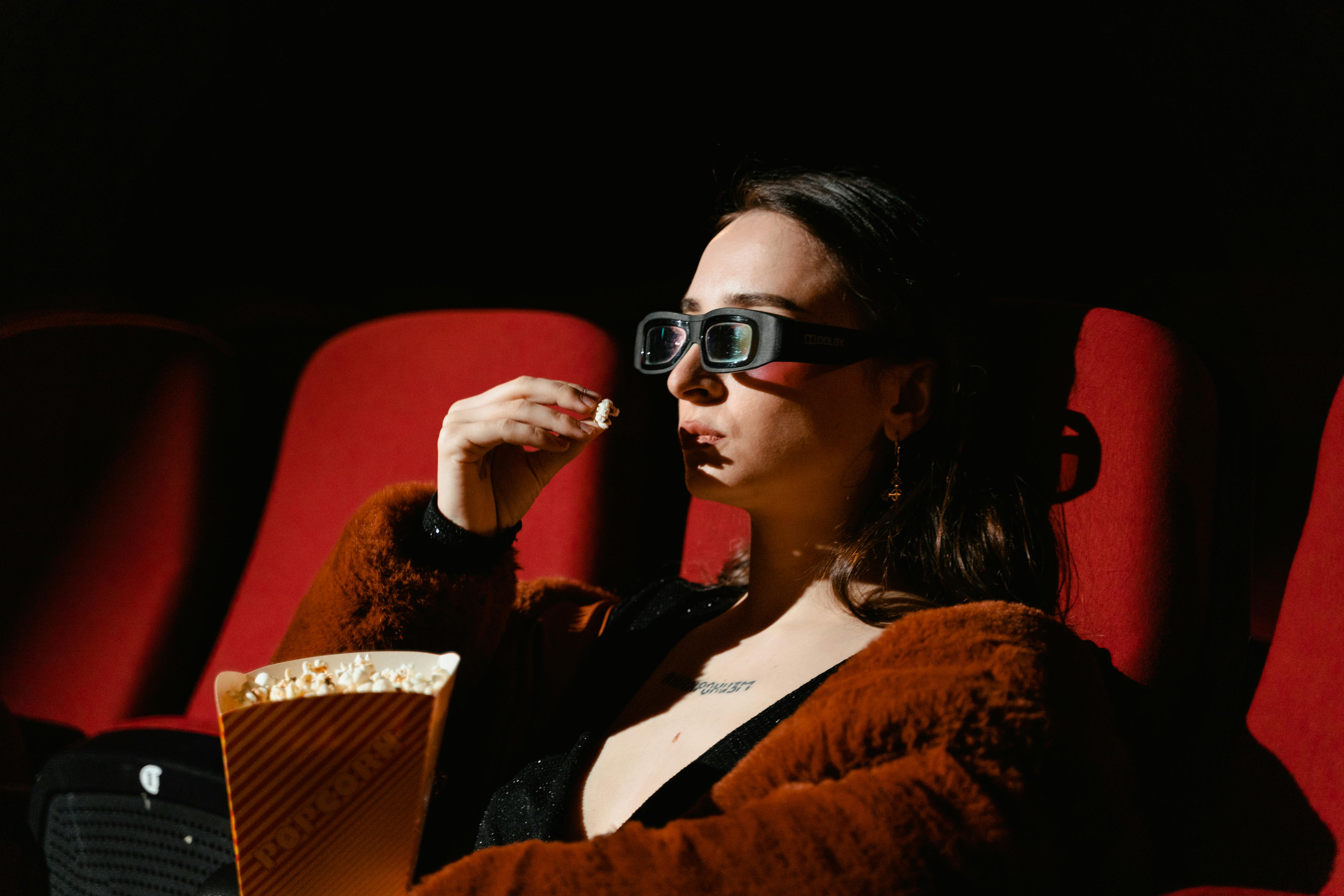
Many movie ticket apps use light themes that cause glare during night use, generic home screens without location awareness or personalization, overwhelming poster grids without curation, delayed trailer/rating visibility, and buried booking paths. Users often feel disconnected (no greeting or local context), spend too much time searching among unfiltered options, miss key info (ratings, cast, trailers), or abandon due to complex flows. This design solves these with dark mode for eye comfort, immediate personalization (greeting + location), category tabs for quick filtering (For You, Dining, Events, Movies), prominent search bar, curated trending carousels, and consolidated detail pages with trailer button, rating stars, description, starring grid, and large "Book Your Tickets" CTA.
Objectives
Deliver a dark-mode interface optimized for evening/mobile cinema planning with high contrast and reduced glare.
Achieve instant personalization via user greeting and location display (e.g., "Ranga Nagar, Chromepet, Chennai").
Enable fast content discovery through category tabs (For You, Dining, Events, Movies) with visual icons.
Provide prominent, centered search bar for movie/theater queries with magnifying glass icon.
Curate trending and personalized content via large poster carousels (e.g., "Trending" with "See All").
Present movie details clearly: large poster, trailer play button, rating (★4.9/10), title, description text, starring actors grid.
Drive conversion with fixed yellow/orange "Book Your Tickets" CTA on detail screen.
Include supporting actions: wishlist heart, skip/next on onboarding, back arrow on detail.
Ensure thumb-friendly layout with bottom-aligned elements and large tappable areas.
Use neon/purple accents sparingly for highlights (trailer ring, rating stars, location pin).
Balance visual dominance (posters) with readable text hierarchy.
Phase 2
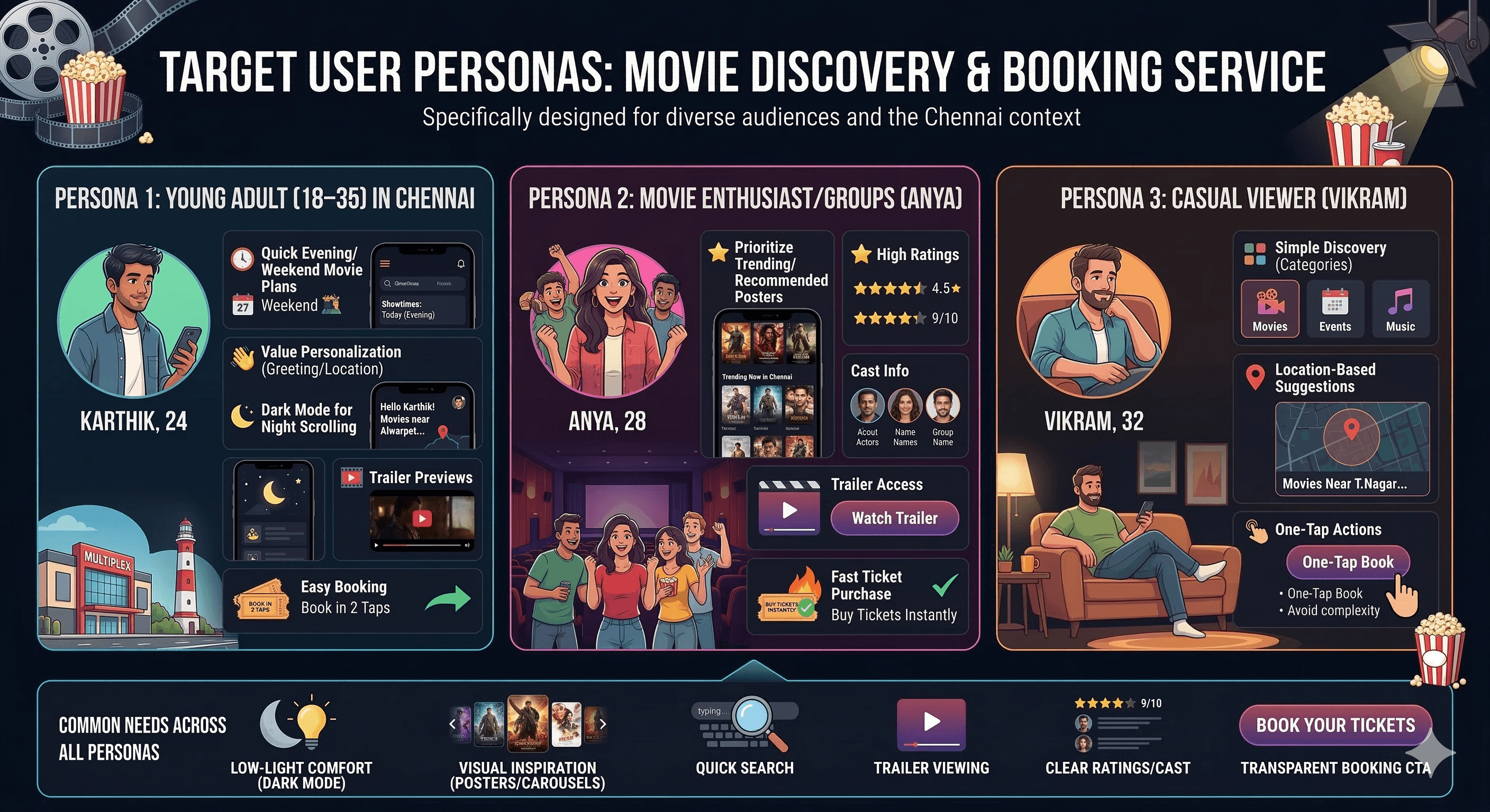
Target Users
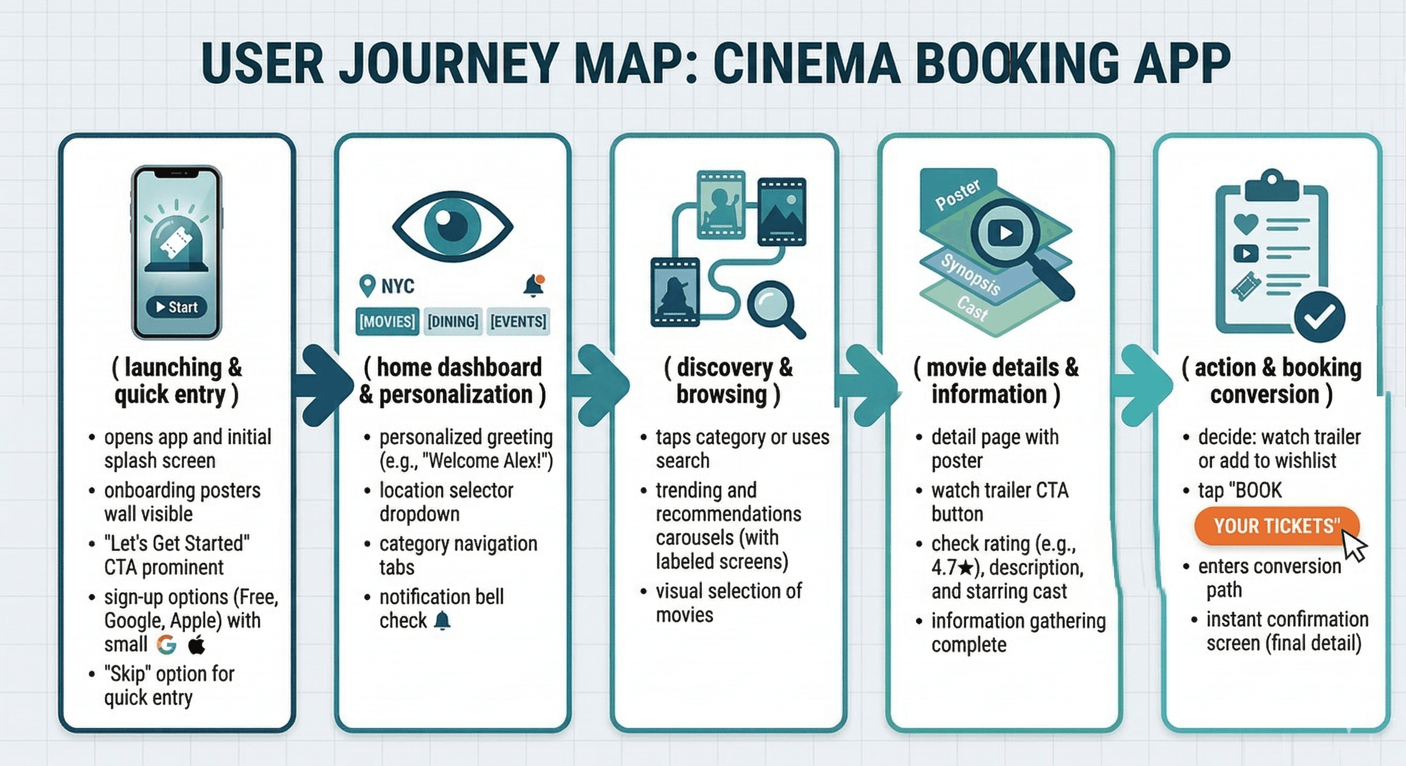
User Journey Map
Step 1: Launch → onboarding posters wall + "Let’s Get Started" + sign-up options (Free, Google, Apple) or skip → quick entry.
Step 2: Home → personalized greeting + location dropdown + category tabs → directed exploration.
Step 3: Category tap or search → trending/recommendations carousels → visual selection.
Step 4: Movie tap → detail page with poster + trailer CTA + rating/description/starring → info gathering.
Step 5: Action → watch trailer, add to wishlist, or tap "Book Your Tickets" → conversion path.
Supporting flows: Skip onboarding, change location, browse categories (Dining/Events integrated), notification bell check.
Design Principles
Dark theme priority → navy/black base reduces eye strain for night cinema planning.
Visual-first content → large posters/carousels dominate to spark interest quickly.
Neon accent usage → purple/pink for trailer rings, ratings, location pins → draws attention without overwhelming dark bg.
Personalization layer → greeting + location + avatar/notification → immediate relevance.
Transparency → ratings (★4.9/10), movie year/duration, cast grid visible upfront.
Action clarity → large CTAs ("Take a tour", "Book Your Tickets") in contrasting colors.
Simplicity → minimal text density, rounded elements, generous spacing.
Thumb ergonomics → bottom-aligned nav/CTAs, centered search.
Immersion → full-bleed posters on onboarding/detail → emotional pull.
Consistency → same dark bg, neon highlights, rounded corners across screens.
Phase 3
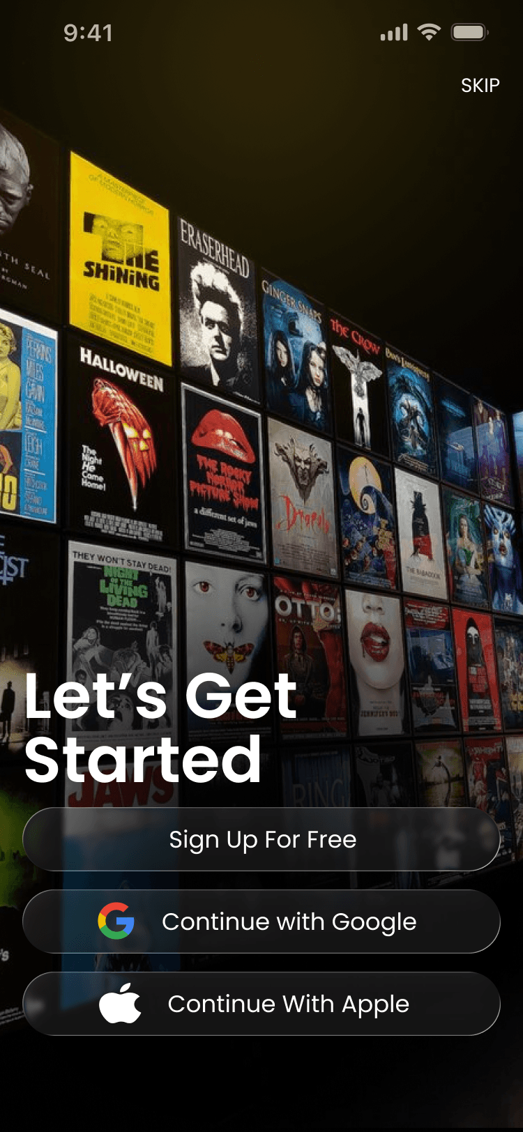
Screens Breakdown – Onboarding / Get Started Screen
Background: Full-bleed dark gradient with grid of movie posters (The Shining, Eraserhead, Halloween, Jaws, etc.) – creates instant cinema nostalgia/immersion.
Overlay text: Centered white "Let’s Get Started" headline → clear purpose.
Sign-up options: Glassmorphic cards/buttons – "Sign Up For Free", Google continue, Apple continue – large, rounded, subtle blur/shadow for depth.
Skip button: Top-right "SKIP" in white → low-friction exit for returning users.
Purpose: Build excitement with posters wall, offer easy entry (sign-up or skip), set dark/premium tone immediately.
Screens Breakdown – Homepage / Discovery Screen
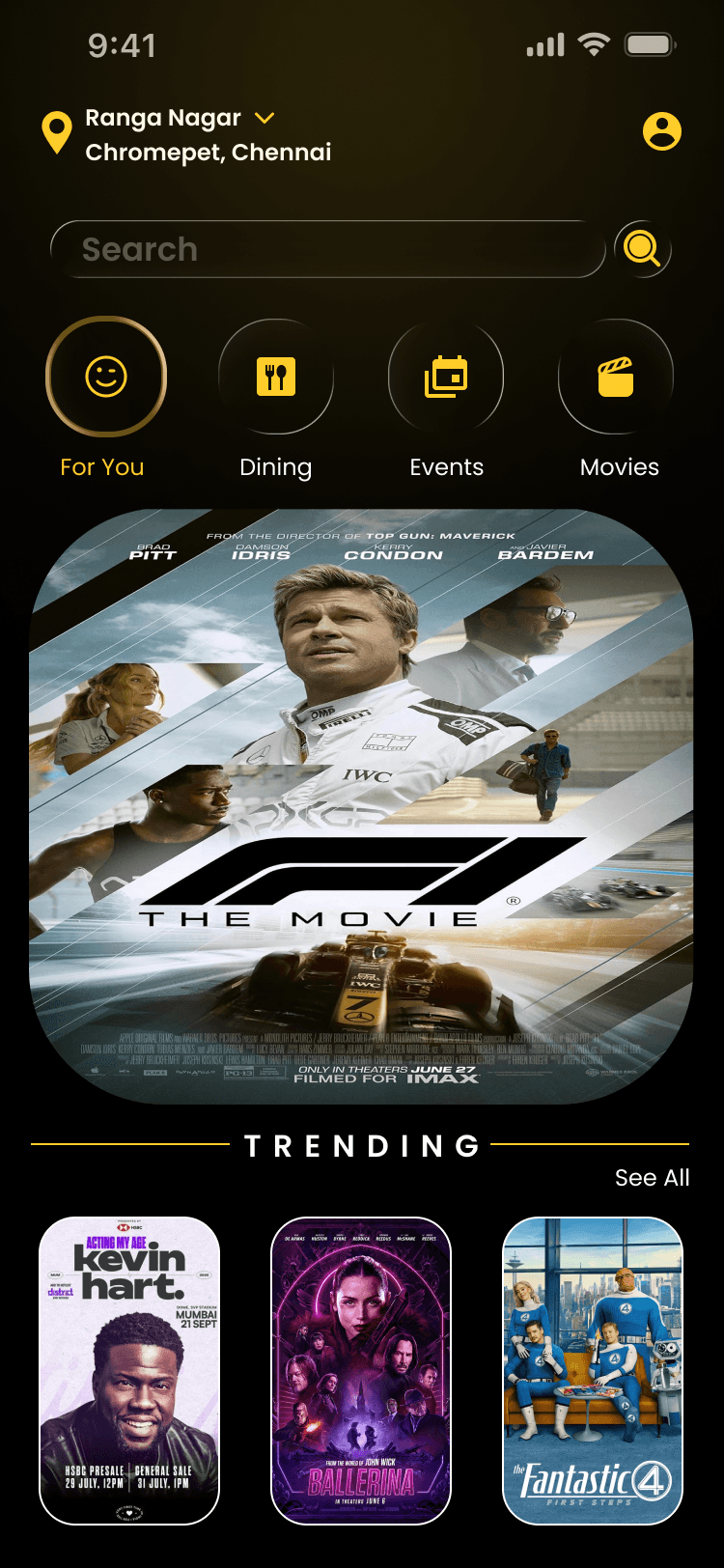
Header: Location pin + "Ranga Nagar ▼ Chromepet, Chennai" dropdown → local relevance; avatar + notification bell.
Tagline: White text "For You" implied via category tabs.
Category tabs: Circular gold/yellow icons – For You (smile), Dining (fork/knife), Events (calendar), Movies (clapperboard) → quick filtering.
Search bar: Centered rounded field "Search" with magnifying glass → prominent entry point.
Content: Large trending carousel (e.g., F1 movie poster with IMAX tag), "Trending" label + "See All".
Bottom: Implied nav (not shown in screenshot but consistent with your style).
Purpose: Personalized/local start, visual trending discovery, fast category switch, prominent search.
Screens Breakdown – Movie Detail Screen
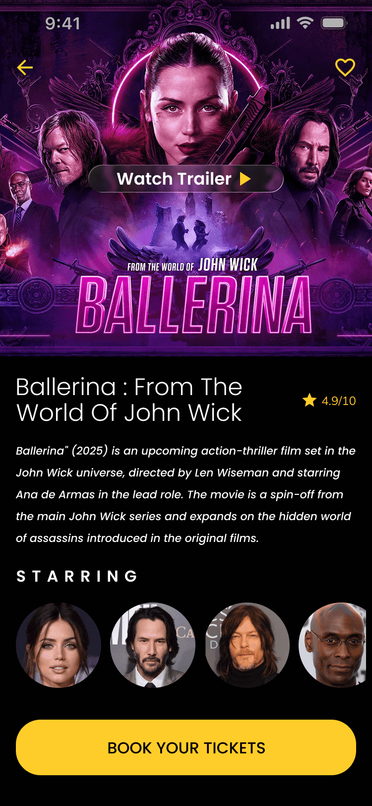
Header: Back arrow (yellow), movie title implied.
Hero: Full-bleed poster of Ballerina (neon purple ring glow, cast silhouettes, gun action pose) → high visual impact.
Trailer CTA: Black bar overlay "Watch Trailer" with white play icon → immediate engagement.
Title block: "Ballerina : From The World Of John Wick" in white, rating ★4.9/10 in yellow star.
Description: White text block with plot summary (action-thriller, spin-off, director/starring details).
Starring grid: 5 circular actor photos (Ana de Armas, Keanu Reeves, etc.) → quick cast scan.
CTA: Large yellow/orange "Book Your Tickets" button bottom → conversion anchor.
Purpose: Immersive poster + trailer access → desire building; rating/description/cast → informed decision; prominent CTA → easy booking.
Phase 4
UI Design & Visual System
Background: Deep black/navy – eye comfort, cinema-like darkness.
Accents: Neon purple/pink (trailer ring, poster glow), yellow/gold (ratings, category icons, CTA).
Text: White primary, gray secondary – high contrast on dark.
Images: High-res posters with dramatic lighting – visual dominance.
Typography: Bold sans-serif for titles/ratings, regular for descriptions.
Components: Rounded search bar, circular category icons, glassmorphic sign-up cards, neon-ring trailer button, grid for cast/facilities.
Shadows/blur: Subtle elevation on cards/buttons → depth in dark theme.
Prototype & Interactions
Onboarding: Swipe/skip/next on posters wall, tap sign-up buttons.
Homepage: Category tab switch (highlight glow), carousel swipe, location dropdown tap, search focus.
Detail: Trailer button tap → video play, poster zoom/pinch, heart wishlist fill, back arrow, book button press.
General: Neon glow on hover/tap, smooth transitions, notification bell animation.
Technical & Accessibility Considerations
Dark mode native – low power, glare-free.
Contrast ≥4.5:1 (white on black).
Touch targets ≥48px (CTAs, icons).
Image alt text, semantic labels.
Responsive scaling for different phones.
Performance: Optimized posters, lazy load carousels.
UX Outcomes & Value
Dark mode → better night usage comfort.
Personalization → higher engagement/retention.
Categories/carousels → faster relevant discovery.
Trailer + rating upfront → quicker decisions.
Large CTAs → higher conversion potential.
Overall: Premium, immersive cinema feel vs generic apps.
Reflection & Learnings
Dark + neon works well for entertainment apps.
Posters wall onboarding builds instant excitement.
Location/greeting → strong personalization.
Category icons → intuitive filtering.
Trailer integration → key desire driver.
Future: Add seat selection, showtimes, payment flow, reviews section.
Call to Action
Contact: LinkedIn/Instagram/email. Designed by JAISURYA – UI/UX Designer, Chennai.
More Projects


UI / UX Design
CineVibe
A dark-mode cinema companion for discovering trending films, watching trailers, checking ratings & cast, and booking tickets with personalized local recommendations.
Year :
2025
Industry :
Movies/Series
Client :
Cinema
Project Duration :
2 weeks
Phase 1
Project Overview
The Movie Booking App is a mobile UI/UX design focused on cinema ticket discovery, movie information, and booking. It uses a dark theme (deep black/navy background) for comfortable viewing in low-light environments (typical for evening movie planning), purple/pink neon accents for highlights (e.g., trailer button, rating stars, location pin), white text for contrast, and high-resolution movie posters as dominant visual elements. Key screens include immersive onboarding (posters wall + sign-up), personalized homepage (location, categories, search, trending/recommendations), and detailed movie page (poster, trailer CTA, rating, description, starring actors, book tickets). As a solo designer, I created this in Figma, prioritizing visual immersion, personalization, quick discovery, and clear calls-to-action to reduce friction in ticket booking.
Problem Statement
Many movie ticket apps use light themes that cause glare during night use, generic home screens without location awareness or personalization, overwhelming poster grids without curation, delayed trailer/rating visibility, and buried booking paths. Users often feel disconnected (no greeting or local context), spend too much time searching among unfiltered options, miss key info (ratings, cast, trailers), or abandon due to complex flows. This design solves these with dark mode for eye comfort, immediate personalization (greeting + location), category tabs for quick filtering (For You, Dining, Events, Movies), prominent search bar, curated trending carousels, and consolidated detail pages with trailer button, rating stars, description, starring grid, and large "Book Your Tickets" CTA.
Objectives
Deliver a dark-mode interface optimized for evening/mobile cinema planning with high contrast and reduced glare.
Achieve instant personalization via user greeting and location display (e.g., "Ranga Nagar, Chromepet, Chennai").
Enable fast content discovery through category tabs (For You, Dining, Events, Movies) with visual icons.
Provide prominent, centered search bar for movie/theater queries with magnifying glass icon.
Curate trending and personalized content via large poster carousels (e.g., "Trending" with "See All").
Present movie details clearly: large poster, trailer play button, rating (★4.9/10), title, description text, starring actors grid.
Drive conversion with fixed yellow/orange "Book Your Tickets" CTA on detail screen.
Include supporting actions: wishlist heart, skip/next on onboarding, back arrow on detail.
Ensure thumb-friendly layout with bottom-aligned elements and large tappable areas.
Use neon/purple accents sparingly for highlights (trailer ring, rating stars, location pin).
Balance visual dominance (posters) with readable text hierarchy.
Phase 2
Target Users
User Journey Map
Step 1: Launch → onboarding posters wall + "Let’s Get Started" + sign-up options (Free, Google, Apple) or skip → quick entry.
Step 2: Home → personalized greeting + location dropdown + category tabs → directed exploration.
Step 3: Category tap or search → trending/recommendations carousels → visual selection.
Step 4: Movie tap → detail page with poster + trailer CTA + rating/description/starring → info gathering.
Step 5: Action → watch trailer, add to wishlist, or tap "Book Your Tickets" → conversion path.
Supporting flows: Skip onboarding, change location, browse categories (Dining/Events integrated), notification bell check.
Design Principles
Dark theme priority → navy/black base reduces eye strain for night cinema planning.
Visual-first content → large posters/carousels dominate to spark interest quickly.
Neon accent usage → purple/pink for trailer rings, ratings, location pins → draws attention without overwhelming dark bg.
Personalization layer → greeting + location + avatar/notification → immediate relevance.
Transparency → ratings (★4.9/10), movie year/duration, cast grid visible upfront.
Action clarity → large CTAs ("Take a tour", "Book Your Tickets") in contrasting colors.
Simplicity → minimal text density, rounded elements, generous spacing.
Thumb ergonomics → bottom-aligned nav/CTAs, centered search.
Immersion → full-bleed posters on onboarding/detail → emotional pull.
Consistency → same dark bg, neon highlights, rounded corners across screens.
Phase 3
Screens Breakdown – Onboarding / Get Started Screen
Background: Full-bleed dark gradient with grid of movie posters (The Shining, Eraserhead, Halloween, Jaws, etc.) – creates instant cinema nostalgia/immersion.
Overlay text: Centered white "Let’s Get Started" headline → clear purpose.
Sign-up options: Glassmorphic cards/buttons – "Sign Up For Free", Google continue, Apple continue – large, rounded, subtle blur/shadow for depth.
Skip button: Top-right "SKIP" in white → low-friction exit for returning users.
Purpose: Build excitement with posters wall, offer easy entry (sign-up or skip), set dark/premium tone immediately.
Screens Breakdown – Homepage / Discovery Screen
Header: Location pin + "Ranga Nagar ▼ Chromepet, Chennai" dropdown → local relevance; avatar + notification bell.
Tagline: White text "For You" implied via category tabs.
Category tabs: Circular gold/yellow icons – For You (smile), Dining (fork/knife), Events (calendar), Movies (clapperboard) → quick filtering.
Search bar: Centered rounded field "Search" with magnifying glass → prominent entry point.
Content: Large trending carousel (e.g., F1 movie poster with IMAX tag), "Trending" label + "See All".
Bottom: Implied nav (not shown in screenshot but consistent with your style).
Purpose: Personalized/local start, visual trending discovery, fast category switch, prominent search.
Screens Breakdown – Movie Detail Screen
Header: Back arrow (yellow), movie title implied.
Hero: Full-bleed poster of Ballerina (neon purple ring glow, cast silhouettes, gun action pose) → high visual impact.
Trailer CTA: Black bar overlay "Watch Trailer" with white play icon → immediate engagement.
Title block: "Ballerina : From The World Of John Wick" in white, rating ★4.9/10 in yellow star.
Description: White text block with plot summary (action-thriller, spin-off, director/starring details).
Starring grid: 5 circular actor photos (Ana de Armas, Keanu Reeves, etc.) → quick cast scan.
CTA: Large yellow/orange "Book Your Tickets" button bottom → conversion anchor.
Purpose: Immersive poster + trailer access → desire building; rating/description/cast → informed decision; prominent CTA → easy booking.
Phase 4
UI Design & Visual System
Background: Deep black/navy – eye comfort, cinema-like darkness.
Accents: Neon purple/pink (trailer ring, poster glow), yellow/gold (ratings, category icons, CTA).
Text: White primary, gray secondary – high contrast on dark.
Images: High-res posters with dramatic lighting – visual dominance.
Typography: Bold sans-serif for titles/ratings, regular for descriptions.
Components: Rounded search bar, circular category icons, glassmorphic sign-up cards, neon-ring trailer button, grid for cast/facilities.
Shadows/blur: Subtle elevation on cards/buttons → depth in dark theme.
Prototype & Interactions
Onboarding: Swipe/skip/next on posters wall, tap sign-up buttons.
Homepage: Category tab switch (highlight glow), carousel swipe, location dropdown tap, search focus.
Detail: Trailer button tap → video play, poster zoom/pinch, heart wishlist fill, back arrow, book button press.
General: Neon glow on hover/tap, smooth transitions, notification bell animation.
Technical & Accessibility Considerations
Dark mode native – low power, glare-free.
Contrast ≥4.5:1 (white on black).
Touch targets ≥48px (CTAs, icons).
Image alt text, semantic labels.
Responsive scaling for different phones.
Performance: Optimized posters, lazy load carousels.
UX Outcomes & Value
Dark mode → better night usage comfort.
Personalization → higher engagement/retention.
Categories/carousels → faster relevant discovery.
Trailer + rating upfront → quicker decisions.
Large CTAs → higher conversion potential.
Overall: Premium, immersive cinema feel vs generic apps.
Reflection & Learnings
Dark + neon works well for entertainment apps.
Posters wall onboarding builds instant excitement.
Location/greeting → strong personalization.
Category icons → intuitive filtering.
Trailer integration → key desire driver.
Future: Add seat selection, showtimes, payment flow, reviews section.
Call to Action
Contact: LinkedIn/Instagram/email. Designed by JAISURYA – UI/UX Designer, Chennai.
More Projects
UI / UX Design
CineVibe
A dark-mode cinema companion for discovering trending films, watching trailers, checking ratings & cast, and booking tickets with personalized local recommendations.
Year :
2025
Industry :
Movies/Series
Client :
Cinema
Project Duration :
2 weeks
Phase 1
Project Overview
The Movie Booking App is a mobile UI/UX design focused on cinema ticket discovery, movie information, and booking. It uses a dark theme (deep black/navy background) for comfortable viewing in low-light environments (typical for evening movie planning), purple/pink neon accents for highlights (e.g., trailer button, rating stars, location pin), white text for contrast, and high-resolution movie posters as dominant visual elements. Key screens include immersive onboarding (posters wall + sign-up), personalized homepage (location, categories, search, trending/recommendations), and detailed movie page (poster, trailer CTA, rating, description, starring actors, book tickets). As a solo designer, I created this in Figma, prioritizing visual immersion, personalization, quick discovery, and clear calls-to-action to reduce friction in ticket booking.
Problem Statement
Many movie ticket apps use light themes that cause glare during night use, generic home screens without location awareness or personalization, overwhelming poster grids without curation, delayed trailer/rating visibility, and buried booking paths. Users often feel disconnected (no greeting or local context), spend too much time searching among unfiltered options, miss key info (ratings, cast, trailers), or abandon due to complex flows. This design solves these with dark mode for eye comfort, immediate personalization (greeting + location), category tabs for quick filtering (For You, Dining, Events, Movies), prominent search bar, curated trending carousels, and consolidated detail pages with trailer button, rating stars, description, starring grid, and large "Book Your Tickets" CTA.
Objectives
Deliver a dark-mode interface optimized for evening/mobile cinema planning with high contrast and reduced glare.
Achieve instant personalization via user greeting and location display (e.g., "Ranga Nagar, Chromepet, Chennai").
Enable fast content discovery through category tabs (For You, Dining, Events, Movies) with visual icons.
Provide prominent, centered search bar for movie/theater queries with magnifying glass icon.
Curate trending and personalized content via large poster carousels (e.g., "Trending" with "See All").
Present movie details clearly: large poster, trailer play button, rating (★4.9/10), title, description text, starring actors grid.
Drive conversion with fixed yellow/orange "Book Your Tickets" CTA on detail screen.
Include supporting actions: wishlist heart, skip/next on onboarding, back arrow on detail.
Ensure thumb-friendly layout with bottom-aligned elements and large tappable areas.
Use neon/purple accents sparingly for highlights (trailer ring, rating stars, location pin).
Balance visual dominance (posters) with readable text hierarchy.
Phase 2
Target Users
User Journey Map
Step 1: Launch → onboarding posters wall + "Let’s Get Started" + sign-up options (Free, Google, Apple) or skip → quick entry.
Step 2: Home → personalized greeting + location dropdown + category tabs → directed exploration.
Step 3: Category tap or search → trending/recommendations carousels → visual selection.
Step 4: Movie tap → detail page with poster + trailer CTA + rating/description/starring → info gathering.
Step 5: Action → watch trailer, add to wishlist, or tap "Book Your Tickets" → conversion path.
Supporting flows: Skip onboarding, change location, browse categories (Dining/Events integrated), notification bell check.
Design Principles
Dark theme priority → navy/black base reduces eye strain for night cinema planning.
Visual-first content → large posters/carousels dominate to spark interest quickly.
Neon accent usage → purple/pink for trailer rings, ratings, location pins → draws attention without overwhelming dark bg.
Personalization layer → greeting + location + avatar/notification → immediate relevance.
Transparency → ratings (★4.9/10), movie year/duration, cast grid visible upfront.
Action clarity → large CTAs ("Take a tour", "Book Your Tickets") in contrasting colors.
Simplicity → minimal text density, rounded elements, generous spacing.
Thumb ergonomics → bottom-aligned nav/CTAs, centered search.
Immersion → full-bleed posters on onboarding/detail → emotional pull.
Consistency → same dark bg, neon highlights, rounded corners across screens.
Phase 3
Screens Breakdown – Onboarding / Get Started Screen
Background: Full-bleed dark gradient with grid of movie posters (The Shining, Eraserhead, Halloween, Jaws, etc.) – creates instant cinema nostalgia/immersion.
Overlay text: Centered white "Let’s Get Started" headline → clear purpose.
Sign-up options: Glassmorphic cards/buttons – "Sign Up For Free", Google continue, Apple continue – large, rounded, subtle blur/shadow for depth.
Skip button: Top-right "SKIP" in white → low-friction exit for returning users.
Purpose: Build excitement with posters wall, offer easy entry (sign-up or skip), set dark/premium tone immediately.
Screens Breakdown – Homepage / Discovery Screen
Header: Location pin + "Ranga Nagar ▼ Chromepet, Chennai" dropdown → local relevance; avatar + notification bell.
Tagline: White text "For You" implied via category tabs.
Category tabs: Circular gold/yellow icons – For You (smile), Dining (fork/knife), Events (calendar), Movies (clapperboard) → quick filtering.
Search bar: Centered rounded field "Search" with magnifying glass → prominent entry point.
Content: Large trending carousel (e.g., F1 movie poster with IMAX tag), "Trending" label + "See All".
Bottom: Implied nav (not shown in screenshot but consistent with your style).
Purpose: Personalized/local start, visual trending discovery, fast category switch, prominent search.
Screens Breakdown – Movie Detail Screen
Header: Back arrow (yellow), movie title implied.
Hero: Full-bleed poster of Ballerina (neon purple ring glow, cast silhouettes, gun action pose) → high visual impact.
Trailer CTA: Black bar overlay "Watch Trailer" with white play icon → immediate engagement.
Title block: "Ballerina : From The World Of John Wick" in white, rating ★4.9/10 in yellow star.
Description: White text block with plot summary (action-thriller, spin-off, director/starring details).
Starring grid: 5 circular actor photos (Ana de Armas, Keanu Reeves, etc.) → quick cast scan.
CTA: Large yellow/orange "Book Your Tickets" button bottom → conversion anchor.
Purpose: Immersive poster + trailer access → desire building; rating/description/cast → informed decision; prominent CTA → easy booking.
Phase 4
UI Design & Visual System
Background: Deep black/navy – eye comfort, cinema-like darkness.
Accents: Neon purple/pink (trailer ring, poster glow), yellow/gold (ratings, category icons, CTA).
Text: White primary, gray secondary – high contrast on dark.
Images: High-res posters with dramatic lighting – visual dominance.
Typography: Bold sans-serif for titles/ratings, regular for descriptions.
Components: Rounded search bar, circular category icons, glassmorphic sign-up cards, neon-ring trailer button, grid for cast/facilities.
Shadows/blur: Subtle elevation on cards/buttons → depth in dark theme.
Prototype & Interactions
Onboarding: Swipe/skip/next on posters wall, tap sign-up buttons.
Homepage: Category tab switch (highlight glow), carousel swipe, location dropdown tap, search focus.
Detail: Trailer button tap → video play, poster zoom/pinch, heart wishlist fill, back arrow, book button press.
General: Neon glow on hover/tap, smooth transitions, notification bell animation.
Technical & Accessibility Considerations
Dark mode native – low power, glare-free.
Contrast ≥4.5:1 (white on black).
Touch targets ≥48px (CTAs, icons).
Image alt text, semantic labels.
Responsive scaling for different phones.
Performance: Optimized posters, lazy load carousels.
UX Outcomes & Value
Dark mode → better night usage comfort.
Personalization → higher engagement/retention.
Categories/carousels → faster relevant discovery.
Trailer + rating upfront → quicker decisions.
Large CTAs → higher conversion potential.
Overall: Premium, immersive cinema feel vs generic apps.
Reflection & Learnings
Dark + neon works well for entertainment apps.
Posters wall onboarding builds instant excitement.
Location/greeting → strong personalization.
Category icons → intuitive filtering.
Trailer integration → key desire driver.
Future: Add seat selection, showtimes, payment flow, reviews section.
Call to Action
Contact: LinkedIn/Instagram/email. Designed by JAISURYA – UI/UX Designer, Chennai.