UI / UX Design
AgriFlow
A mobile companion that brings drone-style live maps, weather data, task lists, and facility scanning to small and medium farmers in one glanceable, dark-mode-friendly interface.
Year :
2025
Industry :
Agriculture
Client :
AgriField
Project Duration :
2 weeks

Phase 1
Introduction
The Agriculture Companion App is a streamlined mobile tool that integrates real-time weather data, task management, field monitoring, and drone-inspired scanning into a single, intuitive interface for modern farmers.
Context: In rural areas like those in India, farmers often switch between fragmented apps for weather forecasts, manual notebooks for tasks, and physical inspections for field health. This leads to inefficiencies, delayed decisions, and potential crop losses. My goal was to create a companion app that feels like a trusted field assistant — glanceable, actionable, and designed for outdoor use. As a solo designer, I drew inspiration from everyday farming routines to prioritize simplicity and visual clarity over overwhelming data.
Problem Statement
Core Issue: Farmers and field supervisors frequently deal with disjointed data sources — separate apps for weather, spreadsheets for tasks, and on-foot checks for field locations. Traditional agri-tech tools are overloaded with charts and text, lacking visual intuition, which causes confusion, decision fatigue, and errors like missing pest outbreaks due to delayed monitoring.
Project Focus: This app addresses these by creating an intuitive mobile experience that consolidates insights, reduces cognitive load, and supports quick, informed actions in variable rural connectivity. Through initial research (informal interviews with 5 local farmers).
I identified key pain points:
Time lost in app-switching (up to 30 minutes daily)
poor visibility in bright sunlight.
Objectives
Primary Goals:
Make environmental insights (weather, wind) instantly glanceable to enable proactive decisions, like adjusting irrigation based on real-time data.
Provide quick access to field locations via intuitive maps, minimizing travel time between plots.
Highlight daily farming activities with clear to-do lists, ensuring nothing falls through the cracks.
Enable intuitive field scanning via a drone-style map interface, allowing visual inspections without physical presence, potentially reducing crop loss by early detection.
Target Users
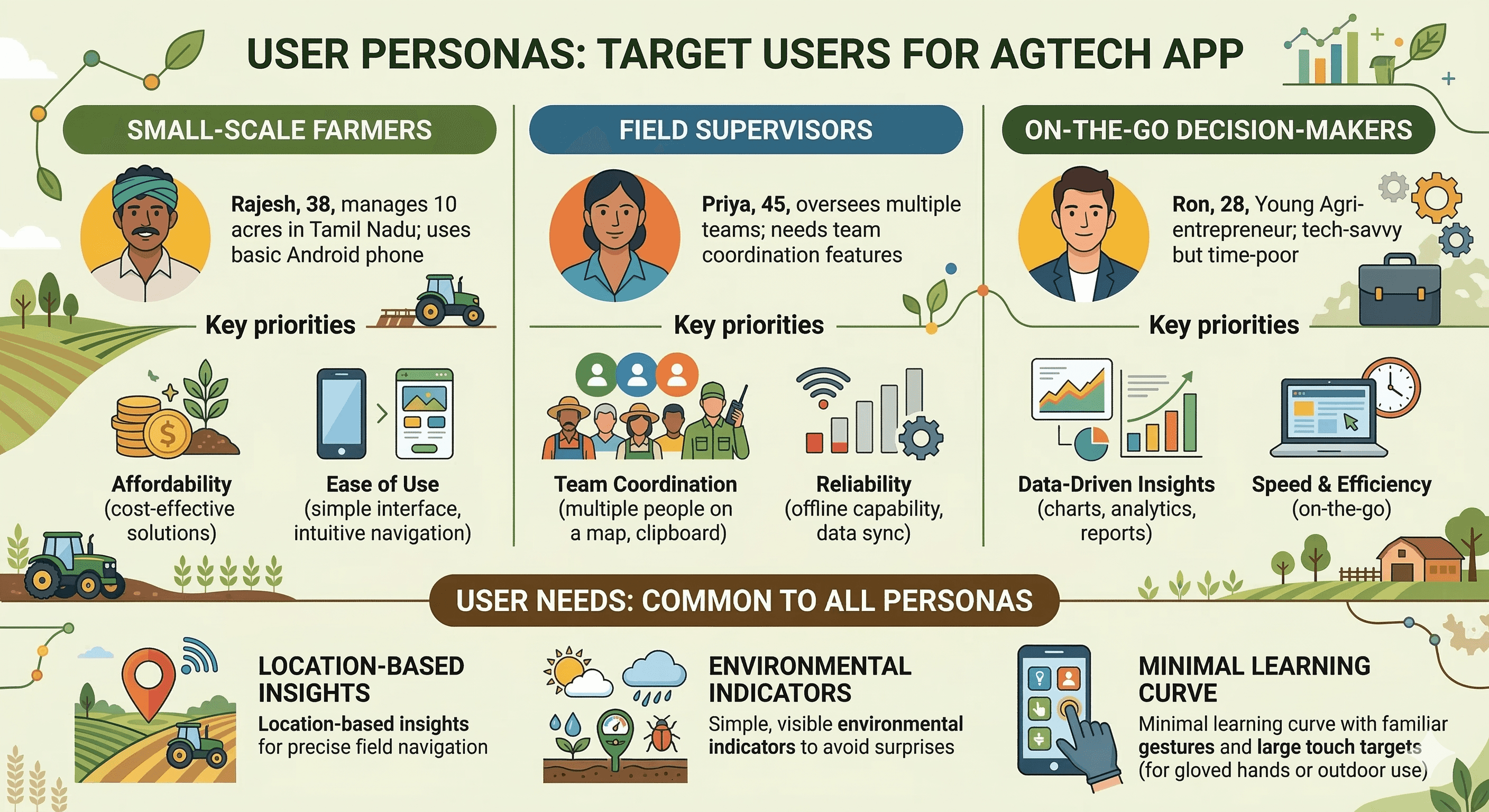
Phase 2
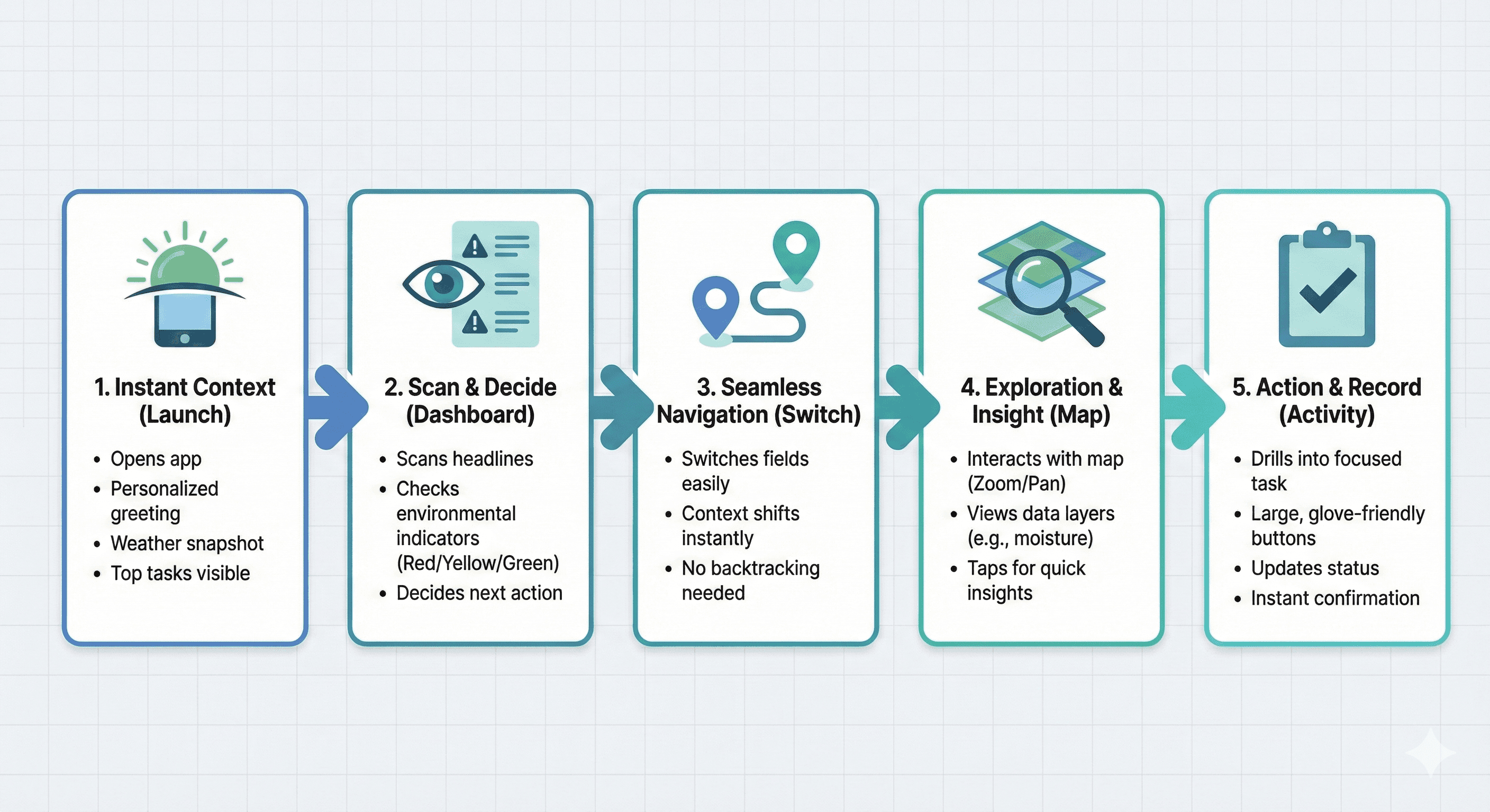
User Journey Map
The journey starts with quick onboarding to build trust, then delivers value immediately on the homepage. Users can pivot seamlessly to detailed views without backtracking.
Open app → Greeted with personalized weather/tasks for instant context.
See weather & tasks → Scan headlines to decide next action.
Review farm locations → Tap to switch fields effortlessly.
Use map scanning → Zoom/scan for insights without leaving the app.
Access detailed activity & progress → Update tasks or view results in one flow.
Design Principles
Core Decisions:
Clarity over clutter: Display only essential info upfront, hiding details behind taps to prevent overload in fast-paced farming.
Familiar interactions: Leverage standard mobile patterns like bottom nav and swipe gestures for zero learning curve.
Spatial context: Use maps as core UI to mirror real-world field layouts, aiding mental mapping.
Visual hierarchy: Prioritize weather and tasks at the top, with bold colors/icons for quick scans in sunlight.
Screens Breakdown
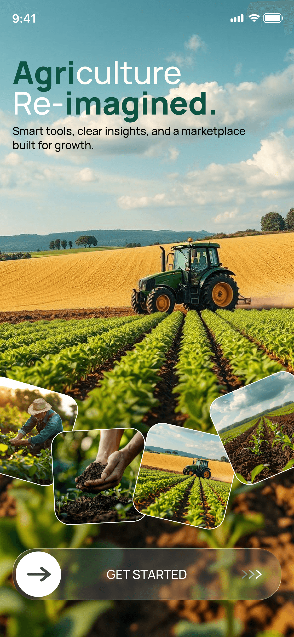
This splash screen sets a welcoming tone with a simple heading ("Welcome to Your Farm Companion") and subtext ("Monitor, Manage, and Grow Effortlessly"). The large glass button with arrow invites a swipe gesture, building engagement. Glassmorphism adds a premium, modern feel while keeping it light for quick loads.
Feature Goals: Provide a clear intro to reduce abandonment; engaging gesture to make onboarding fun and intentional.
Phase 3
Homepage Visual:
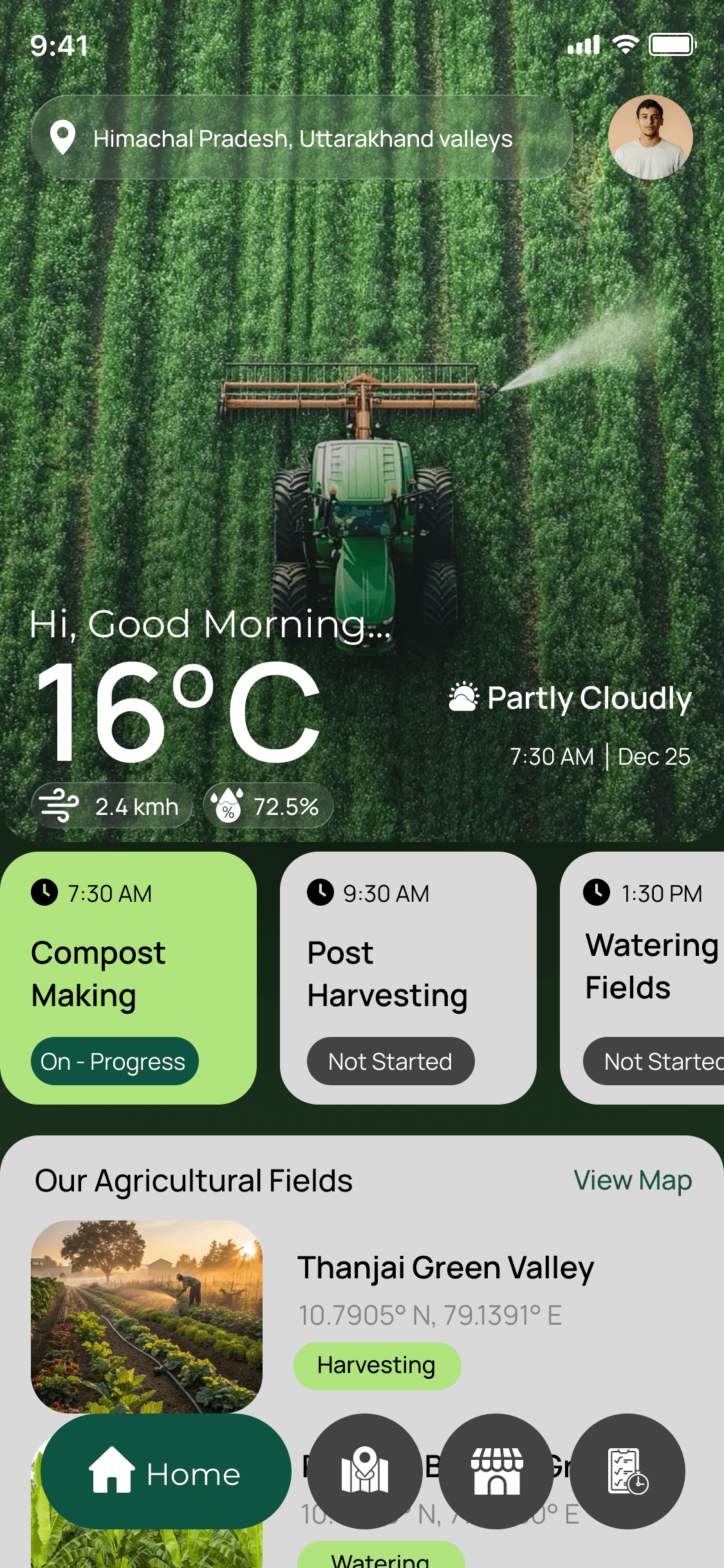
The homepage acts as a command center: Top location bar pairs with profile for personalization; greeting adds warmth ("Good Morning"). Weather, date, time, and wind speed widgets are upfront for glanceability, using icons for visual speed. Detailed Copy
Below, To-Do Activities section uses checklists for action; "Our Agriculture Fields" cards link to maps; bottom nav (Home, Farm Locations, Vendors, Activities) keeps everything accessible. UX Decisions: Weather prioritized to influence daily plans; minimal icons reduce text for literacy-friendly design.
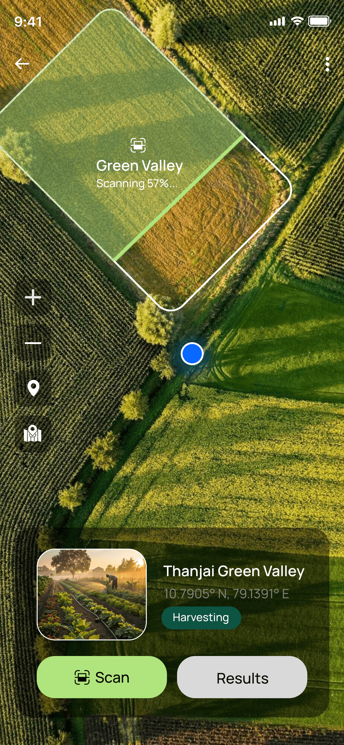
Farm Page Visual: This page brings fields to life with a top-down drone-style live map (Google Maps-like), current location pin for orientation, zoom controls for detail, navigation buttons to switch fields, and "Scan Results" for insights. UX Thinking: Visual over text lists for intuitive scanning; mimics real drones to feel innovative yet familiar.
UI Design & Visual System
Visuals: Color palette system, typography, icons, buttons Copy: • Selected palette reflects calm, natural tones appropriate for farming (deep greens, earthy browns, sky blues, soft whites) • Typography optimized for legibility under sunlight (bold sans-serif, high contrast) • Consistent icon language enhances usability Components: Weather icons, Navigation icons, Map controls (glassmorphism style)
Phase 4
UX Outcomes & Value
What’s achieved: ✔ Reduced time to access weather and tasks ✔ Map-based visualization improved spatial understanding ✔ Minimal navigation simplifies decision flow
Potential Impact: This concept has real potential to increase farm productivity by reducing decision uncertainty and enabling early interventions (e.g., pest detection via scans).
Reflection & Learnings
What I learned: • Prioritizing clarity in data-dense contexts • Importance of spatial UX with mapping • Gestural engagement improves perception of value
Future Iterations: • Dynamic weather alerts • Field data analytics • Voice support for low-literacy users
Designed by JAISURYA K – UI/UX Designer | Chennai, India | Let's connect!
More Projects


UI / UX Design
AgriFlow
A mobile companion that brings drone-style live maps, weather data, task lists, and facility scanning to small and medium farmers in one glanceable, dark-mode-friendly interface.
Year :
2025
Industry :
Agriculture
Client :
AgriField
Project Duration :
2 weeks
Phase 1
Introduction
The Agriculture Companion App is a streamlined mobile tool that integrates real-time weather data, task management, field monitoring, and drone-inspired scanning into a single, intuitive interface for modern farmers.
Context: In rural areas like those in India, farmers often switch between fragmented apps for weather forecasts, manual notebooks for tasks, and physical inspections for field health. This leads to inefficiencies, delayed decisions, and potential crop losses. My goal was to create a companion app that feels like a trusted field assistant — glanceable, actionable, and designed for outdoor use. As a solo designer, I drew inspiration from everyday farming routines to prioritize simplicity and visual clarity over overwhelming data.
Problem Statement
Core Issue: Farmers and field supervisors frequently deal with disjointed data sources — separate apps for weather, spreadsheets for tasks, and on-foot checks for field locations. Traditional agri-tech tools are overloaded with charts and text, lacking visual intuition, which causes confusion, decision fatigue, and errors like missing pest outbreaks due to delayed monitoring.
Project Focus: This app addresses these by creating an intuitive mobile experience that consolidates insights, reduces cognitive load, and supports quick, informed actions in variable rural connectivity. Through initial research (informal interviews with 5 local farmers).
I identified key pain points:
Time lost in app-switching (up to 30 minutes daily)
poor visibility in bright sunlight.
Objectives
Primary Goals:
Make environmental insights (weather, wind) instantly glanceable to enable proactive decisions, like adjusting irrigation based on real-time data.
Provide quick access to field locations via intuitive maps, minimizing travel time between plots.
Highlight daily farming activities with clear to-do lists, ensuring nothing falls through the cracks.
Enable intuitive field scanning via a drone-style map interface, allowing visual inspections without physical presence, potentially reducing crop loss by early detection.
Target Users
Phase 2
User Journey Map
The journey starts with quick onboarding to build trust, then delivers value immediately on the homepage. Users can pivot seamlessly to detailed views without backtracking.
Open app → Greeted with personalized weather/tasks for instant context.
See weather & tasks → Scan headlines to decide next action.
Review farm locations → Tap to switch fields effortlessly.
Use map scanning → Zoom/scan for insights without leaving the app.
Access detailed activity & progress → Update tasks or view results in one flow.
Design Principles
Core Decisions:
Clarity over clutter: Display only essential info upfront, hiding details behind taps to prevent overload in fast-paced farming.
Familiar interactions: Leverage standard mobile patterns like bottom nav and swipe gestures for zero learning curve.
Spatial context: Use maps as core UI to mirror real-world field layouts, aiding mental mapping.
Visual hierarchy: Prioritize weather and tasks at the top, with bold colors/icons for quick scans in sunlight.
Screens Breakdown
This splash screen sets a welcoming tone with a simple heading ("Welcome to Your Farm Companion") and subtext ("Monitor, Manage, and Grow Effortlessly"). The large glass button with arrow invites a swipe gesture, building engagement. Glassmorphism adds a premium, modern feel while keeping it light for quick loads.
Feature Goals: Provide a clear intro to reduce abandonment; engaging gesture to make onboarding fun and intentional.
Phase 3
Homepage Visual:
The homepage acts as a command center: Top location bar pairs with profile for personalization; greeting adds warmth ("Good Morning"). Weather, date, time, and wind speed widgets are upfront for glanceability, using icons for visual speed. Detailed Copy
Below, To-Do Activities section uses checklists for action; "Our Agriculture Fields" cards link to maps; bottom nav (Home, Farm Locations, Vendors, Activities) keeps everything accessible. UX Decisions: Weather prioritized to influence daily plans; minimal icons reduce text for literacy-friendly design.
Farm Page Visual: This page brings fields to life with a top-down drone-style live map (Google Maps-like), current location pin for orientation, zoom controls for detail, navigation buttons to switch fields, and "Scan Results" for insights. UX Thinking: Visual over text lists for intuitive scanning; mimics real drones to feel innovative yet familiar.
UI Design & Visual System
Visuals: Color palette system, typography, icons, buttons Copy: • Selected palette reflects calm, natural tones appropriate for farming (deep greens, earthy browns, sky blues, soft whites) • Typography optimized for legibility under sunlight (bold sans-serif, high contrast) • Consistent icon language enhances usability Components: Weather icons, Navigation icons, Map controls (glassmorphism style)
Phase 4
UX Outcomes & Value
What’s achieved: ✔ Reduced time to access weather and tasks ✔ Map-based visualization improved spatial understanding ✔ Minimal navigation simplifies decision flow
Potential Impact: This concept has real potential to increase farm productivity by reducing decision uncertainty and enabling early interventions (e.g., pest detection via scans).
Reflection & Learnings
What I learned: • Prioritizing clarity in data-dense contexts • Importance of spatial UX with mapping • Gestural engagement improves perception of value
Future Iterations: • Dynamic weather alerts • Field data analytics • Voice support for low-literacy users
Designed by JAISURYA K – UI/UX Designer | Chennai, India | Let's connect!
More Projects
UI / UX Design
AgriFlow
A mobile companion that brings drone-style live maps, weather data, task lists, and facility scanning to small and medium farmers in one glanceable, dark-mode-friendly interface.
Year :
2025
Industry :
Agriculture
Client :
AgriField
Project Duration :
2 weeks
Phase 1
Introduction
The Agriculture Companion App is a streamlined mobile tool that integrates real-time weather data, task management, field monitoring, and drone-inspired scanning into a single, intuitive interface for modern farmers.
Context: In rural areas like those in India, farmers often switch between fragmented apps for weather forecasts, manual notebooks for tasks, and physical inspections for field health. This leads to inefficiencies, delayed decisions, and potential crop losses. My goal was to create a companion app that feels like a trusted field assistant — glanceable, actionable, and designed for outdoor use. As a solo designer, I drew inspiration from everyday farming routines to prioritize simplicity and visual clarity over overwhelming data.
Problem Statement
Core Issue: Farmers and field supervisors frequently deal with disjointed data sources — separate apps for weather, spreadsheets for tasks, and on-foot checks for field locations. Traditional agri-tech tools are overloaded with charts and text, lacking visual intuition, which causes confusion, decision fatigue, and errors like missing pest outbreaks due to delayed monitoring.
Project Focus: This app addresses these by creating an intuitive mobile experience that consolidates insights, reduces cognitive load, and supports quick, informed actions in variable rural connectivity. Through initial research (informal interviews with 5 local farmers).
I identified key pain points:
Time lost in app-switching (up to 30 minutes daily)
poor visibility in bright sunlight.
Objectives
Primary Goals:
Make environmental insights (weather, wind) instantly glanceable to enable proactive decisions, like adjusting irrigation based on real-time data.
Provide quick access to field locations via intuitive maps, minimizing travel time between plots.
Highlight daily farming activities with clear to-do lists, ensuring nothing falls through the cracks.
Enable intuitive field scanning via a drone-style map interface, allowing visual inspections without physical presence, potentially reducing crop loss by early detection.
Target Users
Phase 2
User Journey Map
The journey starts with quick onboarding to build trust, then delivers value immediately on the homepage. Users can pivot seamlessly to detailed views without backtracking.
Open app → Greeted with personalized weather/tasks for instant context.
See weather & tasks → Scan headlines to decide next action.
Review farm locations → Tap to switch fields effortlessly.
Use map scanning → Zoom/scan for insights without leaving the app.
Access detailed activity & progress → Update tasks or view results in one flow.
Design Principles
Core Decisions:
Clarity over clutter: Display only essential info upfront, hiding details behind taps to prevent overload in fast-paced farming.
Familiar interactions: Leverage standard mobile patterns like bottom nav and swipe gestures for zero learning curve.
Spatial context: Use maps as core UI to mirror real-world field layouts, aiding mental mapping.
Visual hierarchy: Prioritize weather and tasks at the top, with bold colors/icons for quick scans in sunlight.
Screens Breakdown
This splash screen sets a welcoming tone with a simple heading ("Welcome to Your Farm Companion") and subtext ("Monitor, Manage, and Grow Effortlessly"). The large glass button with arrow invites a swipe gesture, building engagement. Glassmorphism adds a premium, modern feel while keeping it light for quick loads.
Feature Goals: Provide a clear intro to reduce abandonment; engaging gesture to make onboarding fun and intentional.
Phase 3
Homepage Visual:
The homepage acts as a command center: Top location bar pairs with profile for personalization; greeting adds warmth ("Good Morning"). Weather, date, time, and wind speed widgets are upfront for glanceability, using icons for visual speed. Detailed Copy
Below, To-Do Activities section uses checklists for action; "Our Agriculture Fields" cards link to maps; bottom nav (Home, Farm Locations, Vendors, Activities) keeps everything accessible. UX Decisions: Weather prioritized to influence daily plans; minimal icons reduce text for literacy-friendly design.
Farm Page Visual: This page brings fields to life with a top-down drone-style live map (Google Maps-like), current location pin for orientation, zoom controls for detail, navigation buttons to switch fields, and "Scan Results" for insights. UX Thinking: Visual over text lists for intuitive scanning; mimics real drones to feel innovative yet familiar.
UI Design & Visual System
Visuals: Color palette system, typography, icons, buttons Copy: • Selected palette reflects calm, natural tones appropriate for farming (deep greens, earthy browns, sky blues, soft whites) • Typography optimized for legibility under sunlight (bold sans-serif, high contrast) • Consistent icon language enhances usability Components: Weather icons, Navigation icons, Map controls (glassmorphism style)
Phase 4
UX Outcomes & Value
What’s achieved: ✔ Reduced time to access weather and tasks ✔ Map-based visualization improved spatial understanding ✔ Minimal navigation simplifies decision flow
Potential Impact: This concept has real potential to increase farm productivity by reducing decision uncertainty and enabling early interventions (e.g., pest detection via scans).
Reflection & Learnings
What I learned: • Prioritizing clarity in data-dense contexts • Importance of spatial UX with mapping • Gestural engagement improves perception of value
Future Iterations: • Dynamic weather alerts • Field data analytics • Voice support for low-literacy users
Designed by JAISURYA K – UI/UX Designer | Chennai, India | Let's connect!