UI / UX Design
SerenFlow
SerenFlow is a gentle meditation and mindfulness app designed to bring peace to busy lives. With personalized greetings, soothing nature-inspired playlists, quick 15-minute sessions, and an immersive audio player, it helps users find calm through guided meditation, ambient music, and daily relaxation. Built with soft pastel gradients and serene visuals, SerenFlow makes mindfulness feel approachable and beautiful.
Year :
2025
Industry :
Mental Health & Mindfulness Tech
Client :
Personal
Project Duration :
3 weeks

Phase 1
Project Overview
The Meditation App is a mobile UI/UX design created to help users calm their mind and body through guided meditations, calm music sessions, breathing exercises, and daily mindfulness content. It adopts a soothing pastel color palette (soft pinks, purples, blues, sunset gradients) for a peaceful, non-intrusive feel, high-resolution nature imagery (forests, beaches, sunsets, yoga silhouettes) as core visuals, white/gray text for readability, and minimalistic layouts with rounded elements. Key screens include the home dashboard with personalized greeting ("Hello, JAI"), featured meditation card, playlists grid, the audio player with waveform and controls, and the initial welcome/get started screen with yoga pose silhouette and call-to-action button. As a solo designer, I built this in Figma, emphasizing emotional comfort, ease of entry, quick access to calming content, and gentle motivation to build a daily habit without pressure.
Problem Statement
Many meditation and mindfulness apps suffer from clinical or overly busy interfaces that feel stressful rather than calming, impersonal home screens that fail to acknowledge the user, complex navigation that discourages daily use, lack of immediate audio access, and onboarding flows that are either too long or too generic. Users often feel overwhelmed by too many categories/options, struggle to find quick 3–15 minute sessions during busy days, lose motivation without personalization, or abandon the app due to harsh visuals that don't match the goal of relaxation. This app directly addresses these by using soft pastel gradients and nature imagery for instant tranquility, starting with a warm personalized greeting ("Hello, JAI" + "We wish you have a good day!"), featuring a prominent "Watch now" meditation card for zero-friction start, presenting playlists with clear durations/listening stats for decision ease, providing a full-featured audio player with waveform and controls, and offering a simple welcome screen with "GET STARTED" CTA and log-in link to lower barriers.
Objectives
Create a calming visual language with pastel pink/purple/blue sunset gradients and serene nature photos to induce relaxation from the first glance.
Deliver personalized entry point with user greeting ("Hello, JAI") and positive daily message ("We wish you have a good day!") to build emotional connection.
Feature a prominent meditation card (e.g., "Meditation mindfulness" with quote and "Watch now" play button) for immediate engagement.
Organize content in easy-to-scan playlists grid with thumbnail images, titles, durations (15 Mins), and listening stats (1.5M, 2.1M, etc.) for credibility and choice.
Provide a clean audio player interface with gradient background, waveform visualization, play/pause/skip controls, progress bar, heart wishlist, and track info (title, author, duration).
Offer simple onboarding/welcome screen with yoga silhouette at sunset, headline "Welcome to the app", subtext about exploring and finding peace, large "GET STARTED" button, and "Log in" link.
Include persistent bottom navigation (Home house, Music note, Sleep moon, Meditate pose) for intuitive section switching.
Use rounded cards/buttons, generous white space, and soft shadows to maintain a gentle, non-overwhelming feel.
Balance inspiration (nature images, quotes) with functionality (quick play, progress indicators).
Support short sessions (3–15 mins) for busy users, emphasizing accessibility and daily habit formation.
Phase 2
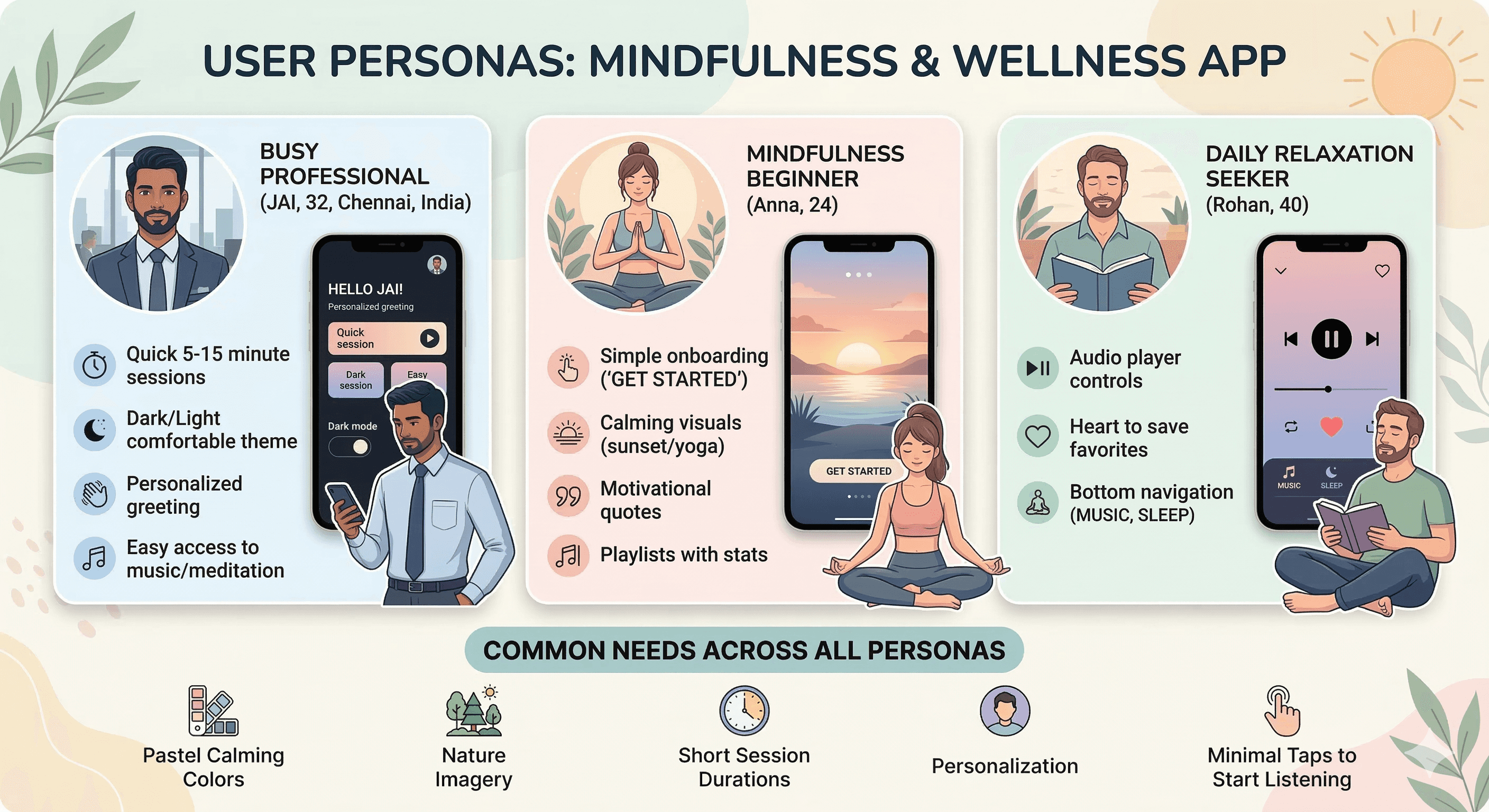
Target Users
User Journey Map
Step 1: First launch → welcome screen (yoga silhouette at sunset + headline/subtext + GET STARTED button + Log in link) → account creation or guest entry.
Step 2: Home dashboard → greeting "Hello, JAI" + good day wish + featured meditation card + "Watch now" tap → start session.
Step 3: Playlists scroll → select session (e.g., Painting Forest 15 Mins) → transition to player.
Step 4: Now Playing screen → see waveform, track title/author/duration, control playback (play/pause/skip forward/backward), heart save, progress bar.
Step 5: Bottom nav switch → Music for calm tracks, Sleep for bedtime sounds, Meditate for guided exercises.
Supporting actions: Search icon tap for specific content, notification bell for reminders, back arrow to return from player.
Design Principles
Calming pastel palette → soft pinks/purples/blues/sunset gradients to evoke peace and reduce anxiety from first screen.
Nature & human imagery → yoga silhouettes, forests, beaches, sunsets → visual anchors for mindfulness.
Personalization first → greeting with user name + positive daily message → immediate emotional connection.
Minimalism & gentleness → rounded cards/buttons, generous spacing, soft shadows, no harsh edges/colors.
Audio-first focus → prominent "Watch now" play button, full-featured player with waveform and controls.
Glanceability → large thumbnails, clear durations/listening stats, simple grid layouts.
Thumb ergonomics → bottom nav, large CTAs, centered featured content.
Consistency → same pastel gradients, rounded elements, white text/icons across screens.
Motivation without pressure → quotes ("Sometimes the most productive thing is meditation"), stats (listening numbers) to encourage without guilt.
Accessibility → high contrast text on gradients, large tappable areas, simple flows.
Phase 3
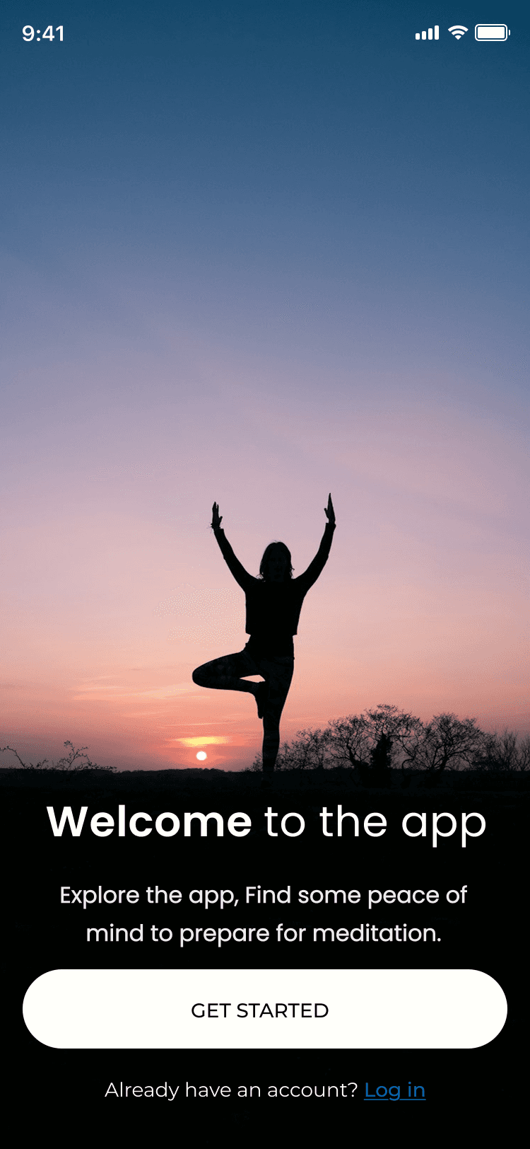
Screens Breakdown – Welcome / Get Started Screen
Background: Full-screen silhouette of woman in tree pose yoga at sunset (blue/orange sky gradient) → instant calm and aspiration.
Overlay text: Bold white headline "Welcome to the app", subtext "Explore the app, Find some peace of mind to prepare for meditation." → clear value proposition.
Primary CTA: Large rounded white button "GET STARTED" → strong action focus.
Secondary link: "Already have an account? Log in" in blue → easy return path.
Purpose: Low-friction entry, set peaceful tone, motivate exploration without overwhelming choices.
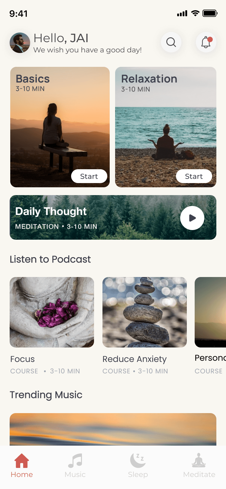
Screens Breakdown – Home / Main Dashboard Screen
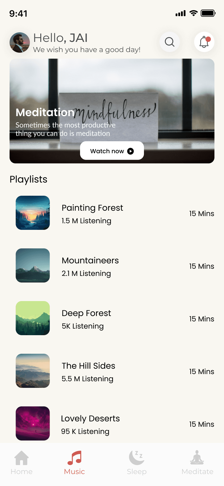
Header: Circular avatar + "Hello, JAI" greeting in black + "We wish you have a good day!" subtext + search icon + notification bell (with red dot).
Featured content: Large card with nature window image (forest view), overlay text "Meditation mindfulness" + quote "Sometimes the most productive thing you can do is meditation" + rounded "Watch now" play button.
Playlists grid: 6 cards (Painting Forest, Mountaineers, Deep Forest, The Hill Sides, Lovely Deserts) with thumbnail nature images, titles, durations (15 Mins), listening stats (1.5M, 2.1M, 5K, 5.5M, 95K).
Bottom navigation: Icons (Home house, Music note, Sleep moon, Meditate pose) with labels → persistent access.
Purpose: Personalized welcome, immediate featured session, visual playlist discovery, easy mode switching.
Screens Breakdown – Now Playing / Audio Player Screen
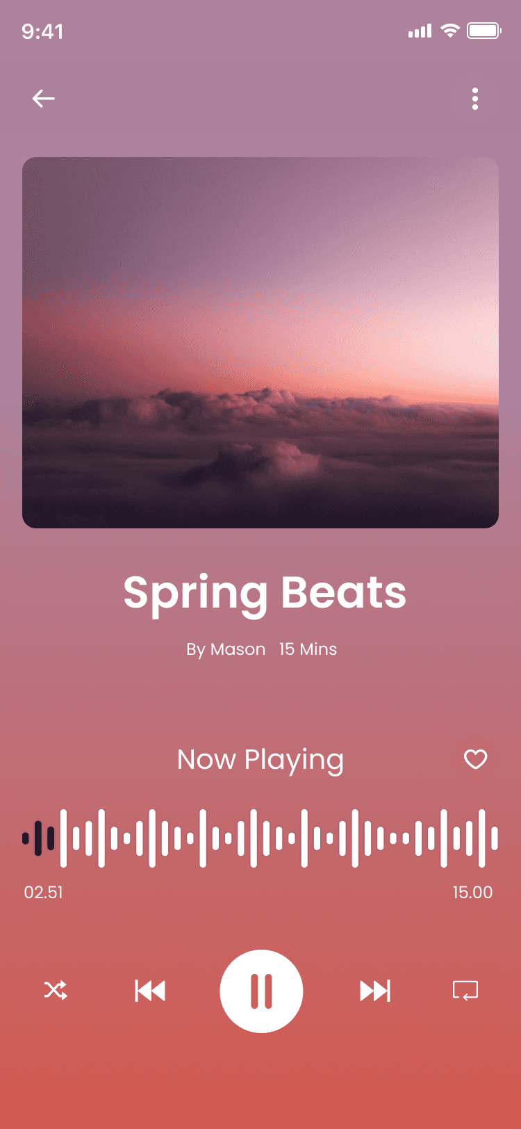
Background: Full-screen sunset gradient (pink/orange/purple sky with clouds) → immersive, calming atmosphere.
Track info: Top title "Spring Beats" in white, author "By Mason" + duration "15 Mins".
Waveform: Horizontal black waveform visualization in center → real-time audio feedback.
Controls: Bottom row with skip backward, play/pause (large white circle), skip forward, speed (×1), loop, and back arrow.
Extras: Heart icon for save/favorite.
Progress bar: Thin line with time markers (02:51 / 15:00).
Purpose: Distraction-free listening, clear controls, visual waveform for engagement, save option for repeat sessions.
Phase 4
UI Design & Visual System
Primary colors: Soft pastel gradients (pink #F8E1E9 to purple #D7BDE2 to blue #AED6F1), sunset oranges/pinks for backgrounds.
Text: White on gradients for contrast, black/gray on light areas.
Images: High-res nature photos (forests, beaches, sunsets, yoga poses) → emotional calm.
Typography: Clean sans-serif bold for titles (e.g., "Hello, JAI"), regular for subtext/durations.
Components: Rounded cards/buttons (16–24px radius), subtle shadows, play icons in white/circles.
Spacing: Generous padding (24–40px), grid layouts for playlists.
Icons: Simple line icons (search, bell, heart, play, nav symbols) in white/black.
Prototype & Interactions
Onboarding/welcome: Tap GET STARTED → dashboard fade-in, Log in link opens auth.
Home: "Watch now" tap → player transition, playlist card tap → player load.
Player: Play/pause toggle, skip forward/backward (15s), progress drag, heart fill animation.
Bottom nav: Icon highlight on tap, smooth screen switch.
General: Soft fade transitions, subtle scale on button press.
Technical & Accessibility Considerations
Gradient backgrounds → optimized for performance (CSS or image).
Contrast ≥4.5:1 on text/overlays.
Touch targets ≥48px for buttons/icons.
Alt text for images/quotes.
Responsive scaling for different phone sizes.
Audio playback continuity on background/minimize.
UX Outcomes & Value
Pastel nature visuals → instant relaxation effect.
Personalized greeting → higher daily return rate.
Featured card + playlists → zero-friction start.
Player waveform/controls → immersive listening.
Bottom nav → easy mode switching (Music/Sleep/Meditate).
Overall: Gentle, accessible mindfulness companion.
Reflection & Learnings
Soft gradients + nature images → stronger emotional impact than plain colors.
Greeting + daily wish → builds daily habit connection.
Short durations (15 Mins) + stats → encourages completion.
Large play buttons → reduces hesitation.
Future: Add guided breathing timer, progress streaks, voice guidance, offline downloads.
More Projects


UI / UX Design
SerenFlow
SerenFlow is a gentle meditation and mindfulness app designed to bring peace to busy lives. With personalized greetings, soothing nature-inspired playlists, quick 15-minute sessions, and an immersive audio player, it helps users find calm through guided meditation, ambient music, and daily relaxation. Built with soft pastel gradients and serene visuals, SerenFlow makes mindfulness feel approachable and beautiful.
Year :
2025
Industry :
Mental Health & Mindfulness Tech
Client :
Personal
Project Duration :
3 weeks
Phase 1
Project Overview
The Meditation App is a mobile UI/UX design created to help users calm their mind and body through guided meditations, calm music sessions, breathing exercises, and daily mindfulness content. It adopts a soothing pastel color palette (soft pinks, purples, blues, sunset gradients) for a peaceful, non-intrusive feel, high-resolution nature imagery (forests, beaches, sunsets, yoga silhouettes) as core visuals, white/gray text for readability, and minimalistic layouts with rounded elements. Key screens include the home dashboard with personalized greeting ("Hello, JAI"), featured meditation card, playlists grid, the audio player with waveform and controls, and the initial welcome/get started screen with yoga pose silhouette and call-to-action button. As a solo designer, I built this in Figma, emphasizing emotional comfort, ease of entry, quick access to calming content, and gentle motivation to build a daily habit without pressure.
Problem Statement
Many meditation and mindfulness apps suffer from clinical or overly busy interfaces that feel stressful rather than calming, impersonal home screens that fail to acknowledge the user, complex navigation that discourages daily use, lack of immediate audio access, and onboarding flows that are either too long or too generic. Users often feel overwhelmed by too many categories/options, struggle to find quick 3–15 minute sessions during busy days, lose motivation without personalization, or abandon the app due to harsh visuals that don't match the goal of relaxation. This app directly addresses these by using soft pastel gradients and nature imagery for instant tranquility, starting with a warm personalized greeting ("Hello, JAI" + "We wish you have a good day!"), featuring a prominent "Watch now" meditation card for zero-friction start, presenting playlists with clear durations/listening stats for decision ease, providing a full-featured audio player with waveform and controls, and offering a simple welcome screen with "GET STARTED" CTA and log-in link to lower barriers.
Objectives
Create a calming visual language with pastel pink/purple/blue sunset gradients and serene nature photos to induce relaxation from the first glance.
Deliver personalized entry point with user greeting ("Hello, JAI") and positive daily message ("We wish you have a good day!") to build emotional connection.
Feature a prominent meditation card (e.g., "Meditation mindfulness" with quote and "Watch now" play button) for immediate engagement.
Organize content in easy-to-scan playlists grid with thumbnail images, titles, durations (15 Mins), and listening stats (1.5M, 2.1M, etc.) for credibility and choice.
Provide a clean audio player interface with gradient background, waveform visualization, play/pause/skip controls, progress bar, heart wishlist, and track info (title, author, duration).
Offer simple onboarding/welcome screen with yoga silhouette at sunset, headline "Welcome to the app", subtext about exploring and finding peace, large "GET STARTED" button, and "Log in" link.
Include persistent bottom navigation (Home house, Music note, Sleep moon, Meditate pose) for intuitive section switching.
Use rounded cards/buttons, generous white space, and soft shadows to maintain a gentle, non-overwhelming feel.
Balance inspiration (nature images, quotes) with functionality (quick play, progress indicators).
Support short sessions (3–15 mins) for busy users, emphasizing accessibility and daily habit formation.
Phase 2
Target Users
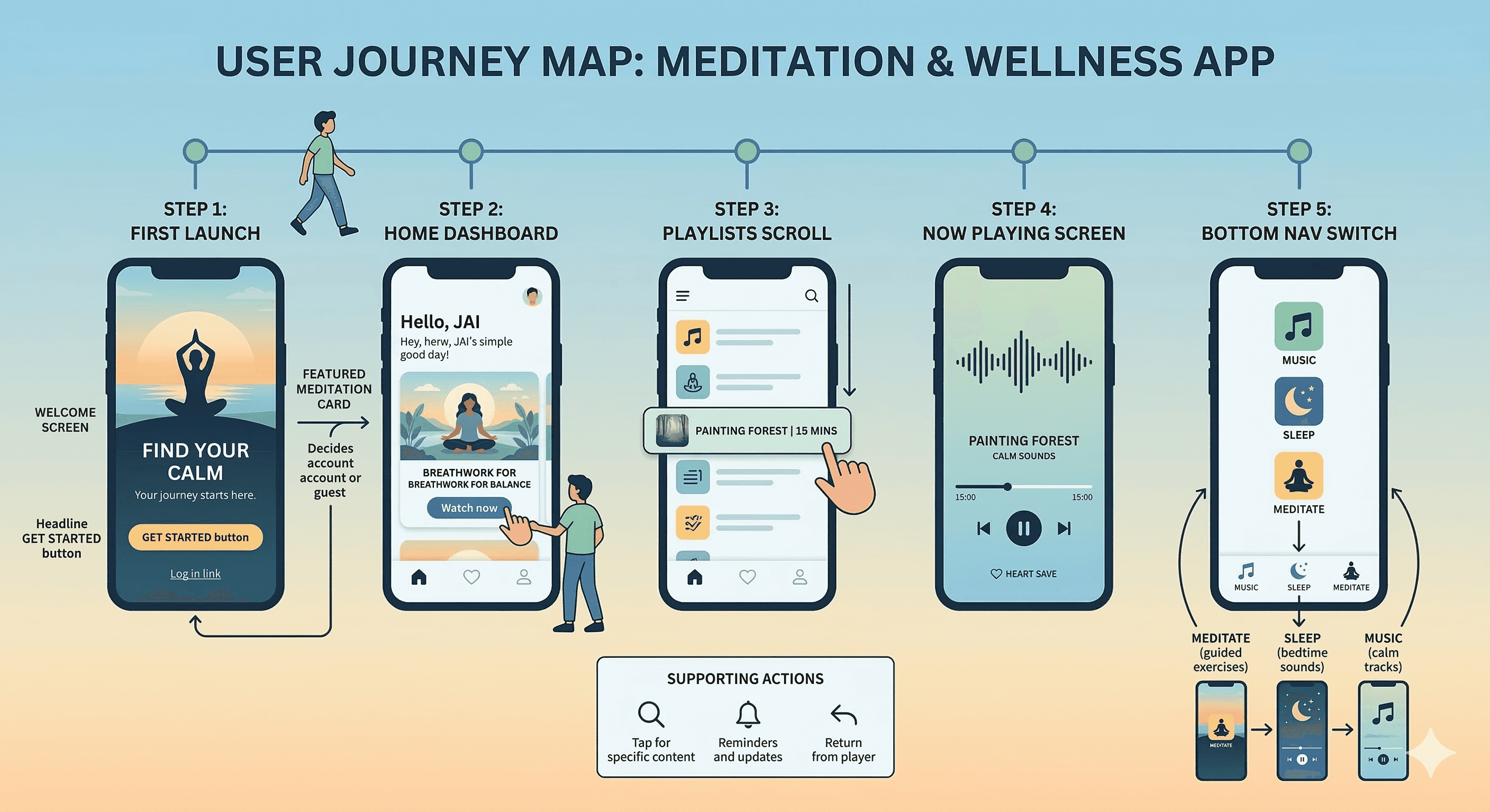
User Journey Map
Step 1: First launch → welcome screen (yoga silhouette at sunset + headline/subtext + GET STARTED button + Log in link) → account creation or guest entry.
Step 2: Home dashboard → greeting "Hello, JAI" + good day wish + featured meditation card + "Watch now" tap → start session.
Step 3: Playlists scroll → select session (e.g., Painting Forest 15 Mins) → transition to player.
Step 4: Now Playing screen → see waveform, track title/author/duration, control playback (play/pause/skip forward/backward), heart save, progress bar.
Step 5: Bottom nav switch → Music for calm tracks, Sleep for bedtime sounds, Meditate for guided exercises.
Supporting actions: Search icon tap for specific content, notification bell for reminders, back arrow to return from player.
Design Principles
Calming pastel palette → soft pinks/purples/blues/sunset gradients to evoke peace and reduce anxiety from first screen.
Nature & human imagery → yoga silhouettes, forests, beaches, sunsets → visual anchors for mindfulness.
Personalization first → greeting with user name + positive daily message → immediate emotional connection.
Minimalism & gentleness → rounded cards/buttons, generous spacing, soft shadows, no harsh edges/colors.
Audio-first focus → prominent "Watch now" play button, full-featured player with waveform and controls.
Glanceability → large thumbnails, clear durations/listening stats, simple grid layouts.
Thumb ergonomics → bottom nav, large CTAs, centered featured content.
Consistency → same pastel gradients, rounded elements, white text/icons across screens.
Motivation without pressure → quotes ("Sometimes the most productive thing is meditation"), stats (listening numbers) to encourage without guilt.
Accessibility → high contrast text on gradients, large tappable areas, simple flows.
Phase 3
Screens Breakdown – Welcome / Get Started Screen
Background: Full-screen silhouette of woman in tree pose yoga at sunset (blue/orange sky gradient) → instant calm and aspiration.
Overlay text: Bold white headline "Welcome to the app", subtext "Explore the app, Find some peace of mind to prepare for meditation." → clear value proposition.
Primary CTA: Large rounded white button "GET STARTED" → strong action focus.
Secondary link: "Already have an account? Log in" in blue → easy return path.
Purpose: Low-friction entry, set peaceful tone, motivate exploration without overwhelming choices.
Screens Breakdown – Home / Main Dashboard Screen
Header: Circular avatar + "Hello, JAI" greeting in black + "We wish you have a good day!" subtext + search icon + notification bell (with red dot).
Featured content: Large card with nature window image (forest view), overlay text "Meditation mindfulness" + quote "Sometimes the most productive thing you can do is meditation" + rounded "Watch now" play button.
Playlists grid: 6 cards (Painting Forest, Mountaineers, Deep Forest, The Hill Sides, Lovely Deserts) with thumbnail nature images, titles, durations (15 Mins), listening stats (1.5M, 2.1M, 5K, 5.5M, 95K).
Bottom navigation: Icons (Home house, Music note, Sleep moon, Meditate pose) with labels → persistent access.
Purpose: Personalized welcome, immediate featured session, visual playlist discovery, easy mode switching.
Screens Breakdown – Now Playing / Audio Player Screen
Background: Full-screen sunset gradient (pink/orange/purple sky with clouds) → immersive, calming atmosphere.
Track info: Top title "Spring Beats" in white, author "By Mason" + duration "15 Mins".
Waveform: Horizontal black waveform visualization in center → real-time audio feedback.
Controls: Bottom row with skip backward, play/pause (large white circle), skip forward, speed (×1), loop, and back arrow.
Extras: Heart icon for save/favorite.
Progress bar: Thin line with time markers (02:51 / 15:00).
Purpose: Distraction-free listening, clear controls, visual waveform for engagement, save option for repeat sessions.
Phase 4
UI Design & Visual System
Primary colors: Soft pastel gradients (pink #F8E1E9 to purple #D7BDE2 to blue #AED6F1), sunset oranges/pinks for backgrounds.
Text: White on gradients for contrast, black/gray on light areas.
Images: High-res nature photos (forests, beaches, sunsets, yoga poses) → emotional calm.
Typography: Clean sans-serif bold for titles (e.g., "Hello, JAI"), regular for subtext/durations.
Components: Rounded cards/buttons (16–24px radius), subtle shadows, play icons in white/circles.
Spacing: Generous padding (24–40px), grid layouts for playlists.
Icons: Simple line icons (search, bell, heart, play, nav symbols) in white/black.
Prototype & Interactions
Onboarding/welcome: Tap GET STARTED → dashboard fade-in, Log in link opens auth.
Home: "Watch now" tap → player transition, playlist card tap → player load.
Player: Play/pause toggle, skip forward/backward (15s), progress drag, heart fill animation.
Bottom nav: Icon highlight on tap, smooth screen switch.
General: Soft fade transitions, subtle scale on button press.
Technical & Accessibility Considerations
Gradient backgrounds → optimized for performance (CSS or image).
Contrast ≥4.5:1 on text/overlays.
Touch targets ≥48px for buttons/icons.
Alt text for images/quotes.
Responsive scaling for different phone sizes.
Audio playback continuity on background/minimize.
UX Outcomes & Value
Pastel nature visuals → instant relaxation effect.
Personalized greeting → higher daily return rate.
Featured card + playlists → zero-friction start.
Player waveform/controls → immersive listening.
Bottom nav → easy mode switching (Music/Sleep/Meditate).
Overall: Gentle, accessible mindfulness companion.
Reflection & Learnings
Soft gradients + nature images → stronger emotional impact than plain colors.
Greeting + daily wish → builds daily habit connection.
Short durations (15 Mins) + stats → encourages completion.
Large play buttons → reduces hesitation.
Future: Add guided breathing timer, progress streaks, voice guidance, offline downloads.
More Projects
UI / UX Design
SerenFlow
SerenFlow is a gentle meditation and mindfulness app designed to bring peace to busy lives. With personalized greetings, soothing nature-inspired playlists, quick 15-minute sessions, and an immersive audio player, it helps users find calm through guided meditation, ambient music, and daily relaxation. Built with soft pastel gradients and serene visuals, SerenFlow makes mindfulness feel approachable and beautiful.
Year :
2025
Industry :
Mental Health & Mindfulness Tech
Client :
Personal
Project Duration :
3 weeks
Phase 1
Project Overview
The Meditation App is a mobile UI/UX design created to help users calm their mind and body through guided meditations, calm music sessions, breathing exercises, and daily mindfulness content. It adopts a soothing pastel color palette (soft pinks, purples, blues, sunset gradients) for a peaceful, non-intrusive feel, high-resolution nature imagery (forests, beaches, sunsets, yoga silhouettes) as core visuals, white/gray text for readability, and minimalistic layouts with rounded elements. Key screens include the home dashboard with personalized greeting ("Hello, JAI"), featured meditation card, playlists grid, the audio player with waveform and controls, and the initial welcome/get started screen with yoga pose silhouette and call-to-action button. As a solo designer, I built this in Figma, emphasizing emotional comfort, ease of entry, quick access to calming content, and gentle motivation to build a daily habit without pressure.
Problem Statement
Many meditation and mindfulness apps suffer from clinical or overly busy interfaces that feel stressful rather than calming, impersonal home screens that fail to acknowledge the user, complex navigation that discourages daily use, lack of immediate audio access, and onboarding flows that are either too long or too generic. Users often feel overwhelmed by too many categories/options, struggle to find quick 3–15 minute sessions during busy days, lose motivation without personalization, or abandon the app due to harsh visuals that don't match the goal of relaxation. This app directly addresses these by using soft pastel gradients and nature imagery for instant tranquility, starting with a warm personalized greeting ("Hello, JAI" + "We wish you have a good day!"), featuring a prominent "Watch now" meditation card for zero-friction start, presenting playlists with clear durations/listening stats for decision ease, providing a full-featured audio player with waveform and controls, and offering a simple welcome screen with "GET STARTED" CTA and log-in link to lower barriers.
Objectives
Create a calming visual language with pastel pink/purple/blue sunset gradients and serene nature photos to induce relaxation from the first glance.
Deliver personalized entry point with user greeting ("Hello, JAI") and positive daily message ("We wish you have a good day!") to build emotional connection.
Feature a prominent meditation card (e.g., "Meditation mindfulness" with quote and "Watch now" play button) for immediate engagement.
Organize content in easy-to-scan playlists grid with thumbnail images, titles, durations (15 Mins), and listening stats (1.5M, 2.1M, etc.) for credibility and choice.
Provide a clean audio player interface with gradient background, waveform visualization, play/pause/skip controls, progress bar, heart wishlist, and track info (title, author, duration).
Offer simple onboarding/welcome screen with yoga silhouette at sunset, headline "Welcome to the app", subtext about exploring and finding peace, large "GET STARTED" button, and "Log in" link.
Include persistent bottom navigation (Home house, Music note, Sleep moon, Meditate pose) for intuitive section switching.
Use rounded cards/buttons, generous white space, and soft shadows to maintain a gentle, non-overwhelming feel.
Balance inspiration (nature images, quotes) with functionality (quick play, progress indicators).
Support short sessions (3–15 mins) for busy users, emphasizing accessibility and daily habit formation.
Phase 2
Target Users
User Journey Map
Step 1: First launch → welcome screen (yoga silhouette at sunset + headline/subtext + GET STARTED button + Log in link) → account creation or guest entry.
Step 2: Home dashboard → greeting "Hello, JAI" + good day wish + featured meditation card + "Watch now" tap → start session.
Step 3: Playlists scroll → select session (e.g., Painting Forest 15 Mins) → transition to player.
Step 4: Now Playing screen → see waveform, track title/author/duration, control playback (play/pause/skip forward/backward), heart save, progress bar.
Step 5: Bottom nav switch → Music for calm tracks, Sleep for bedtime sounds, Meditate for guided exercises.
Supporting actions: Search icon tap for specific content, notification bell for reminders, back arrow to return from player.
Design Principles
Calming pastel palette → soft pinks/purples/blues/sunset gradients to evoke peace and reduce anxiety from first screen.
Nature & human imagery → yoga silhouettes, forests, beaches, sunsets → visual anchors for mindfulness.
Personalization first → greeting with user name + positive daily message → immediate emotional connection.
Minimalism & gentleness → rounded cards/buttons, generous spacing, soft shadows, no harsh edges/colors.
Audio-first focus → prominent "Watch now" play button, full-featured player with waveform and controls.
Glanceability → large thumbnails, clear durations/listening stats, simple grid layouts.
Thumb ergonomics → bottom nav, large CTAs, centered featured content.
Consistency → same pastel gradients, rounded elements, white text/icons across screens.
Motivation without pressure → quotes ("Sometimes the most productive thing is meditation"), stats (listening numbers) to encourage without guilt.
Accessibility → high contrast text on gradients, large tappable areas, simple flows.
Phase 3
Screens Breakdown – Welcome / Get Started Screen
Background: Full-screen silhouette of woman in tree pose yoga at sunset (blue/orange sky gradient) → instant calm and aspiration.
Overlay text: Bold white headline "Welcome to the app", subtext "Explore the app, Find some peace of mind to prepare for meditation." → clear value proposition.
Primary CTA: Large rounded white button "GET STARTED" → strong action focus.
Secondary link: "Already have an account? Log in" in blue → easy return path.
Purpose: Low-friction entry, set peaceful tone, motivate exploration without overwhelming choices.
Screens Breakdown – Home / Main Dashboard Screen
Header: Circular avatar + "Hello, JAI" greeting in black + "We wish you have a good day!" subtext + search icon + notification bell (with red dot).
Featured content: Large card with nature window image (forest view), overlay text "Meditation mindfulness" + quote "Sometimes the most productive thing you can do is meditation" + rounded "Watch now" play button.
Playlists grid: 6 cards (Painting Forest, Mountaineers, Deep Forest, The Hill Sides, Lovely Deserts) with thumbnail nature images, titles, durations (15 Mins), listening stats (1.5M, 2.1M, 5K, 5.5M, 95K).
Bottom navigation: Icons (Home house, Music note, Sleep moon, Meditate pose) with labels → persistent access.
Purpose: Personalized welcome, immediate featured session, visual playlist discovery, easy mode switching.
Screens Breakdown – Now Playing / Audio Player Screen
Background: Full-screen sunset gradient (pink/orange/purple sky with clouds) → immersive, calming atmosphere.
Track info: Top title "Spring Beats" in white, author "By Mason" + duration "15 Mins".
Waveform: Horizontal black waveform visualization in center → real-time audio feedback.
Controls: Bottom row with skip backward, play/pause (large white circle), skip forward, speed (×1), loop, and back arrow.
Extras: Heart icon for save/favorite.
Progress bar: Thin line with time markers (02:51 / 15:00).
Purpose: Distraction-free listening, clear controls, visual waveform for engagement, save option for repeat sessions.
Phase 4
UI Design & Visual System
Primary colors: Soft pastel gradients (pink #F8E1E9 to purple #D7BDE2 to blue #AED6F1), sunset oranges/pinks for backgrounds.
Text: White on gradients for contrast, black/gray on light areas.
Images: High-res nature photos (forests, beaches, sunsets, yoga poses) → emotional calm.
Typography: Clean sans-serif bold for titles (e.g., "Hello, JAI"), regular for subtext/durations.
Components: Rounded cards/buttons (16–24px radius), subtle shadows, play icons in white/circles.
Spacing: Generous padding (24–40px), grid layouts for playlists.
Icons: Simple line icons (search, bell, heart, play, nav symbols) in white/black.
Prototype & Interactions
Onboarding/welcome: Tap GET STARTED → dashboard fade-in, Log in link opens auth.
Home: "Watch now" tap → player transition, playlist card tap → player load.
Player: Play/pause toggle, skip forward/backward (15s), progress drag, heart fill animation.
Bottom nav: Icon highlight on tap, smooth screen switch.
General: Soft fade transitions, subtle scale on button press.
Technical & Accessibility Considerations
Gradient backgrounds → optimized for performance (CSS or image).
Contrast ≥4.5:1 on text/overlays.
Touch targets ≥48px for buttons/icons.
Alt text for images/quotes.
Responsive scaling for different phone sizes.
Audio playback continuity on background/minimize.
UX Outcomes & Value
Pastel nature visuals → instant relaxation effect.
Personalized greeting → higher daily return rate.
Featured card + playlists → zero-friction start.
Player waveform/controls → immersive listening.
Bottom nav → easy mode switching (Music/Sleep/Meditate).
Overall: Gentle, accessible mindfulness companion.
Reflection & Learnings
Soft gradients + nature images → stronger emotional impact than plain colors.
Greeting + daily wish → builds daily habit connection.
Short durations (15 Mins) + stats → encourages completion.
Large play buttons → reduces hesitation.
Future: Add guided breathing timer, progress streaks, voice guidance, offline downloads.