Web Design
KARE
A light, pet-loving e-commerce site for natural foods, treats, and toys. Clean layouts, emotional pet photos, educational cards, and easy navigation make shopping for your companion feel simple, caring, and joyful.
Year :
2025
Industry :
E-Commerce
Client :
Conceptual
Project Duration :
3 weeks

Phase 1
Project Overview
KARE is an e-commerce website for modern pet care products, offering natural foods, treats, toys, and accessories focused on pet health, peace, and joy. The design uses a clean, light minimalist theme (white background with black/gray text, vibrant pet product photos) to create a fresh, caring, and pet-centric shopping experience. The layout follows a single-page scroll structure optimized for desktop and mobile: fixed header navigation, hero banner with tagline and CTAs, "What makes us different" feature cards, "What pets truly need" need cards, mid-page CTA banner, best sellers product grid, newsletter subscribe form, and multi-column footer. As a solo designer, I developed this in Figma over [X weeks], prioritizing emotional connection through pet-focused imagery, educational content via card grids, product transparency with prices, and responsive elements to make shopping for pet care feel simple, trustworthy, and delightful for pet owners.
Problem Statement
Many pet care websites have cluttered layouts with too many product categories, impersonal or overly salesy messaging that ignores pet owner concerns like nutrition and wellness, lack of educational content to explain brand differences, hidden pet needs explanations, complicated navigation with poor mobile support, and subscription forms that feel intrusive. Pet owners, emotionally invested in their animals' happiness, experience frustration with unclear product benefits, doubt in natural claims without proof, no visual inspiration for pet needs (health/peace/joy), and difficulty finding support (shipping, returns), leading to high bounce rates and abandoned carts. This design solves these by starting with an empathetic hero for immediate connection, organizing unique selling points and pet needs in scannable card grids, highlighting a mid-page CTA for curated collections, featuring a prominent best sellers grid with prices, providing a simple single-field newsletter form, and using a structured footer with categorized links for easy access to essential info.
Objectives
Develop a light, minimalist theme that conveys care through white space, vibrant pet photos, and balanced typography.
Create a fixed header with essential navigation (logo, Shop, All Products, Foods, More dropdown, search bar) for persistent access.
Design a hero banner with compelling tagline ("Modern pet care made simple"), descriptive subtext on quality, and clear CTAs ("Shop", "Learn") to drive actions.
Organize unique selling points in a "What makes us different" card grid with 3 items (Natural ingredients, Ordering effortless, Guidance from experts) including photos and "Learn >" links.
Highlight pet needs in a "What pets truly need" card grid with 3 items (Health, Peace, Joy) including headlines, subtexts, photos, and "Browse >" links.
Include a mid-page CTA banner with large pet photo, headline ("Ready to begin?"), subtext on curated collection, and "Find Out" button for engagement.
Showcase products in a best sellers grid with photos, names, prices, and variety (natural foods, treats, toys).
Implement a simple newsletter subscribe form with headline, subtext, email input, and "Subscribe" button to capture leads.
Design a multi-column footer with categorized links (Customer, Company, Legal, Social, Support) for comprehensive support.
Ensure mobile-first responsiveness with stacked cards, centered text, and collapsible footers.
Balance e-commerce functionality (product grid, shop CTAs) with educational elements (difference/needs cards) to increase conversions.
Design Process
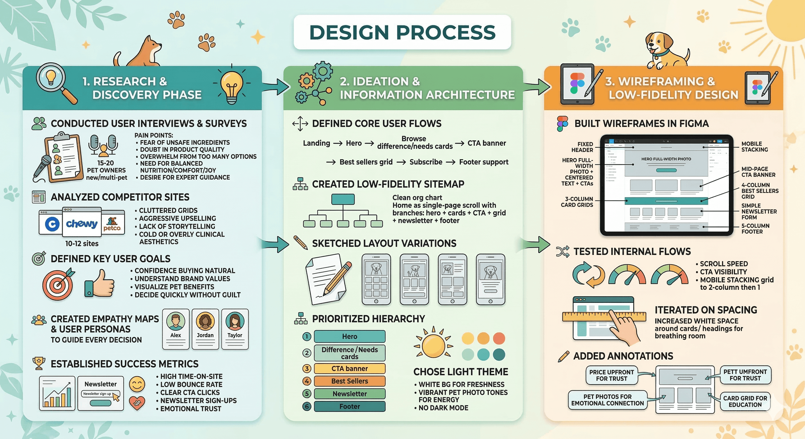
1. Research & Discovery Phase
Conducted user interviews and surveys with 15–20 pet owners (new pet parents, multi-pet households) to identify core pain points: fear of unsafe ingredients, doubt in product quality, overwhelm from too many options, need for balanced nutrition/comfort/joy, and desire for expert guidance.
Analyzed 10–12 competitor sites (e.g., Chewy, Petco, BarkBox, The Farmer's Dog, Ollie) → common issues: cluttered grids, aggressive upselling, lack of storytelling, cold or overly clinical aesthetics.
Defined key user goals: feel confident buying natural products, understand brand values, visualize pet benefits (health/peace/joy), decide quickly without guilt.
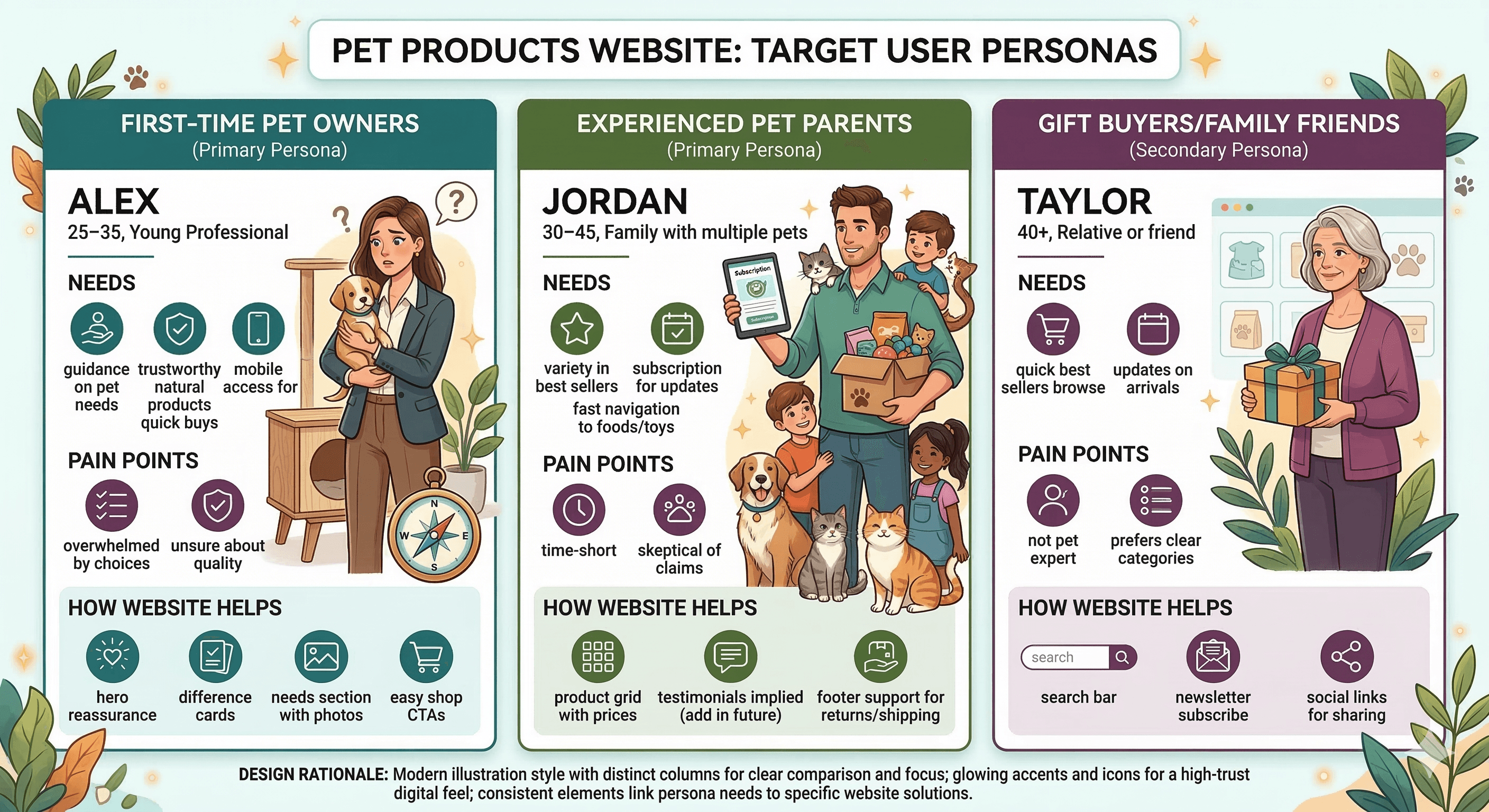
Created empathy maps and user personas (new pet parent Alex, experienced owner Jordan, gift buyer Taylor) to guide every decision.
Established success metrics: high time-on-site, low bounce rate, clear CTA clicks, newsletter sign-ups, emotional trust (via cards/story).
2. Ideation & Information Architecture
Defined core user flows: Landing → Hero → Browse difference/needs cards → CTA banner → Best sellers grid → Subscribe → Footer support.
Created low-fidelity sitemap: Home as single-page scroll (hero + cards + CTA + grid + newsletter + footer).
Sketched 3–4 layout variations: focused on white space, large hero pet photo, card-first difference/needs sections, mid-page CTA for conversion, grid for products.
Prioritized hierarchy: Hero (emotional hook), Difference/Needs cards (trust + education), CTA banner (mid-scroll push), Best Sellers (conversion engine), Newsletter (lead capture), Footer (support net).
Chose light theme early → white bg for freshness, vibrant pet photo tones for energy, no dark mode (daytime pet shopping dominant).
3. Wireframing & Low-Fidelity Design
Built wireframes in Figma: fixed header, hero full-width photo + centered text + CTAs, 3-column card grids for difference/needs (stacking on mobile), mid-page CTA banner with photo, 4-column best sellers grid, simple newsletter form, 5-column footer.
Tested internal flows: scroll speed, CTA visibility, mobile stacking (grid to 2-column then 1).
Iterated on spacing: increased white space around cards/headings for breathing room.
Added annotations: "price upfront for trust", "pet photos for emotional connection", "card grid for education".
Phase 2
Target Users / Personas
Color Palette
Primary: White (#FFFFFF) – background for cleanliness and freshness.
Secondary: Black (#000000) – headlines, CTAs, text for strong contrast.
Accent: Gray (#4A4A4A–#808080) – subtext, links for subtlety.
Vibrant tones: Orange (#F5A623) for CTA banners, teal (#00A896) for card backgrounds, natural colors from pet photos (brown fur, green plants).
Rationale: Light, clean palette evokes care and trust; accents highlight actions and needs; vibrant photo tones add energy without overwhelming.
Typography
Headings: Bold sans-serif (e.g., Montserrat or similar) – large (48–72pt) for hero/headlines, black for impact.
Subheadings: Regular sans-serif for section labels ("What makes us different", "Best Sellers") – 24–32pt, black/gray.
Body text: Regular sans-serif (e.g., Open Sans) – 16–18pt, gray for subtexts/descriptions, black for CTAs/links.
Rationale: Clean sans-serif for modern readability; bold for hierarchy; consistent sizing to guide eye flow.
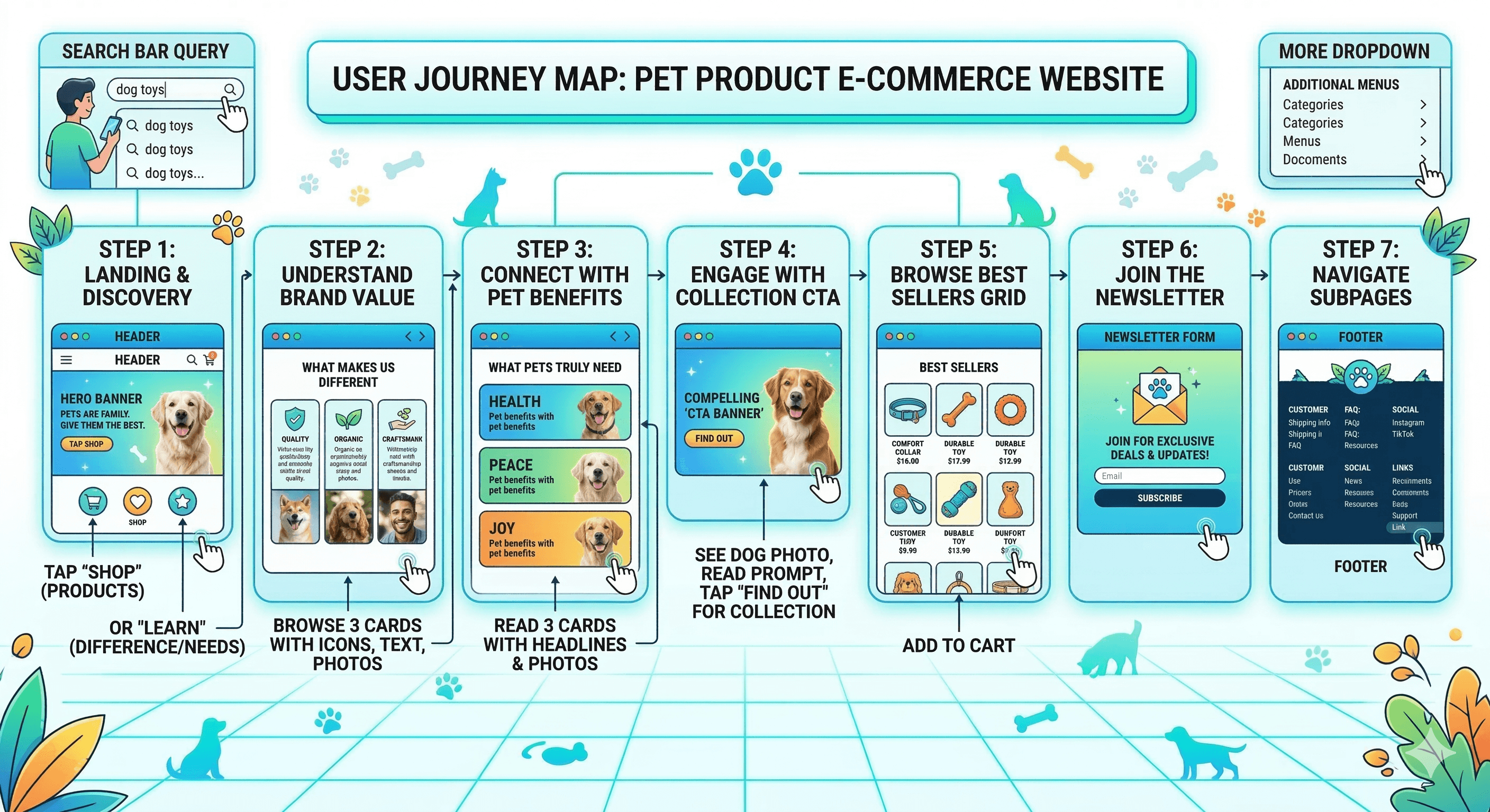
User Journey Map
Step 1: Landing → view header + hero banner → read tagline/subtext, see pet photo → tap "Shop" for products or "Learn" for difference/needs.
Step 2: Scroll to "What makes us different" → browse 3 cards with icons/text/photos → understand brand unique value.
Step 3: Scroll to "What pets truly need" → read 3 cards with headlines (Health, Peace, Joy) + subtexts/photos → connect emotionally with pet benefits.
Step 4: CTA banner → see dog photo, read prompt → tap "Find Out" for collection.
Step 5: Scroll to best sellers grid → browse photos/names/prices → add to cart (implied).
Step 6: Newsletter form → read prompt, enter email, subscribe.
Step 7: Footer → select links (e.g., Customer > Shipping info, Social > Instagram) → navigate subpages.
Supporting: Search bar query → product results; More dropdown → additional menus.
Design Principles
Light minimalist theme → white bg for freshness, openness.
Pet-focused visuals → vibrant, happy pet photos to evoke joy and care.
Educational card grids → "difference" and "needs" sections for value explanation.
Emotional headlines → "Modern pet care made simple", "Ready to begin?" for connection.
Transparency → upfront prices in best sellers.
Low-friction subscribe → single-field form.
Comprehensive footer → categorized links for support.
Responsiveness → mobile stacking for pet owners on the go.
Hierarchy → large headlines, subtle subtext.
Accessibility → high contrast, alt text for photos.
Phase 3
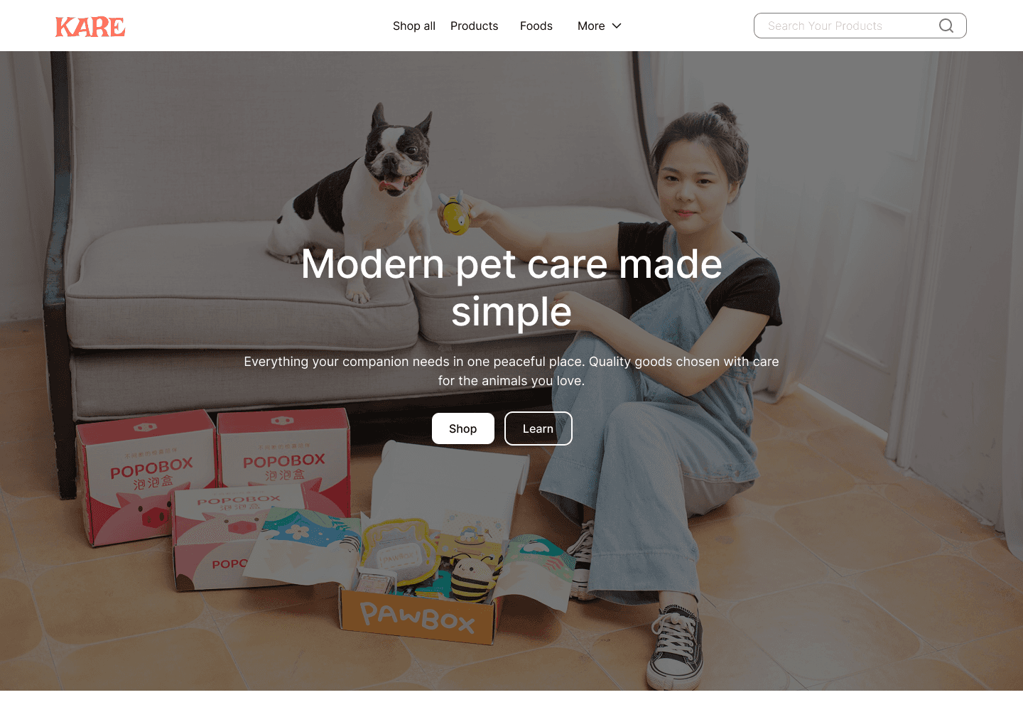
Sections Breakdown – Header + Banner/Hero
Header: Logo "KARE", menu (Shop, All Products, Foods, More), search bar.
Banner: Pet photo with woman/dog, headline "Modern pet care made simple", subtext on quality, "Shop" + "Learn" CTAs.
Choices: Fixed header, centered text.
Purpose: Immediate empathy, action guidance.
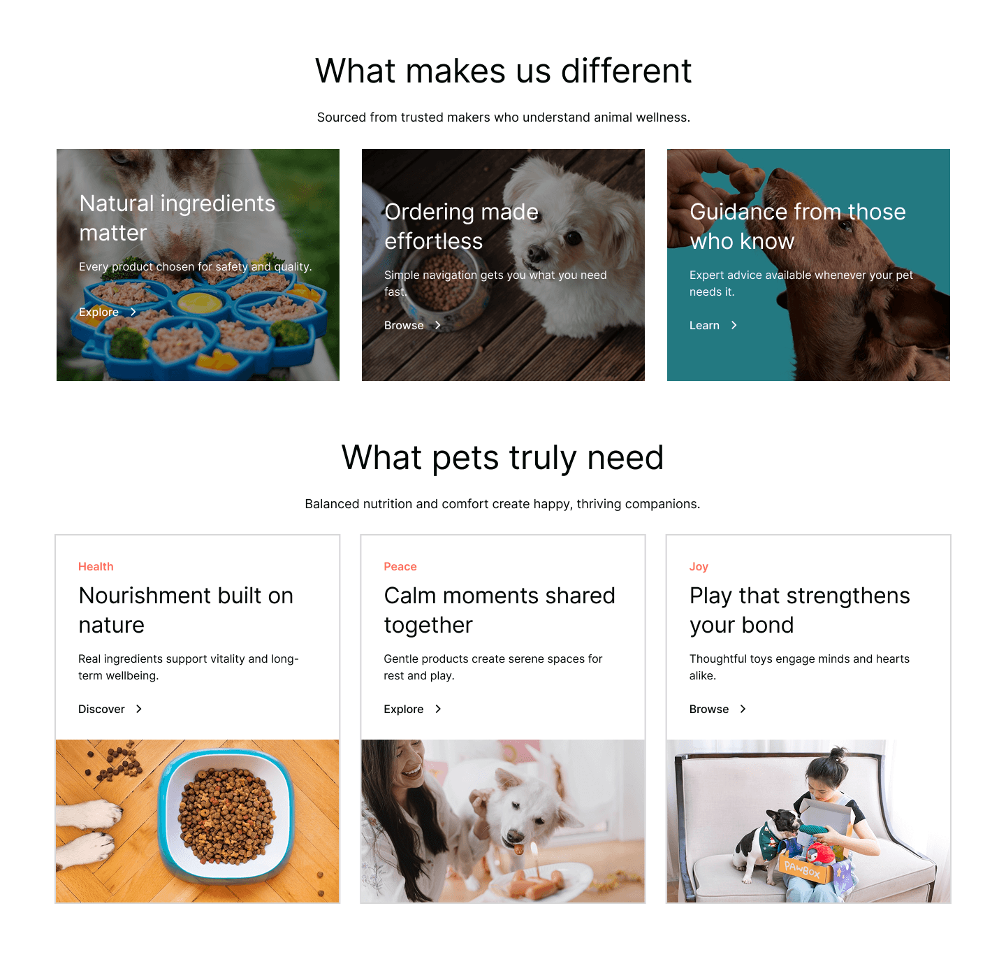
Sections Breakdown – Blogs (What Makes Us Different + What Pets Truly Need)
"What makes us different" headline + subtext "Sourced from trusted makers who understand animal wellness".
3 cards: Natural ingredients (food photo + text), Ordering effortless (delivery photo + text), Guidance from experts (person with pet photo + text).
"What pets truly need" headline + subtext "Balanced nutrition and comfort create happy, thriving companions".
3 cards: Health (food bowl photo + "Natural" text), Peace (woman with pets photo + "Gentle together" text), Joy (child with toys photo + "Thoughtful bond" text).
Choices: Card grid layout, icons, "Learn >" links.
Purpose: Educate on brand value, pet benefits.
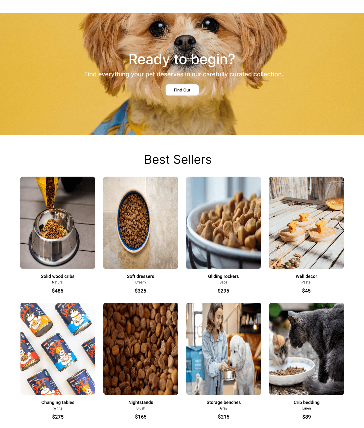
Sections Breakdown – Collections (Ready to Begin CTA Banner)
Large dog face photo, headline "Ready to begin? Find everything in our carefully curated collection.", "Find Out" button.
Choices: Yellow banner for energy, centered text.
Purpose: Mid-page conversion push, lead to full collections.
"Best Sellers" headline.
Grid of 8 product cards: Solid wood cribs $485, Soft dressers $325, Gliding rockers $295, Wall decor $45, Changing tables $275, Nightstands $185, Storage benches $215, Crib bedding $89 – photos, names, prices.
Choices: 4-column grid, natural lighting photos.
Purpose: Quick product showcase, price transparency.
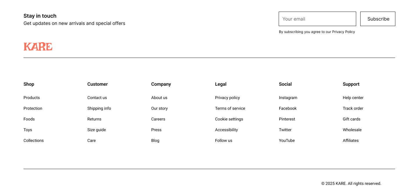
Sections Breakdown – Footer + Newsletter/Subscribe
Newsletter: "Get updates on new arrivals and special offers" prompt, email field, "Subscribe" button, privacy policy note.
Footer: 5 columns – Customer (Contact us, Shipping info, Returns, Size guide, Careers), Company (Our story, Press), Legal (Privacy policy, Terms of service, Cookie settings, Accessibility), Social (Instagram, Facebook, Pinterest, Twitter, YouTube), Support (Help center, Track order, Gift cards, Wholesale, Affiliates).
Choices: Simple form, categorized columns.
Purpose: Lead capture, full support.
Phase 4
Visual Design & High-Fidelity Mockups
Defined color palette: White (#FFFFFF) primary bg, Black (#000000) text/headlines, Gray (#4A4A4A–#808080) subtext, Orange (#F5A623) CTA banners, Teal (#00A896) card accents, natural vibrant tones from photos.
Typography: Bold sans-serif headings, regular body, small gray for subtext.
Hero: Selected warm pet photo (woman with dog on sofa) → overlaid centered headline/subtext/CTAs with drop shadow for legibility.
Cards: 3-column grid for difference/needs with photos, headlines, subtexts, "Explore/Browse/Learn >" links.
CTA banner: Large dog face photo, headline/subtext, "Find Out" button.
Best Sellers: 4-column grid with photos, names, prices.
Newsletter: Single-field form with gray border, black "Subscribe" button.
Footer: 5 columns with categorized links.
Responsive breakpoints: Desktop (4-col grid), Tablet (2-col), Mobile (1-col + stacked footer).
5. Prototyping & Testing
Built interactive prototype in Figma: clickable CTAs (Shop → products, Learn → difference/needs), card "Learn >" links, carousel swipe (implied), form submit mock.
Conducted 5 usability tests (pet owners via friends/family): tasks like "find natural food", "understand brand difference", "subscribe to updates".
Key findings: Hero CTAs clear, card grids intuitive, CTA banner boosted mid-scroll engagement, newsletter form low friction.
Minor iterations: increased font size on subtext, added subtle hover scale on cards/buttons, ensured mobile CTAs large enough.
6. Final Polish & Handoff
Optimized images for load speed (compressed high-res pet photos).
Added accessibility checks: contrast ≥4.5:1, alt text for photos ("Woman with dog", "Food bowl"), keyboard nav support.
Prepared style guide: colors, typography, spacing rules, button styles.
Exported assets: desktop/mobile mockups, style guide PDF, interactive prototype link.
Planned future phases: product detail pages, cart/checkout, filters (type, price), user accounts.
Key Learnings from the Process
Pet photos with happy owners → strong emotional connection.
Card grids → effective for explaining value and pet needs quickly.
Mid-page CTA banner → boosts conversions during scroll.
Light minimalist theme → feels modern and caring for pet products.
Multi-column footer → handles lots of info cleanly.
More Projects


Web Design
KARE
A light, pet-loving e-commerce site for natural foods, treats, and toys. Clean layouts, emotional pet photos, educational cards, and easy navigation make shopping for your companion feel simple, caring, and joyful.
Year :
2025
Industry :
E-Commerce
Client :
Conceptual
Project Duration :
3 weeks
Phase 1
Project Overview
KARE is an e-commerce website for modern pet care products, offering natural foods, treats, toys, and accessories focused on pet health, peace, and joy. The design uses a clean, light minimalist theme (white background with black/gray text, vibrant pet product photos) to create a fresh, caring, and pet-centric shopping experience. The layout follows a single-page scroll structure optimized for desktop and mobile: fixed header navigation, hero banner with tagline and CTAs, "What makes us different" feature cards, "What pets truly need" need cards, mid-page CTA banner, best sellers product grid, newsletter subscribe form, and multi-column footer. As a solo designer, I developed this in Figma over [X weeks], prioritizing emotional connection through pet-focused imagery, educational content via card grids, product transparency with prices, and responsive elements to make shopping for pet care feel simple, trustworthy, and delightful for pet owners.
Problem Statement
Many pet care websites have cluttered layouts with too many product categories, impersonal or overly salesy messaging that ignores pet owner concerns like nutrition and wellness, lack of educational content to explain brand differences, hidden pet needs explanations, complicated navigation with poor mobile support, and subscription forms that feel intrusive. Pet owners, emotionally invested in their animals' happiness, experience frustration with unclear product benefits, doubt in natural claims without proof, no visual inspiration for pet needs (health/peace/joy), and difficulty finding support (shipping, returns), leading to high bounce rates and abandoned carts. This design solves these by starting with an empathetic hero for immediate connection, organizing unique selling points and pet needs in scannable card grids, highlighting a mid-page CTA for curated collections, featuring a prominent best sellers grid with prices, providing a simple single-field newsletter form, and using a structured footer with categorized links for easy access to essential info.
Objectives
Develop a light, minimalist theme that conveys care through white space, vibrant pet photos, and balanced typography.
Create a fixed header with essential navigation (logo, Shop, All Products, Foods, More dropdown, search bar) for persistent access.
Design a hero banner with compelling tagline ("Modern pet care made simple"), descriptive subtext on quality, and clear CTAs ("Shop", "Learn") to drive actions.
Organize unique selling points in a "What makes us different" card grid with 3 items (Natural ingredients, Ordering effortless, Guidance from experts) including photos and "Learn >" links.
Highlight pet needs in a "What pets truly need" card grid with 3 items (Health, Peace, Joy) including headlines, subtexts, photos, and "Browse >" links.
Include a mid-page CTA banner with large pet photo, headline ("Ready to begin?"), subtext on curated collection, and "Find Out" button for engagement.
Showcase products in a best sellers grid with photos, names, prices, and variety (natural foods, treats, toys).
Implement a simple newsletter subscribe form with headline, subtext, email input, and "Subscribe" button to capture leads.
Design a multi-column footer with categorized links (Customer, Company, Legal, Social, Support) for comprehensive support.
Ensure mobile-first responsiveness with stacked cards, centered text, and collapsible footers.
Balance e-commerce functionality (product grid, shop CTAs) with educational elements (difference/needs cards) to increase conversions.
Design Process
1. Research & Discovery Phase
Conducted user interviews and surveys with 15–20 pet owners (new pet parents, multi-pet households) to identify core pain points: fear of unsafe ingredients, doubt in product quality, overwhelm from too many options, need for balanced nutrition/comfort/joy, and desire for expert guidance.
Analyzed 10–12 competitor sites (e.g., Chewy, Petco, BarkBox, The Farmer's Dog, Ollie) → common issues: cluttered grids, aggressive upselling, lack of storytelling, cold or overly clinical aesthetics.
Defined key user goals: feel confident buying natural products, understand brand values, visualize pet benefits (health/peace/joy), decide quickly without guilt.
Created empathy maps and user personas (new pet parent Alex, experienced owner Jordan, gift buyer Taylor) to guide every decision.
Established success metrics: high time-on-site, low bounce rate, clear CTA clicks, newsletter sign-ups, emotional trust (via cards/story).
2. Ideation & Information Architecture
Defined core user flows: Landing → Hero → Browse difference/needs cards → CTA banner → Best sellers grid → Subscribe → Footer support.
Created low-fidelity sitemap: Home as single-page scroll (hero + cards + CTA + grid + newsletter + footer).
Sketched 3–4 layout variations: focused on white space, large hero pet photo, card-first difference/needs sections, mid-page CTA for conversion, grid for products.
Prioritized hierarchy: Hero (emotional hook), Difference/Needs cards (trust + education), CTA banner (mid-scroll push), Best Sellers (conversion engine), Newsletter (lead capture), Footer (support net).
Chose light theme early → white bg for freshness, vibrant pet photo tones for energy, no dark mode (daytime pet shopping dominant).
3. Wireframing & Low-Fidelity Design
Built wireframes in Figma: fixed header, hero full-width photo + centered text + CTAs, 3-column card grids for difference/needs (stacking on mobile), mid-page CTA banner with photo, 4-column best sellers grid, simple newsletter form, 5-column footer.
Tested internal flows: scroll speed, CTA visibility, mobile stacking (grid to 2-column then 1).
Iterated on spacing: increased white space around cards/headings for breathing room.
Added annotations: "price upfront for trust", "pet photos for emotional connection", "card grid for education".
Phase 2
Target Users / Personas
Color Palette
Primary: White (#FFFFFF) – background for cleanliness and freshness.
Secondary: Black (#000000) – headlines, CTAs, text for strong contrast.
Accent: Gray (#4A4A4A–#808080) – subtext, links for subtlety.
Vibrant tones: Orange (#F5A623) for CTA banners, teal (#00A896) for card backgrounds, natural colors from pet photos (brown fur, green plants).
Rationale: Light, clean palette evokes care and trust; accents highlight actions and needs; vibrant photo tones add energy without overwhelming.
Typography
Headings: Bold sans-serif (e.g., Montserrat or similar) – large (48–72pt) for hero/headlines, black for impact.
Subheadings: Regular sans-serif for section labels ("What makes us different", "Best Sellers") – 24–32pt, black/gray.
Body text: Regular sans-serif (e.g., Open Sans) – 16–18pt, gray for subtexts/descriptions, black for CTAs/links.
Rationale: Clean sans-serif for modern readability; bold for hierarchy; consistent sizing to guide eye flow.
User Journey Map
Step 1: Landing → view header + hero banner → read tagline/subtext, see pet photo → tap "Shop" for products or "Learn" for difference/needs.
Step 2: Scroll to "What makes us different" → browse 3 cards with icons/text/photos → understand brand unique value.
Step 3: Scroll to "What pets truly need" → read 3 cards with headlines (Health, Peace, Joy) + subtexts/photos → connect emotionally with pet benefits.
Step 4: CTA banner → see dog photo, read prompt → tap "Find Out" for collection.
Step 5: Scroll to best sellers grid → browse photos/names/prices → add to cart (implied).
Step 6: Newsletter form → read prompt, enter email, subscribe.
Step 7: Footer → select links (e.g., Customer > Shipping info, Social > Instagram) → navigate subpages.
Supporting: Search bar query → product results; More dropdown → additional menus.
Design Principles
Light minimalist theme → white bg for freshness, openness.
Pet-focused visuals → vibrant, happy pet photos to evoke joy and care.
Educational card grids → "difference" and "needs" sections for value explanation.
Emotional headlines → "Modern pet care made simple", "Ready to begin?" for connection.
Transparency → upfront prices in best sellers.
Low-friction subscribe → single-field form.
Comprehensive footer → categorized links for support.
Responsiveness → mobile stacking for pet owners on the go.
Hierarchy → large headlines, subtle subtext.
Accessibility → high contrast, alt text for photos.
Phase 3
Sections Breakdown – Header + Banner/Hero
Header: Logo "KARE", menu (Shop, All Products, Foods, More), search bar.
Banner: Pet photo with woman/dog, headline "Modern pet care made simple", subtext on quality, "Shop" + "Learn" CTAs.
Choices: Fixed header, centered text.
Purpose: Immediate empathy, action guidance.
Sections Breakdown – Blogs (What Makes Us Different + What Pets Truly Need)
"What makes us different" headline + subtext "Sourced from trusted makers who understand animal wellness".
3 cards: Natural ingredients (food photo + text), Ordering effortless (delivery photo + text), Guidance from experts (person with pet photo + text).
"What pets truly need" headline + subtext "Balanced nutrition and comfort create happy, thriving companions".
3 cards: Health (food bowl photo + "Natural" text), Peace (woman with pets photo + "Gentle together" text), Joy (child with toys photo + "Thoughtful bond" text).
Choices: Card grid layout, icons, "Learn >" links.
Purpose: Educate on brand value, pet benefits.
Sections Breakdown – Collections (Ready to Begin CTA Banner)
Large dog face photo, headline "Ready to begin? Find everything in our carefully curated collection.", "Find Out" button.
Choices: Yellow banner for energy, centered text.
Purpose: Mid-page conversion push, lead to full collections.
"Best Sellers" headline.
Grid of 8 product cards: Solid wood cribs $485, Soft dressers $325, Gliding rockers $295, Wall decor $45, Changing tables $275, Nightstands $185, Storage benches $215, Crib bedding $89 – photos, names, prices.
Choices: 4-column grid, natural lighting photos.
Purpose: Quick product showcase, price transparency.
Sections Breakdown – Footer + Newsletter/Subscribe
Newsletter: "Get updates on new arrivals and special offers" prompt, email field, "Subscribe" button, privacy policy note.
Footer: 5 columns – Customer (Contact us, Shipping info, Returns, Size guide, Careers), Company (Our story, Press), Legal (Privacy policy, Terms of service, Cookie settings, Accessibility), Social (Instagram, Facebook, Pinterest, Twitter, YouTube), Support (Help center, Track order, Gift cards, Wholesale, Affiliates).
Choices: Simple form, categorized columns.
Purpose: Lead capture, full support.
Phase 4
Visual Design & High-Fidelity Mockups
Defined color palette: White (#FFFFFF) primary bg, Black (#000000) text/headlines, Gray (#4A4A4A–#808080) subtext, Orange (#F5A623) CTA banners, Teal (#00A896) card accents, natural vibrant tones from photos.
Typography: Bold sans-serif headings, regular body, small gray for subtext.
Hero: Selected warm pet photo (woman with dog on sofa) → overlaid centered headline/subtext/CTAs with drop shadow for legibility.
Cards: 3-column grid for difference/needs with photos, headlines, subtexts, "Explore/Browse/Learn >" links.
CTA banner: Large dog face photo, headline/subtext, "Find Out" button.
Best Sellers: 4-column grid with photos, names, prices.
Newsletter: Single-field form with gray border, black "Subscribe" button.
Footer: 5 columns with categorized links.
Responsive breakpoints: Desktop (4-col grid), Tablet (2-col), Mobile (1-col + stacked footer).
5. Prototyping & Testing
Built interactive prototype in Figma: clickable CTAs (Shop → products, Learn → difference/needs), card "Learn >" links, carousel swipe (implied), form submit mock.
Conducted 5 usability tests (pet owners via friends/family): tasks like "find natural food", "understand brand difference", "subscribe to updates".
Key findings: Hero CTAs clear, card grids intuitive, CTA banner boosted mid-scroll engagement, newsletter form low friction.
Minor iterations: increased font size on subtext, added subtle hover scale on cards/buttons, ensured mobile CTAs large enough.
6. Final Polish & Handoff
Optimized images for load speed (compressed high-res pet photos).
Added accessibility checks: contrast ≥4.5:1, alt text for photos ("Woman with dog", "Food bowl"), keyboard nav support.
Prepared style guide: colors, typography, spacing rules, button styles.
Exported assets: desktop/mobile mockups, style guide PDF, interactive prototype link.
Planned future phases: product detail pages, cart/checkout, filters (type, price), user accounts.
Key Learnings from the Process
Pet photos with happy owners → strong emotional connection.
Card grids → effective for explaining value and pet needs quickly.
Mid-page CTA banner → boosts conversions during scroll.
Light minimalist theme → feels modern and caring for pet products.
Multi-column footer → handles lots of info cleanly.
More Projects
Web Design
KARE
A light, pet-loving e-commerce site for natural foods, treats, and toys. Clean layouts, emotional pet photos, educational cards, and easy navigation make shopping for your companion feel simple, caring, and joyful.
Year :
2025
Industry :
E-Commerce
Client :
Conceptual
Project Duration :
3 weeks
Phase 1
Project Overview
KARE is an e-commerce website for modern pet care products, offering natural foods, treats, toys, and accessories focused on pet health, peace, and joy. The design uses a clean, light minimalist theme (white background with black/gray text, vibrant pet product photos) to create a fresh, caring, and pet-centric shopping experience. The layout follows a single-page scroll structure optimized for desktop and mobile: fixed header navigation, hero banner with tagline and CTAs, "What makes us different" feature cards, "What pets truly need" need cards, mid-page CTA banner, best sellers product grid, newsletter subscribe form, and multi-column footer. As a solo designer, I developed this in Figma over [X weeks], prioritizing emotional connection through pet-focused imagery, educational content via card grids, product transparency with prices, and responsive elements to make shopping for pet care feel simple, trustworthy, and delightful for pet owners.
Problem Statement
Many pet care websites have cluttered layouts with too many product categories, impersonal or overly salesy messaging that ignores pet owner concerns like nutrition and wellness, lack of educational content to explain brand differences, hidden pet needs explanations, complicated navigation with poor mobile support, and subscription forms that feel intrusive. Pet owners, emotionally invested in their animals' happiness, experience frustration with unclear product benefits, doubt in natural claims without proof, no visual inspiration for pet needs (health/peace/joy), and difficulty finding support (shipping, returns), leading to high bounce rates and abandoned carts. This design solves these by starting with an empathetic hero for immediate connection, organizing unique selling points and pet needs in scannable card grids, highlighting a mid-page CTA for curated collections, featuring a prominent best sellers grid with prices, providing a simple single-field newsletter form, and using a structured footer with categorized links for easy access to essential info.
Objectives
Develop a light, minimalist theme that conveys care through white space, vibrant pet photos, and balanced typography.
Create a fixed header with essential navigation (logo, Shop, All Products, Foods, More dropdown, search bar) for persistent access.
Design a hero banner with compelling tagline ("Modern pet care made simple"), descriptive subtext on quality, and clear CTAs ("Shop", "Learn") to drive actions.
Organize unique selling points in a "What makes us different" card grid with 3 items (Natural ingredients, Ordering effortless, Guidance from experts) including photos and "Learn >" links.
Highlight pet needs in a "What pets truly need" card grid with 3 items (Health, Peace, Joy) including headlines, subtexts, photos, and "Browse >" links.
Include a mid-page CTA banner with large pet photo, headline ("Ready to begin?"), subtext on curated collection, and "Find Out" button for engagement.
Showcase products in a best sellers grid with photos, names, prices, and variety (natural foods, treats, toys).
Implement a simple newsletter subscribe form with headline, subtext, email input, and "Subscribe" button to capture leads.
Design a multi-column footer with categorized links (Customer, Company, Legal, Social, Support) for comprehensive support.
Ensure mobile-first responsiveness with stacked cards, centered text, and collapsible footers.
Balance e-commerce functionality (product grid, shop CTAs) with educational elements (difference/needs cards) to increase conversions.
Design Process
1. Research & Discovery Phase
Conducted user interviews and surveys with 15–20 pet owners (new pet parents, multi-pet households) to identify core pain points: fear of unsafe ingredients, doubt in product quality, overwhelm from too many options, need for balanced nutrition/comfort/joy, and desire for expert guidance.
Analyzed 10–12 competitor sites (e.g., Chewy, Petco, BarkBox, The Farmer's Dog, Ollie) → common issues: cluttered grids, aggressive upselling, lack of storytelling, cold or overly clinical aesthetics.
Defined key user goals: feel confident buying natural products, understand brand values, visualize pet benefits (health/peace/joy), decide quickly without guilt.
Created empathy maps and user personas (new pet parent Alex, experienced owner Jordan, gift buyer Taylor) to guide every decision.
Established success metrics: high time-on-site, low bounce rate, clear CTA clicks, newsletter sign-ups, emotional trust (via cards/story).
2. Ideation & Information Architecture
Defined core user flows: Landing → Hero → Browse difference/needs cards → CTA banner → Best sellers grid → Subscribe → Footer support.
Created low-fidelity sitemap: Home as single-page scroll (hero + cards + CTA + grid + newsletter + footer).
Sketched 3–4 layout variations: focused on white space, large hero pet photo, card-first difference/needs sections, mid-page CTA for conversion, grid for products.
Prioritized hierarchy: Hero (emotional hook), Difference/Needs cards (trust + education), CTA banner (mid-scroll push), Best Sellers (conversion engine), Newsletter (lead capture), Footer (support net).
Chose light theme early → white bg for freshness, vibrant pet photo tones for energy, no dark mode (daytime pet shopping dominant).
3. Wireframing & Low-Fidelity Design
Built wireframes in Figma: fixed header, hero full-width photo + centered text + CTAs, 3-column card grids for difference/needs (stacking on mobile), mid-page CTA banner with photo, 4-column best sellers grid, simple newsletter form, 5-column footer.
Tested internal flows: scroll speed, CTA visibility, mobile stacking (grid to 2-column then 1).
Iterated on spacing: increased white space around cards/headings for breathing room.
Added annotations: "price upfront for trust", "pet photos for emotional connection", "card grid for education".
Phase 2
Target Users / Personas
Color Palette
Primary: White (#FFFFFF) – background for cleanliness and freshness.
Secondary: Black (#000000) – headlines, CTAs, text for strong contrast.
Accent: Gray (#4A4A4A–#808080) – subtext, links for subtlety.
Vibrant tones: Orange (#F5A623) for CTA banners, teal (#00A896) for card backgrounds, natural colors from pet photos (brown fur, green plants).
Rationale: Light, clean palette evokes care and trust; accents highlight actions and needs; vibrant photo tones add energy without overwhelming.
Typography
Headings: Bold sans-serif (e.g., Montserrat or similar) – large (48–72pt) for hero/headlines, black for impact.
Subheadings: Regular sans-serif for section labels ("What makes us different", "Best Sellers") – 24–32pt, black/gray.
Body text: Regular sans-serif (e.g., Open Sans) – 16–18pt, gray for subtexts/descriptions, black for CTAs/links.
Rationale: Clean sans-serif for modern readability; bold for hierarchy; consistent sizing to guide eye flow.
User Journey Map
Step 1: Landing → view header + hero banner → read tagline/subtext, see pet photo → tap "Shop" for products or "Learn" for difference/needs.
Step 2: Scroll to "What makes us different" → browse 3 cards with icons/text/photos → understand brand unique value.
Step 3: Scroll to "What pets truly need" → read 3 cards with headlines (Health, Peace, Joy) + subtexts/photos → connect emotionally with pet benefits.
Step 4: CTA banner → see dog photo, read prompt → tap "Find Out" for collection.
Step 5: Scroll to best sellers grid → browse photos/names/prices → add to cart (implied).
Step 6: Newsletter form → read prompt, enter email, subscribe.
Step 7: Footer → select links (e.g., Customer > Shipping info, Social > Instagram) → navigate subpages.
Supporting: Search bar query → product results; More dropdown → additional menus.
Design Principles
Light minimalist theme → white bg for freshness, openness.
Pet-focused visuals → vibrant, happy pet photos to evoke joy and care.
Educational card grids → "difference" and "needs" sections for value explanation.
Emotional headlines → "Modern pet care made simple", "Ready to begin?" for connection.
Transparency → upfront prices in best sellers.
Low-friction subscribe → single-field form.
Comprehensive footer → categorized links for support.
Responsiveness → mobile stacking for pet owners on the go.
Hierarchy → large headlines, subtle subtext.
Accessibility → high contrast, alt text for photos.
Phase 3
Sections Breakdown – Header + Banner/Hero
Header: Logo "KARE", menu (Shop, All Products, Foods, More), search bar.
Banner: Pet photo with woman/dog, headline "Modern pet care made simple", subtext on quality, "Shop" + "Learn" CTAs.
Choices: Fixed header, centered text.
Purpose: Immediate empathy, action guidance.
Sections Breakdown – Blogs (What Makes Us Different + What Pets Truly Need)
"What makes us different" headline + subtext "Sourced from trusted makers who understand animal wellness".
3 cards: Natural ingredients (food photo + text), Ordering effortless (delivery photo + text), Guidance from experts (person with pet photo + text).
"What pets truly need" headline + subtext "Balanced nutrition and comfort create happy, thriving companions".
3 cards: Health (food bowl photo + "Natural" text), Peace (woman with pets photo + "Gentle together" text), Joy (child with toys photo + "Thoughtful bond" text).
Choices: Card grid layout, icons, "Learn >" links.
Purpose: Educate on brand value, pet benefits.
Sections Breakdown – Collections (Ready to Begin CTA Banner)
Large dog face photo, headline "Ready to begin? Find everything in our carefully curated collection.", "Find Out" button.
Choices: Yellow banner for energy, centered text.
Purpose: Mid-page conversion push, lead to full collections.
"Best Sellers" headline.
Grid of 8 product cards: Solid wood cribs $485, Soft dressers $325, Gliding rockers $295, Wall decor $45, Changing tables $275, Nightstands $185, Storage benches $215, Crib bedding $89 – photos, names, prices.
Choices: 4-column grid, natural lighting photos.
Purpose: Quick product showcase, price transparency.
Sections Breakdown – Footer + Newsletter/Subscribe
Newsletter: "Get updates on new arrivals and special offers" prompt, email field, "Subscribe" button, privacy policy note.
Footer: 5 columns – Customer (Contact us, Shipping info, Returns, Size guide, Careers), Company (Our story, Press), Legal (Privacy policy, Terms of service, Cookie settings, Accessibility), Social (Instagram, Facebook, Pinterest, Twitter, YouTube), Support (Help center, Track order, Gift cards, Wholesale, Affiliates).
Choices: Simple form, categorized columns.
Purpose: Lead capture, full support.
Phase 4
Visual Design & High-Fidelity Mockups
Defined color palette: White (#FFFFFF) primary bg, Black (#000000) text/headlines, Gray (#4A4A4A–#808080) subtext, Orange (#F5A623) CTA banners, Teal (#00A896) card accents, natural vibrant tones from photos.
Typography: Bold sans-serif headings, regular body, small gray for subtext.
Hero: Selected warm pet photo (woman with dog on sofa) → overlaid centered headline/subtext/CTAs with drop shadow for legibility.
Cards: 3-column grid for difference/needs with photos, headlines, subtexts, "Explore/Browse/Learn >" links.
CTA banner: Large dog face photo, headline/subtext, "Find Out" button.
Best Sellers: 4-column grid with photos, names, prices.
Newsletter: Single-field form with gray border, black "Subscribe" button.
Footer: 5 columns with categorized links.
Responsive breakpoints: Desktop (4-col grid), Tablet (2-col), Mobile (1-col + stacked footer).
5. Prototyping & Testing
Built interactive prototype in Figma: clickable CTAs (Shop → products, Learn → difference/needs), card "Learn >" links, carousel swipe (implied), form submit mock.
Conducted 5 usability tests (pet owners via friends/family): tasks like "find natural food", "understand brand difference", "subscribe to updates".
Key findings: Hero CTAs clear, card grids intuitive, CTA banner boosted mid-scroll engagement, newsletter form low friction.
Minor iterations: increased font size on subtext, added subtle hover scale on cards/buttons, ensured mobile CTAs large enough.
6. Final Polish & Handoff
Optimized images for load speed (compressed high-res pet photos).
Added accessibility checks: contrast ≥4.5:1, alt text for photos ("Woman with dog", "Food bowl"), keyboard nav support.
Prepared style guide: colors, typography, spacing rules, button styles.
Exported assets: desktop/mobile mockups, style guide PDF, interactive prototype link.
Planned future phases: product detail pages, cart/checkout, filters (type, price), user accounts.
Key Learnings from the Process
Pet photos with happy owners → strong emotional connection.
Card grids → effective for explaining value and pet needs quickly.
Mid-page CTA banner → boosts conversions during scroll.
Light minimalist theme → feels modern and caring for pet products.
Multi-column footer → handles lots of info cleanly.