Web Design
BUIDLY
BUIDLY — a minimalist e-commerce site for child-safe, durable baby furniture. Clean layouts, real storytelling, and family-focused details make shopping feel reassuring and joyful.
Year :
2025
Industry :
Parenting & Family Products
Client :
Conceptual
Project Duration :
3 weeks

Phase 1
Project Overview
BUIDLY is an e-commerce website dedicated to providing gentle, durable, and child-safe furniture for babies and growing families, including items like solid wood cribs, soft dressers, gliding rockers, wall decor, changing tables, nightstands, storage benches, and crib bedding. The design emphasizes a clean, minimalist light theme (predominantly white background with black/gray text and soft natural wood tones in product photos) to evoke a sense of calm, safety, and timeless quality suitable for family homes. The structure is a single-page scroll layout optimized for both desktop and mobile: fixed header navigation, hero banner with tagline and CTAs, collections product grid, brand story section with image and text, testimonials carousel, newsletter subscribe form, and comprehensive multi-column footer.
Problem Statement
Existing baby furniture websites often feature cluttered product listings with too many items on one page, impersonal or generic messaging that fails to connect with parental concerns like safety and durability, lack of brand storytelling to convey craftsmanship, hidden or scattered customer testimonials, complicated navigation with too many sub-menus, poor mobile responsiveness leading to pinched zooming or misclicks, and subscription forms that feel intrusive or lack clear benefits. Parents, who are often time-stressed and emotionally invested in child safety, experience high frustration with unclear pricing, no visual inspiration for room setups, doubt in product quality without authentic proof, and difficulty finding support info (shipping, returns), resulting in high bounce rates and abandoned carts. This design solves these by starting with a focused hero banner for immediate reassurance, organizing products in a scannable grid with upfront prices, incorporating a dedicated story section with craftsman imagery for trust, featuring a prominent testimonials carousel for social proof, using a simple single-field newsletter form with value prompt, and providing a structured footer with categorized links for easy access to all essential info.
Objectives
Develop a light, minimalist theme that conveys calmness and safety through white space, soft natural tones, and high-res family-oriented product photos.
Create a fixed header with essential navigation (logo, Shop, Collections, About, More dropdown, search bar) for persistent access without disrupting the scroll.
Design a hero banner with a compelling tagline ("Gentle furniture for growing families"), descriptive subtext on quality and care, and clear CTAs ("Shop", "Learn") to drive immediate actions.
Organize collections in a responsive grid showcasing 8 key products with photos, names, prices, and "View all" link for quick browsing and discovery.
Build a story section with headline ("Built for the moments that matter"), narrative text on craftsmanship/safety/longevity, and a relevant image to humanize the brand.
Include a testimonials carousel with 3 real parent quotes, names, and roles for credible social proof.
Implement a simple newsletter subscribe form with headline, subtext, email input, and "Subscribe" button to capture leads.
Design a multi-column footer with categorized links (Shop, Customer, Company, Legal, Social, Support) for comprehensive navigation and support.
Ensure mobile-first responsiveness with stacked grids, centered text, and collapsible elements.
Balance e-commerce functionality (pricing, shop CTAs) with emotional elements (story, testimonials) to increase conversions.
Design Process
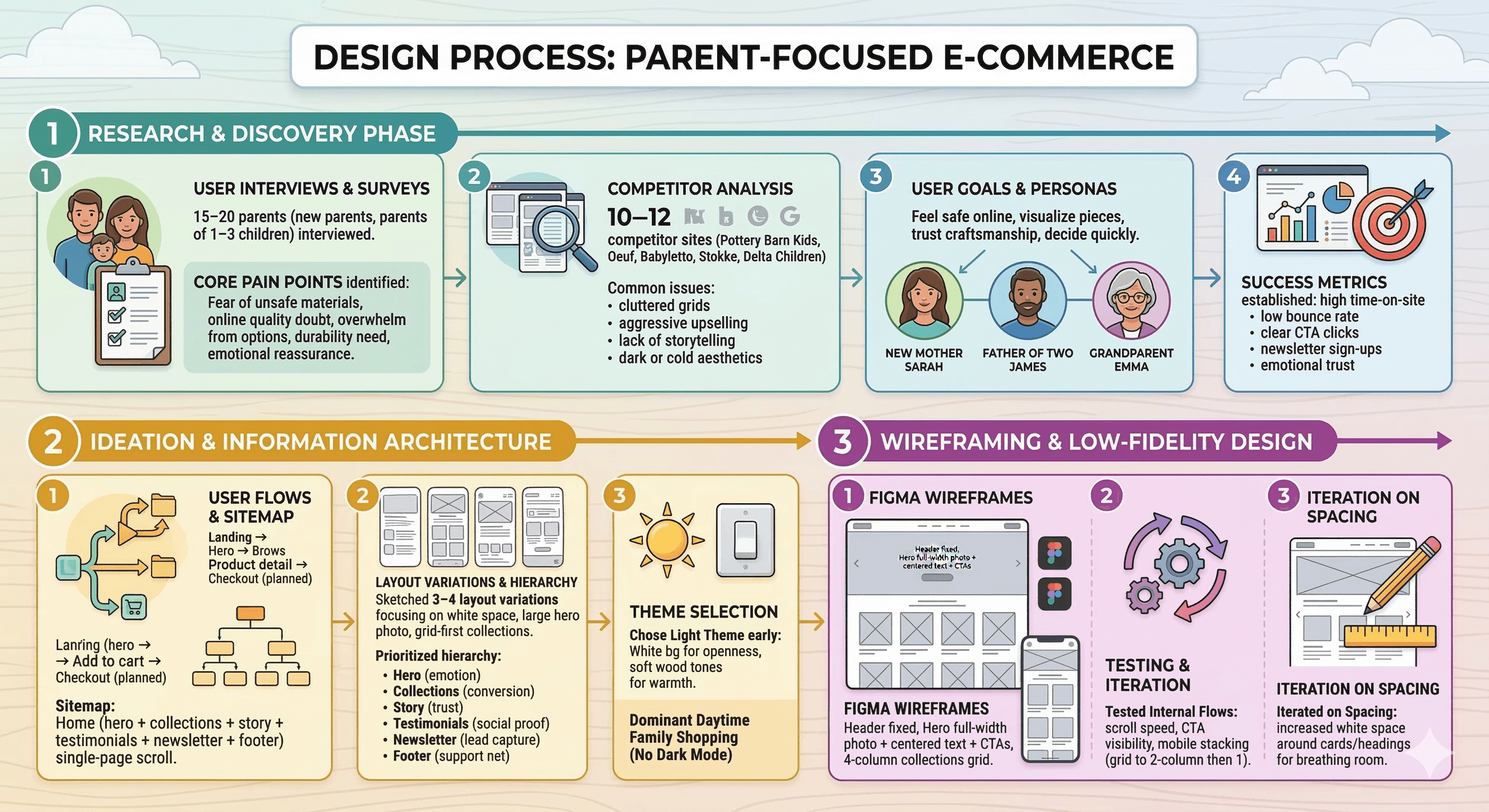
Research & Discovery Phase
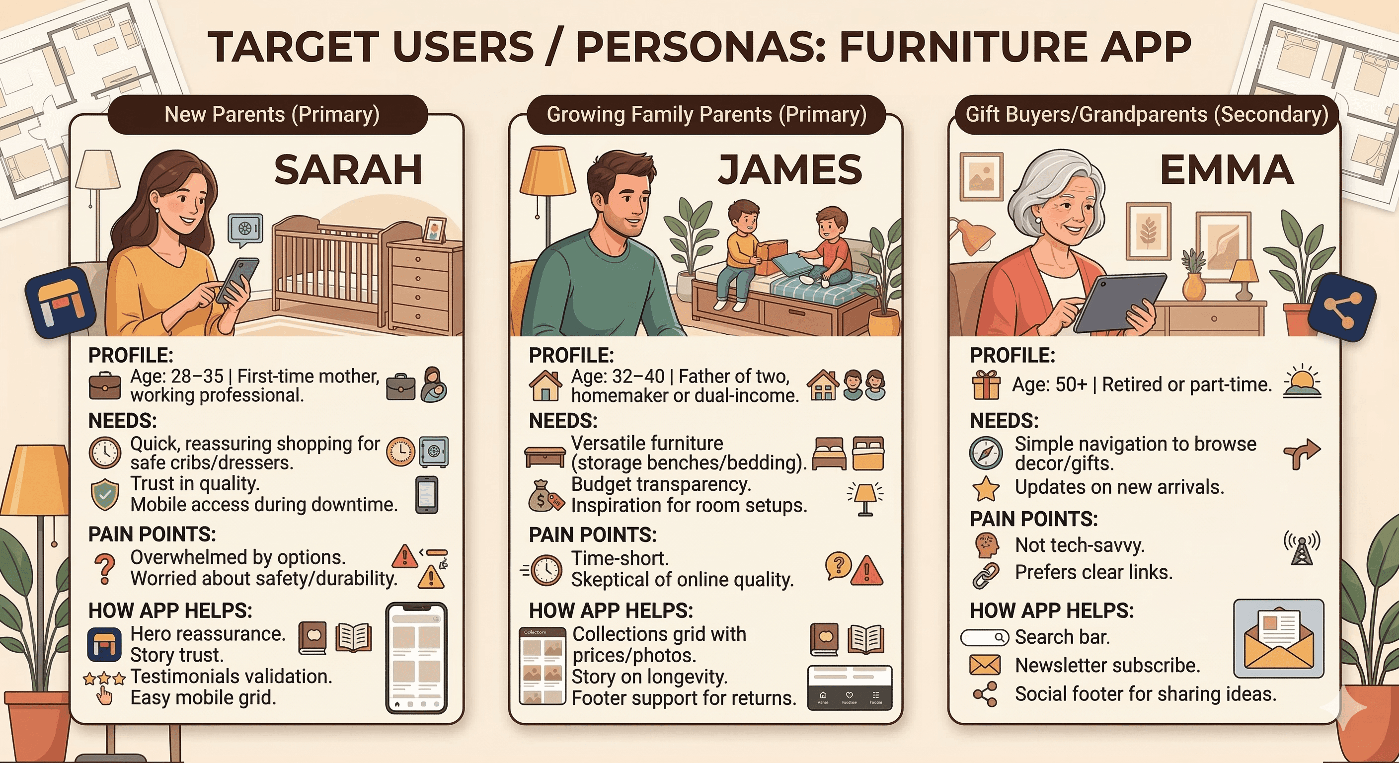
Conducted user interviews and surveys with 15–20 parents (new parents, parents of 1–3 children) to identify core pain points: fear of unsafe materials, doubt in online quality, overwhelm from too many options, need for long-term durability, and desire for emotional reassurance.
Analyzed 10–12 competitor sites (e.g., Pottery Barn Kids, Oeuf, Babyletto, Stokke, Delta Children) → common issues: cluttered grids, aggressive upselling, lack of storytelling, dark or cold aesthetics.
Defined key user goals: feel safe buying online, visualize pieces in real rooms, trust craftsmanship, decide quickly without guilt.
Created empathy maps and user personas (new mother Sarah, father of two James, grandparent Emma) to guide every decision.
Established success metrics: high time-on-site, low bounce rate, clear CTA clicks, newsletter sign-ups, emotional trust (via testimonials/story).
Ideation & Information Architecture
Defined core user flows: Landing → Hero → Browse collections → Product detail → Add to cart → Checkout (not designed yet, but planned).
Created low-fidelity sitemap: Home (hero + collections + story + testimonials + newsletter + footer) as single-page scroll.
Sketched 3–4 layout variations: focused on white space, large hero photo, grid-first collections, story/testimonials in middle for trust peak.
Prioritized hierarchy: Hero (emotional hook), Collections (conversion engine), Story (trust layer), Testimonials (social proof), Newsletter (lead capture), Footer (support net).
Chose light theme early → white bg for openness, soft wood tones for warmth, no dark mode (daytime family shopping dominant).
Wireframing & Low-Fidelity Design
Built wireframes in Figma: header fixed, hero full-width photo + centered text + CTAs, 4-column collections grid (stacking on mobile), story left text/right image, testimonials carousel, simple newsletter form, 6-column footer.
Tested internal flows: scroll speed, CTA visibility, mobile stacking (grid to 2-column then 1).
Iterated on spacing: increased white space around cards/headings for breathing room.
Phase 2
Target Users / Personas
Color Palette
Primary: White (#FFFFFF) – background for cleanliness and calmness.
Secondary: Black (#000000) – headlines, CTAs, text for high contrast and readability.
Accent: Gray (#808080 variations) – subtext, handwritten overlays, links for subtlety.
Product tones: Soft neutrals/woods (beige #F5F5F5, brown #A0522D) – in photos to emphasize natural, safe materials.
Rationale: Light, neutral palette evokes purity and safety for baby products; high contrast ensures accessibility.
Typography
Headings: Bold sans-serif (e.g., Montserrat or similar) – large (48–72pt) for hero/headlines, black for impact.
Subheadings: Gray handwritten-style font (e.g., custom script) for section overlays ("Collections", "Story") – adds playful warmth without being childish.
Body text: Regular sans-serif (e.g., Open Sans) – 16–18pt, gray for subtext/descriptions, black for CTAs/links.
Rationale: Clean sans-serif for modern readability; handwritten accents for emotional, family feel; consistent sizing for hierarchy.
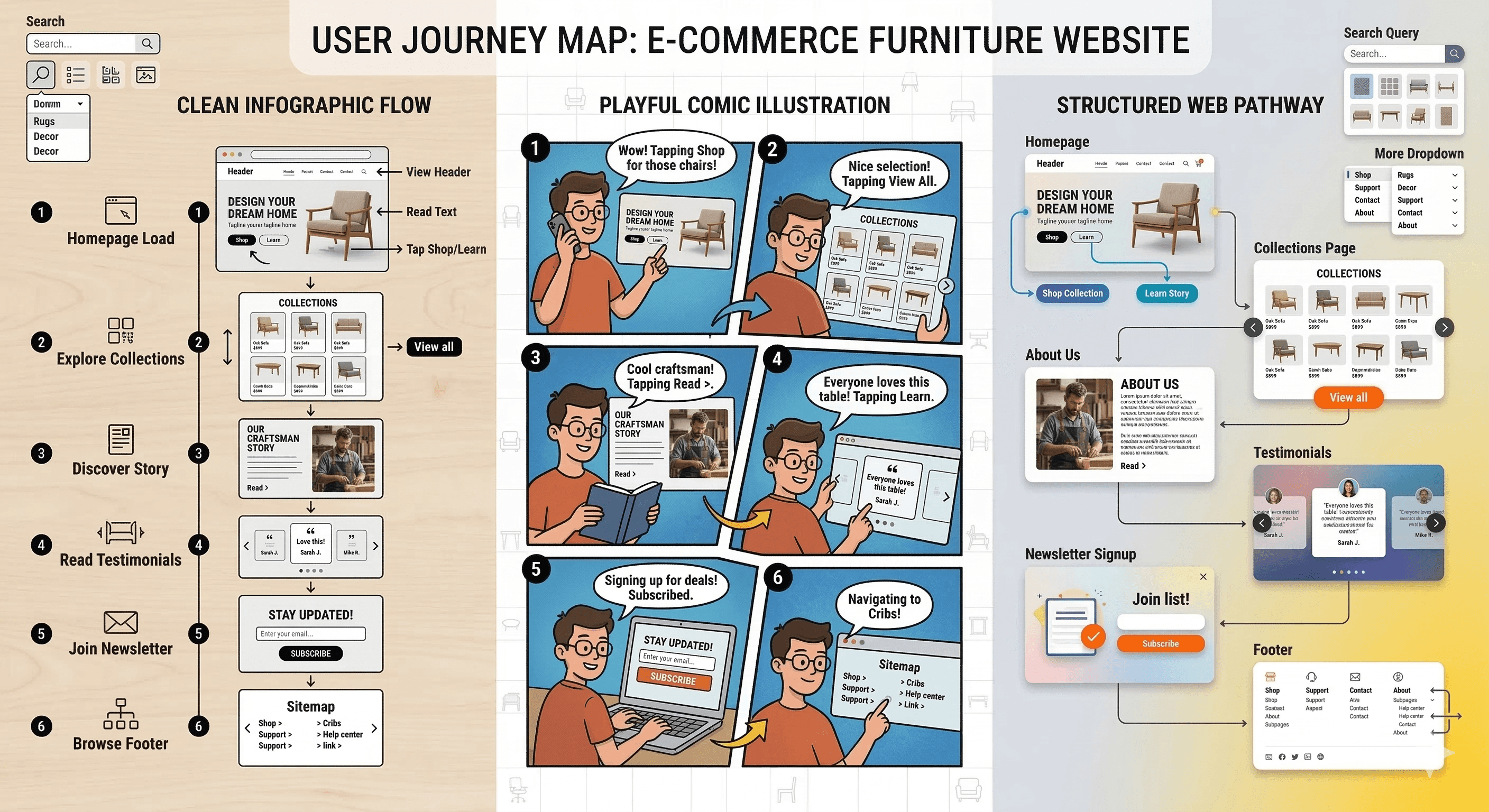
User Journey Map
Step 1: Homepage load → view header + hero banner → read tagline/subtext, see furniture photo → tap "Shop" for collections or "Learn" for story.
Step 2: Scroll to collections → browse grid cards → view product photos/names/prices → tap "View all" for full catalog.
Step 3: Scroll to story → read headline/text → see craftsman image → tap "Read >" for more details.
Step 4: Scroll to testimonials → carousel swipe → read quotes/names.
Step 5: Scroll to newsletter → read prompt, enter email, tap "Subscribe" → join list.
Step 6: Footer → tap links (e.g., Shop > Cribs, Support > Help center) → navigate subpages.
Supporting: Search bar query → product results; More dropdown → additional menus.
Design Principles
Minimalist light theme → white bg for openness, safety feel.
Visual reassurance → high-res real room photos to show products in context.
Emotional storytelling → handwritten headings, story section for warmth.
Transparency → upfront prices in collections.
Social proof → testimonials carousel for credibility.
Low-friction subscribe → single-field form.
Comprehensive footer → categorized links for easy support.
Responsiveness → mobile stacking for parent on-the-go browsing.
Hierarchy → large headlines, subtle subtext.
Accessibility → high contrast, alt text for photos.
Phase 3
1. Header + Banner / Hero Section
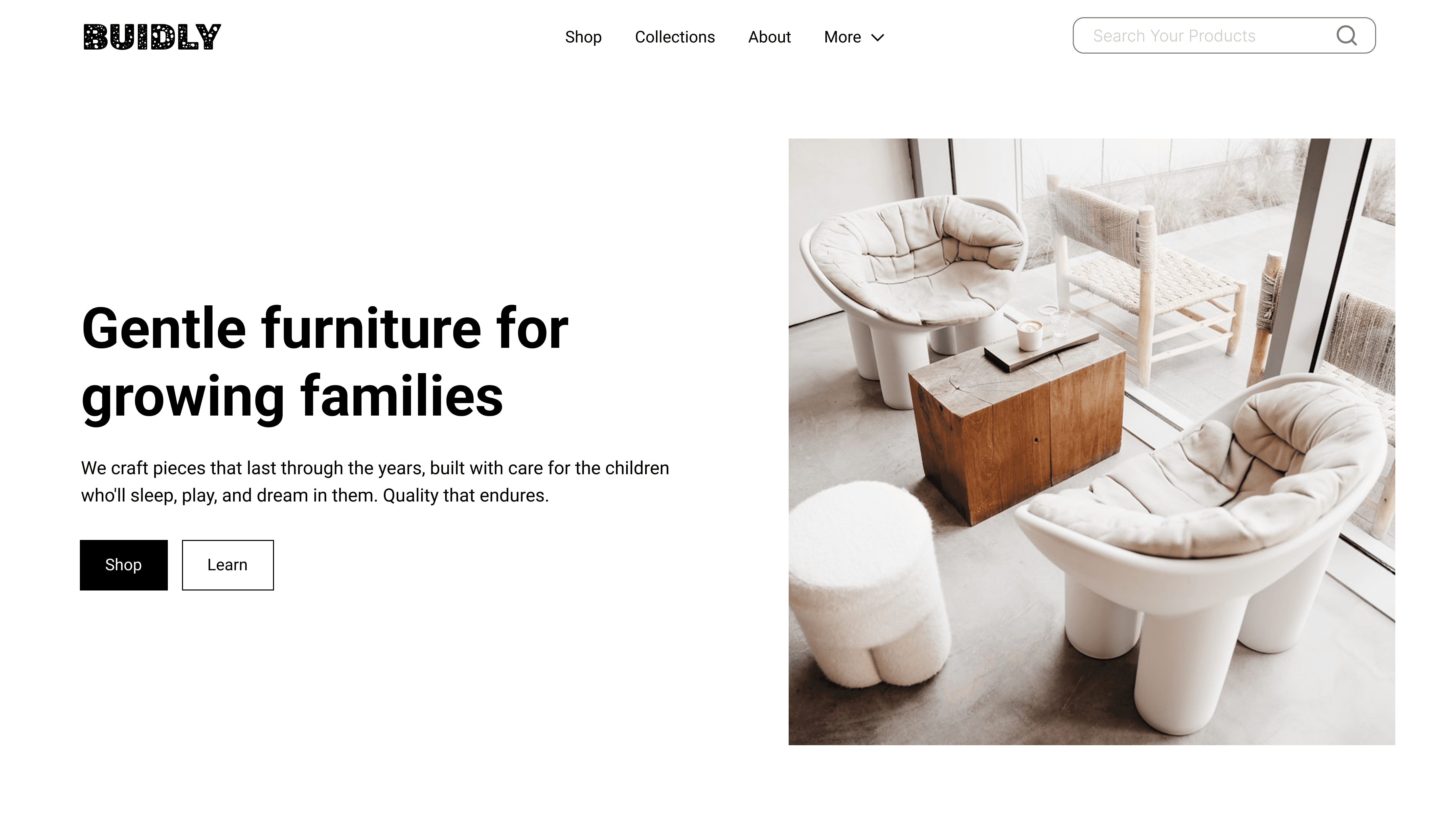
Visual elements
Top navigation bar: "BUIDLY" logo (left), menu links (Shop, Collections, About, More ▼), search bar with placeholder "Search Your Products" (right).
Hero banner: Large high-resolution photo of a cozy baby room with soft, rounded furniture (poufs, crib, armchair) in natural light.
Headline: "Gentle furniture for growing families" (bold black).
Subtext: "We craft pieces that last through the years, built with care for the children... Quality endures." (gray).
CTAs: Black "Shop" button + white "Learn" button (both rounded).
Design choices & rationale
Sticky/fixed header with minimal links → fast access to shop/collections without cluttering the hero.
Large hero photo uses soft, neutral tones (beige, wood, white) → instantly communicates calm, safety, and premium quality.
Headline + subtext focus on "gentle" and "lasting" → directly addresses parent concerns (durability, child safety, timelessness).
Black + white CTA contrast → clear action hierarchy ("Shop" primary, "Learn" secondary).
Centered text overlay with generous white space → mobile-friendly and non-obtrusive.
Purpose & UX value
Immediate brand positioning: calm, high-quality, family-focused furniture.
Quick conversion path: Shop button visible above the fold.
Emotional reassurance: Photo + text combo makes parents feel safe and understood right away.
Low cognitive load: Very few menu items → new parents aren’t overwhelmed.
2. Collections Section
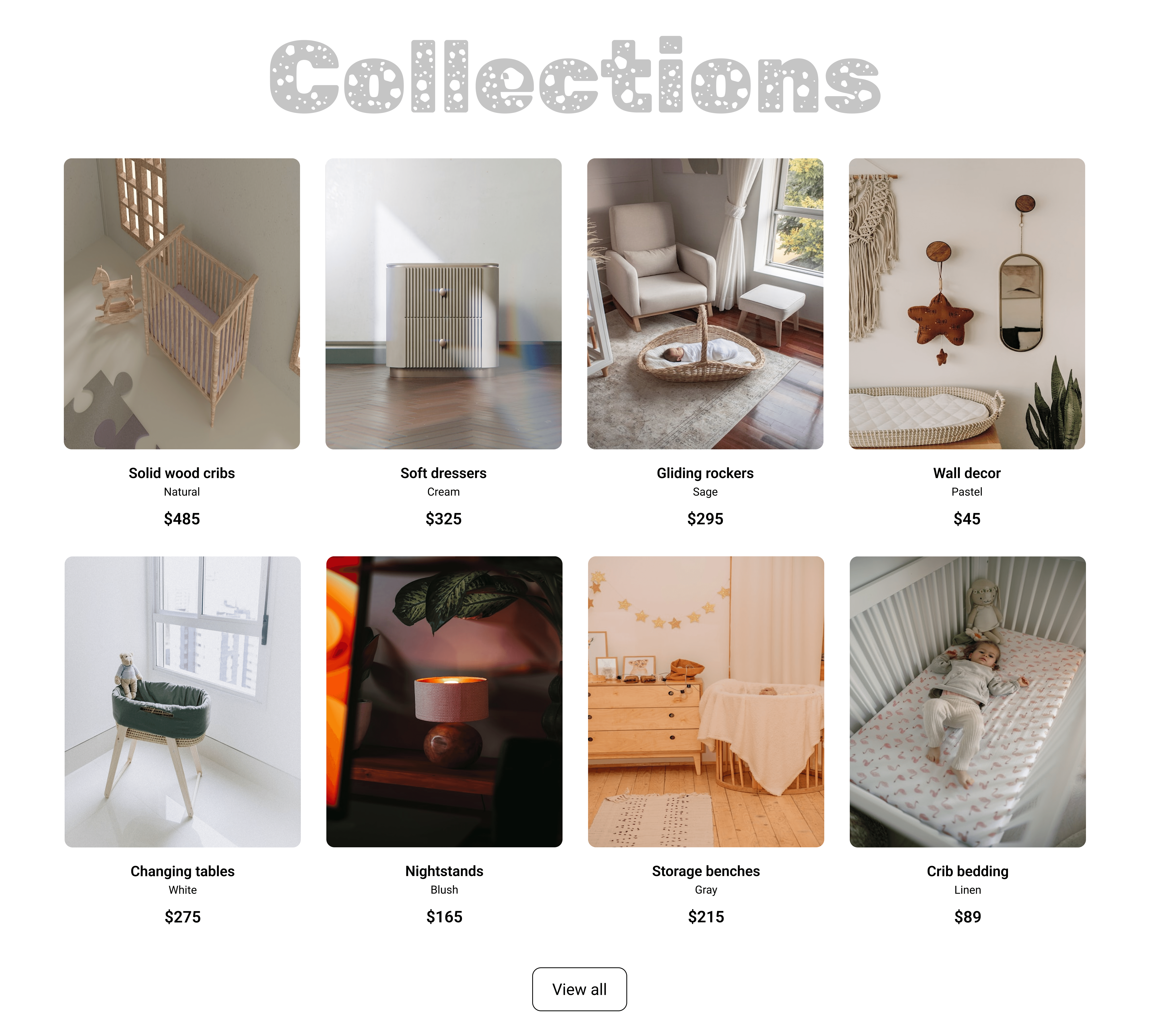
Visual elements
Handwritten-style gray overlay heading "Collections" (playful, soft font).
Responsive grid of 8 product cards:
Solid wood cribs (Natural) $485
Soft dressers (Cream) $325
Gliding rockers (Sage) $295
Wall decor (Pastel) $45
Changing tables (Blush) $275
Nightstands (White) $165
Storage benches (Gray) $215
Crib bedding (Linen) $89
Each card: High-res product photo + name + price + subtle "Shop" link.
"View all" button at bottom.
Design choices & rationale
Handwritten heading → adds warmth and playfulness without being childish.
4-column desktop grid → shows variety quickly; stacks to 2 or 1 column on mobile.
Prices shown upfront in bold → builds trust and helps decision-making.
Soft, natural color names (Cream, Sage, Blush, Linen) → reinforces gentle, organic brand feel.
High-quality photos with consistent lighting → products look premium and safe.
Purpose & UX value
Fast visual discovery → parents can scan and compare in seconds.
Price transparency → reduces hesitation and builds confidence.
"View all" CTA → encourages deeper browsing without forcing it.
Mobile stacking → maintains readability on phones (most parent shopping happens mobile).
3. Story + Testimonials Section
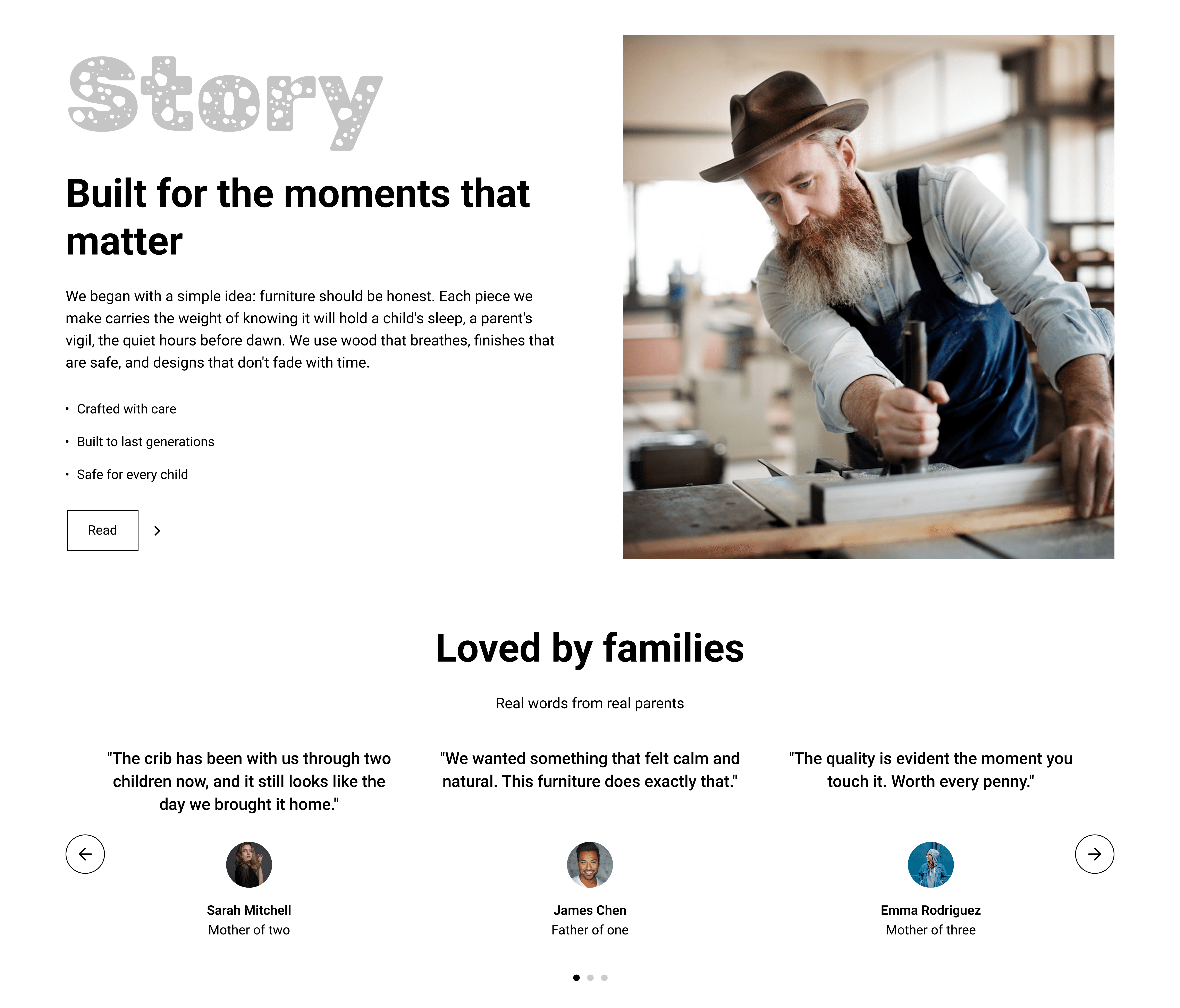
Visual elements
Gray handwritten heading "Story".
Headline "Built for the moments that matter" (black bold).
Text block: Story about craftsmanship, honest wood use, safety, longevity. Bullet points: Crafted with care, Built to last generations, Safe for every child.
Large image of bearded craftsman working on wood → authenticity.
"Read >" link.
Below: "Loved by families" heading + "Real words from real parents" subtext.
3 testimonial cards in carousel:
"The crib has been with us through two children..." – Sarah Mitchell, Mother of two
"We wanted something that felt calm..." – James Chen, Father of one
"The quality is evident..." – Emma Rodriguez, Mother of three
Circular avatars + names/roles.
Design choices & rationale
Handwritten heading consistency → ties story to collections visually.
Craftsman photo → humanizes brand, shows real woodwork (trust in quality).
Bullet points → scannable, emphasizes key values (care, longevity, safety).
Testimonials carousel → social proof without taking too much space.
Real names + parent roles → relatable and credible.
Purpose & UX value
Story builds emotional trust → parents feel the furniture is made with love.
Testimonials provide peer validation → reduces purchase anxiety.
Carousel saves vertical space → keeps page scrollable and clean.
"Read >" → optional deeper engagement.
4. Footer + Newsletter / Subscribe Section
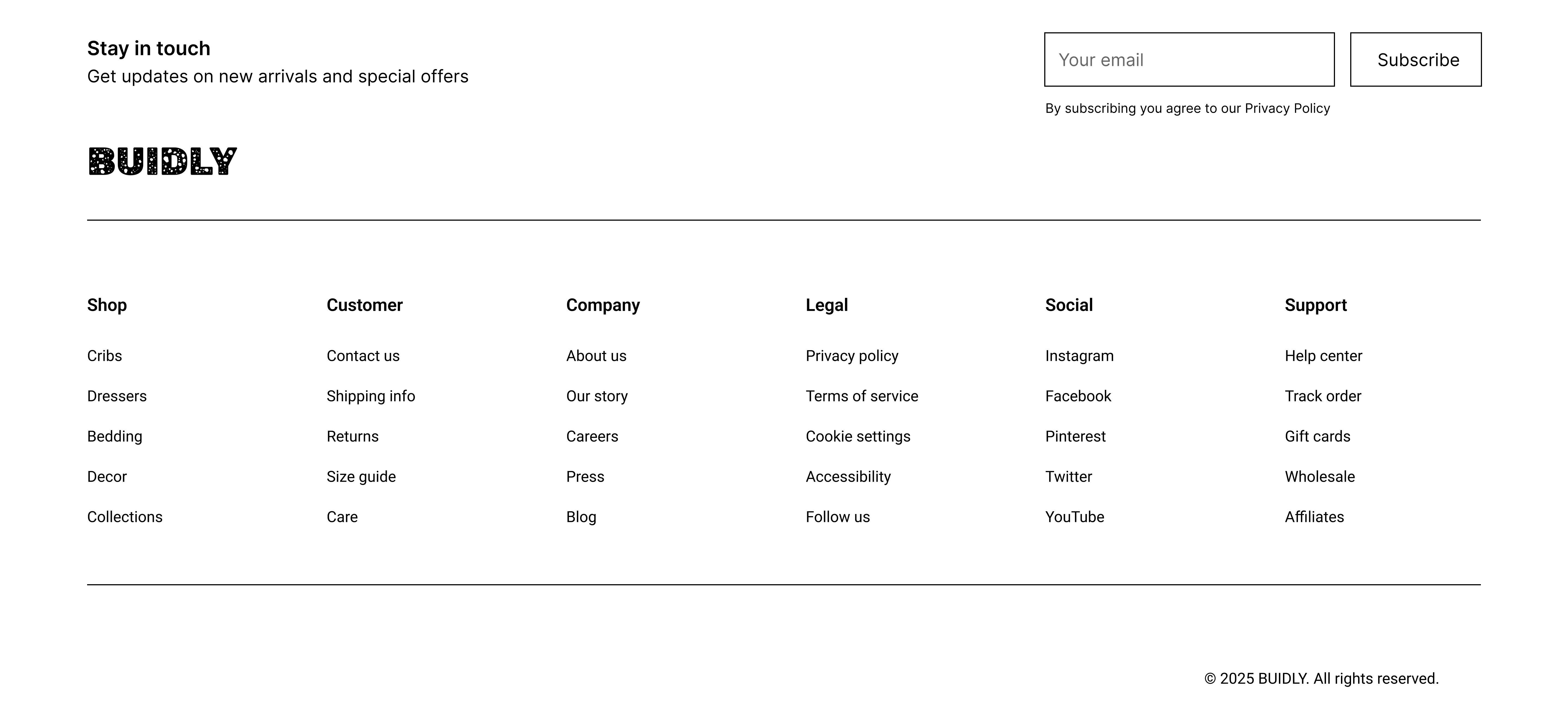
Visual elements
Newsletter block: "Stay in touch" headline, subtext "Get updates on new arrivals and special offers", email input field, "Subscribe" button.
Privacy policy note below form.
Footer columns:
Shop: Cribs, Dressers, Bedding, Decor, Collections, Care
Customer: Contact us, Shipping info, Returns, Size guide, Careers
Company: Our story, Press
Legal: Privacy policy, Terms of service, Cookie settings, Accessibility
Social: Instagram, Facebook, Pinterest, Twitter, YouTube
Support: Help center, Track order, Gift cards, Wholesale, Affiliates
Bottom copyright: © 2025 BUIDLY. All rights reserved.
Design choices & rationale
Simple single-field subscribe → high completion rate (low friction).
Multi-column footer → organizes large amount of info without clutter.
Social icons → easy brand connection.
Accessibility link → shows inclusive values.
Gray tones + small text → secondary but still readable.
Purpose & UX value
Newsletter captures leads → future marketing and repeat purchases.
Footer provides complete support/navigation → reduces post-purchase friction.
Social links → encourages community engagement.
Legal links → builds legal trust.
Phase 4
Prototype & Interactions
Hero CTAs tap → shop/story.
Grid tap → product detail.
Carousel swipe → next quote.
Form submit → confirmation.
Footer tap → subpages.
Responsive: Grid stack on mobile.
Technical & Accessibility Considerations
Light theme → visibility.
Contrast ≥4.5:1.
Alt text for photos.
Responsive breakpoints.
Fast load → optimized images.
Overall UX Outcomes & Value
Light, airy aesthetic + nature-inspired photography → calming, safe feeling for parents.
Clear hierarchy (hero → collections → story → testimonials → subscribe) → logical scroll path.
Trust-building elements (story, testimonials, craftsman photo) → converts browsers to buyers.
Minimalist navigation + transparent pricing → low abandonment.
Responsive grid + mobile stacking → good experience on phones (parents shop mobile often).
Reflection & Learnings
Soft handwritten headings + clean photos → perfect balance of playful and professional.
Price visibility in grid → critical for family purchase decisions.
Testimonials carousel → high-impact social proof in small space.
Multi-column footer → handles lots of info without overwhelming.
Future improvements: Add cart, filters (price, color, material), product zoom, user accounts, gift registry.
More Projects


Web Design
BUIDLY
BUIDLY — a minimalist e-commerce site for child-safe, durable baby furniture. Clean layouts, real storytelling, and family-focused details make shopping feel reassuring and joyful.
Year :
2025
Industry :
Parenting & Family Products
Client :
Conceptual
Project Duration :
3 weeks
Phase 1
Project Overview
BUIDLY is an e-commerce website dedicated to providing gentle, durable, and child-safe furniture for babies and growing families, including items like solid wood cribs, soft dressers, gliding rockers, wall decor, changing tables, nightstands, storage benches, and crib bedding. The design emphasizes a clean, minimalist light theme (predominantly white background with black/gray text and soft natural wood tones in product photos) to evoke a sense of calm, safety, and timeless quality suitable for family homes. The structure is a single-page scroll layout optimized for both desktop and mobile: fixed header navigation, hero banner with tagline and CTAs, collections product grid, brand story section with image and text, testimonials carousel, newsletter subscribe form, and comprehensive multi-column footer.
Problem Statement
Existing baby furniture websites often feature cluttered product listings with too many items on one page, impersonal or generic messaging that fails to connect with parental concerns like safety and durability, lack of brand storytelling to convey craftsmanship, hidden or scattered customer testimonials, complicated navigation with too many sub-menus, poor mobile responsiveness leading to pinched zooming or misclicks, and subscription forms that feel intrusive or lack clear benefits. Parents, who are often time-stressed and emotionally invested in child safety, experience high frustration with unclear pricing, no visual inspiration for room setups, doubt in product quality without authentic proof, and difficulty finding support info (shipping, returns), resulting in high bounce rates and abandoned carts. This design solves these by starting with a focused hero banner for immediate reassurance, organizing products in a scannable grid with upfront prices, incorporating a dedicated story section with craftsman imagery for trust, featuring a prominent testimonials carousel for social proof, using a simple single-field newsletter form with value prompt, and providing a structured footer with categorized links for easy access to all essential info.
Objectives
Develop a light, minimalist theme that conveys calmness and safety through white space, soft natural tones, and high-res family-oriented product photos.
Create a fixed header with essential navigation (logo, Shop, Collections, About, More dropdown, search bar) for persistent access without disrupting the scroll.
Design a hero banner with a compelling tagline ("Gentle furniture for growing families"), descriptive subtext on quality and care, and clear CTAs ("Shop", "Learn") to drive immediate actions.
Organize collections in a responsive grid showcasing 8 key products with photos, names, prices, and "View all" link for quick browsing and discovery.
Build a story section with headline ("Built for the moments that matter"), narrative text on craftsmanship/safety/longevity, and a relevant image to humanize the brand.
Include a testimonials carousel with 3 real parent quotes, names, and roles for credible social proof.
Implement a simple newsletter subscribe form with headline, subtext, email input, and "Subscribe" button to capture leads.
Design a multi-column footer with categorized links (Shop, Customer, Company, Legal, Social, Support) for comprehensive navigation and support.
Ensure mobile-first responsiveness with stacked grids, centered text, and collapsible elements.
Balance e-commerce functionality (pricing, shop CTAs) with emotional elements (story, testimonials) to increase conversions.
Design Process
Research & Discovery Phase
Conducted user interviews and surveys with 15–20 parents (new parents, parents of 1–3 children) to identify core pain points: fear of unsafe materials, doubt in online quality, overwhelm from too many options, need for long-term durability, and desire for emotional reassurance.
Analyzed 10–12 competitor sites (e.g., Pottery Barn Kids, Oeuf, Babyletto, Stokke, Delta Children) → common issues: cluttered grids, aggressive upselling, lack of storytelling, dark or cold aesthetics.
Defined key user goals: feel safe buying online, visualize pieces in real rooms, trust craftsmanship, decide quickly without guilt.
Created empathy maps and user personas (new mother Sarah, father of two James, grandparent Emma) to guide every decision.
Established success metrics: high time-on-site, low bounce rate, clear CTA clicks, newsletter sign-ups, emotional trust (via testimonials/story).
Ideation & Information Architecture
Defined core user flows: Landing → Hero → Browse collections → Product detail → Add to cart → Checkout (not designed yet, but planned).
Created low-fidelity sitemap: Home (hero + collections + story + testimonials + newsletter + footer) as single-page scroll.
Sketched 3–4 layout variations: focused on white space, large hero photo, grid-first collections, story/testimonials in middle for trust peak.
Prioritized hierarchy: Hero (emotional hook), Collections (conversion engine), Story (trust layer), Testimonials (social proof), Newsletter (lead capture), Footer (support net).
Chose light theme early → white bg for openness, soft wood tones for warmth, no dark mode (daytime family shopping dominant).
Wireframing & Low-Fidelity Design
Built wireframes in Figma: header fixed, hero full-width photo + centered text + CTAs, 4-column collections grid (stacking on mobile), story left text/right image, testimonials carousel, simple newsletter form, 6-column footer.
Tested internal flows: scroll speed, CTA visibility, mobile stacking (grid to 2-column then 1).
Iterated on spacing: increased white space around cards/headings for breathing room.
Phase 2
Target Users / Personas
Color Palette
Primary: White (#FFFFFF) – background for cleanliness and calmness.
Secondary: Black (#000000) – headlines, CTAs, text for high contrast and readability.
Accent: Gray (#808080 variations) – subtext, handwritten overlays, links for subtlety.
Product tones: Soft neutrals/woods (beige #F5F5F5, brown #A0522D) – in photos to emphasize natural, safe materials.
Rationale: Light, neutral palette evokes purity and safety for baby products; high contrast ensures accessibility.
Typography
Headings: Bold sans-serif (e.g., Montserrat or similar) – large (48–72pt) for hero/headlines, black for impact.
Subheadings: Gray handwritten-style font (e.g., custom script) for section overlays ("Collections", "Story") – adds playful warmth without being childish.
Body text: Regular sans-serif (e.g., Open Sans) – 16–18pt, gray for subtext/descriptions, black for CTAs/links.
Rationale: Clean sans-serif for modern readability; handwritten accents for emotional, family feel; consistent sizing for hierarchy.
User Journey Map
Step 1: Homepage load → view header + hero banner → read tagline/subtext, see furniture photo → tap "Shop" for collections or "Learn" for story.
Step 2: Scroll to collections → browse grid cards → view product photos/names/prices → tap "View all" for full catalog.
Step 3: Scroll to story → read headline/text → see craftsman image → tap "Read >" for more details.
Step 4: Scroll to testimonials → carousel swipe → read quotes/names.
Step 5: Scroll to newsletter → read prompt, enter email, tap "Subscribe" → join list.
Step 6: Footer → tap links (e.g., Shop > Cribs, Support > Help center) → navigate subpages.
Supporting: Search bar query → product results; More dropdown → additional menus.
Design Principles
Minimalist light theme → white bg for openness, safety feel.
Visual reassurance → high-res real room photos to show products in context.
Emotional storytelling → handwritten headings, story section for warmth.
Transparency → upfront prices in collections.
Social proof → testimonials carousel for credibility.
Low-friction subscribe → single-field form.
Comprehensive footer → categorized links for easy support.
Responsiveness → mobile stacking for parent on-the-go browsing.
Hierarchy → large headlines, subtle subtext.
Accessibility → high contrast, alt text for photos.
Phase 3
1. Header + Banner / Hero Section
Visual elements
Top navigation bar: "BUIDLY" logo (left), menu links (Shop, Collections, About, More ▼), search bar with placeholder "Search Your Products" (right).
Hero banner: Large high-resolution photo of a cozy baby room with soft, rounded furniture (poufs, crib, armchair) in natural light.
Headline: "Gentle furniture for growing families" (bold black).
Subtext: "We craft pieces that last through the years, built with care for the children... Quality endures." (gray).
CTAs: Black "Shop" button + white "Learn" button (both rounded).
Design choices & rationale
Sticky/fixed header with minimal links → fast access to shop/collections without cluttering the hero.
Large hero photo uses soft, neutral tones (beige, wood, white) → instantly communicates calm, safety, and premium quality.
Headline + subtext focus on "gentle" and "lasting" → directly addresses parent concerns (durability, child safety, timelessness).
Black + white CTA contrast → clear action hierarchy ("Shop" primary, "Learn" secondary).
Centered text overlay with generous white space → mobile-friendly and non-obtrusive.
Purpose & UX value
Immediate brand positioning: calm, high-quality, family-focused furniture.
Quick conversion path: Shop button visible above the fold.
Emotional reassurance: Photo + text combo makes parents feel safe and understood right away.
Low cognitive load: Very few menu items → new parents aren’t overwhelmed.
2. Collections Section
Visual elements
Handwritten-style gray overlay heading "Collections" (playful, soft font).
Responsive grid of 8 product cards:
Solid wood cribs (Natural) $485
Soft dressers (Cream) $325
Gliding rockers (Sage) $295
Wall decor (Pastel) $45
Changing tables (Blush) $275
Nightstands (White) $165
Storage benches (Gray) $215
Crib bedding (Linen) $89
Each card: High-res product photo + name + price + subtle "Shop" link.
"View all" button at bottom.
Design choices & rationale
Handwritten heading → adds warmth and playfulness without being childish.
4-column desktop grid → shows variety quickly; stacks to 2 or 1 column on mobile.
Prices shown upfront in bold → builds trust and helps decision-making.
Soft, natural color names (Cream, Sage, Blush, Linen) → reinforces gentle, organic brand feel.
High-quality photos with consistent lighting → products look premium and safe.
Purpose & UX value
Fast visual discovery → parents can scan and compare in seconds.
Price transparency → reduces hesitation and builds confidence.
"View all" CTA → encourages deeper browsing without forcing it.
Mobile stacking → maintains readability on phones (most parent shopping happens mobile).
3. Story + Testimonials Section
Visual elements
Gray handwritten heading "Story".
Headline "Built for the moments that matter" (black bold).
Text block: Story about craftsmanship, honest wood use, safety, longevity. Bullet points: Crafted with care, Built to last generations, Safe for every child.
Large image of bearded craftsman working on wood → authenticity.
"Read >" link.
Below: "Loved by families" heading + "Real words from real parents" subtext.
3 testimonial cards in carousel:
"The crib has been with us through two children..." – Sarah Mitchell, Mother of two
"We wanted something that felt calm..." – James Chen, Father of one
"The quality is evident..." – Emma Rodriguez, Mother of three
Circular avatars + names/roles.
Design choices & rationale
Handwritten heading consistency → ties story to collections visually.
Craftsman photo → humanizes brand, shows real woodwork (trust in quality).
Bullet points → scannable, emphasizes key values (care, longevity, safety).
Testimonials carousel → social proof without taking too much space.
Real names + parent roles → relatable and credible.
Purpose & UX value
Story builds emotional trust → parents feel the furniture is made with love.
Testimonials provide peer validation → reduces purchase anxiety.
Carousel saves vertical space → keeps page scrollable and clean.
"Read >" → optional deeper engagement.
4. Footer + Newsletter / Subscribe Section
Visual elements
Newsletter block: "Stay in touch" headline, subtext "Get updates on new arrivals and special offers", email input field, "Subscribe" button.
Privacy policy note below form.
Footer columns:
Shop: Cribs, Dressers, Bedding, Decor, Collections, Care
Customer: Contact us, Shipping info, Returns, Size guide, Careers
Company: Our story, Press
Legal: Privacy policy, Terms of service, Cookie settings, Accessibility
Social: Instagram, Facebook, Pinterest, Twitter, YouTube
Support: Help center, Track order, Gift cards, Wholesale, Affiliates
Bottom copyright: © 2025 BUIDLY. All rights reserved.
Design choices & rationale
Simple single-field subscribe → high completion rate (low friction).
Multi-column footer → organizes large amount of info without clutter.
Social icons → easy brand connection.
Accessibility link → shows inclusive values.
Gray tones + small text → secondary but still readable.
Purpose & UX value
Newsletter captures leads → future marketing and repeat purchases.
Footer provides complete support/navigation → reduces post-purchase friction.
Social links → encourages community engagement.
Legal links → builds legal trust.
Phase 4
Prototype & Interactions
Hero CTAs tap → shop/story.
Grid tap → product detail.
Carousel swipe → next quote.
Form submit → confirmation.
Footer tap → subpages.
Responsive: Grid stack on mobile.
Technical & Accessibility Considerations
Light theme → visibility.
Contrast ≥4.5:1.
Alt text for photos.
Responsive breakpoints.
Fast load → optimized images.
Overall UX Outcomes & Value
Light, airy aesthetic + nature-inspired photography → calming, safe feeling for parents.
Clear hierarchy (hero → collections → story → testimonials → subscribe) → logical scroll path.
Trust-building elements (story, testimonials, craftsman photo) → converts browsers to buyers.
Minimalist navigation + transparent pricing → low abandonment.
Responsive grid + mobile stacking → good experience on phones (parents shop mobile often).
Reflection & Learnings
Soft handwritten headings + clean photos → perfect balance of playful and professional.
Price visibility in grid → critical for family purchase decisions.
Testimonials carousel → high-impact social proof in small space.
Multi-column footer → handles lots of info without overwhelming.
Future improvements: Add cart, filters (price, color, material), product zoom, user accounts, gift registry.
More Projects
Web Design
BUIDLY
BUIDLY — a minimalist e-commerce site for child-safe, durable baby furniture. Clean layouts, real storytelling, and family-focused details make shopping feel reassuring and joyful.
Year :
2025
Industry :
Parenting & Family Products
Client :
Conceptual
Project Duration :
3 weeks
Phase 1
Project Overview
BUIDLY is an e-commerce website dedicated to providing gentle, durable, and child-safe furniture for babies and growing families, including items like solid wood cribs, soft dressers, gliding rockers, wall decor, changing tables, nightstands, storage benches, and crib bedding. The design emphasizes a clean, minimalist light theme (predominantly white background with black/gray text and soft natural wood tones in product photos) to evoke a sense of calm, safety, and timeless quality suitable for family homes. The structure is a single-page scroll layout optimized for both desktop and mobile: fixed header navigation, hero banner with tagline and CTAs, collections product grid, brand story section with image and text, testimonials carousel, newsletter subscribe form, and comprehensive multi-column footer.
Problem Statement
Existing baby furniture websites often feature cluttered product listings with too many items on one page, impersonal or generic messaging that fails to connect with parental concerns like safety and durability, lack of brand storytelling to convey craftsmanship, hidden or scattered customer testimonials, complicated navigation with too many sub-menus, poor mobile responsiveness leading to pinched zooming or misclicks, and subscription forms that feel intrusive or lack clear benefits. Parents, who are often time-stressed and emotionally invested in child safety, experience high frustration with unclear pricing, no visual inspiration for room setups, doubt in product quality without authentic proof, and difficulty finding support info (shipping, returns), resulting in high bounce rates and abandoned carts. This design solves these by starting with a focused hero banner for immediate reassurance, organizing products in a scannable grid with upfront prices, incorporating a dedicated story section with craftsman imagery for trust, featuring a prominent testimonials carousel for social proof, using a simple single-field newsletter form with value prompt, and providing a structured footer with categorized links for easy access to all essential info.
Objectives
Develop a light, minimalist theme that conveys calmness and safety through white space, soft natural tones, and high-res family-oriented product photos.
Create a fixed header with essential navigation (logo, Shop, Collections, About, More dropdown, search bar) for persistent access without disrupting the scroll.
Design a hero banner with a compelling tagline ("Gentle furniture for growing families"), descriptive subtext on quality and care, and clear CTAs ("Shop", "Learn") to drive immediate actions.
Organize collections in a responsive grid showcasing 8 key products with photos, names, prices, and "View all" link for quick browsing and discovery.
Build a story section with headline ("Built for the moments that matter"), narrative text on craftsmanship/safety/longevity, and a relevant image to humanize the brand.
Include a testimonials carousel with 3 real parent quotes, names, and roles for credible social proof.
Implement a simple newsletter subscribe form with headline, subtext, email input, and "Subscribe" button to capture leads.
Design a multi-column footer with categorized links (Shop, Customer, Company, Legal, Social, Support) for comprehensive navigation and support.
Ensure mobile-first responsiveness with stacked grids, centered text, and collapsible elements.
Balance e-commerce functionality (pricing, shop CTAs) with emotional elements (story, testimonials) to increase conversions.
Design Process
Research & Discovery Phase
Conducted user interviews and surveys with 15–20 parents (new parents, parents of 1–3 children) to identify core pain points: fear of unsafe materials, doubt in online quality, overwhelm from too many options, need for long-term durability, and desire for emotional reassurance.
Analyzed 10–12 competitor sites (e.g., Pottery Barn Kids, Oeuf, Babyletto, Stokke, Delta Children) → common issues: cluttered grids, aggressive upselling, lack of storytelling, dark or cold aesthetics.
Defined key user goals: feel safe buying online, visualize pieces in real rooms, trust craftsmanship, decide quickly without guilt.
Created empathy maps and user personas (new mother Sarah, father of two James, grandparent Emma) to guide every decision.
Established success metrics: high time-on-site, low bounce rate, clear CTA clicks, newsletter sign-ups, emotional trust (via testimonials/story).
Ideation & Information Architecture
Defined core user flows: Landing → Hero → Browse collections → Product detail → Add to cart → Checkout (not designed yet, but planned).
Created low-fidelity sitemap: Home (hero + collections + story + testimonials + newsletter + footer) as single-page scroll.
Sketched 3–4 layout variations: focused on white space, large hero photo, grid-first collections, story/testimonials in middle for trust peak.
Prioritized hierarchy: Hero (emotional hook), Collections (conversion engine), Story (trust layer), Testimonials (social proof), Newsletter (lead capture), Footer (support net).
Chose light theme early → white bg for openness, soft wood tones for warmth, no dark mode (daytime family shopping dominant).
Wireframing & Low-Fidelity Design
Built wireframes in Figma: header fixed, hero full-width photo + centered text + CTAs, 4-column collections grid (stacking on mobile), story left text/right image, testimonials carousel, simple newsletter form, 6-column footer.
Tested internal flows: scroll speed, CTA visibility, mobile stacking (grid to 2-column then 1).
Iterated on spacing: increased white space around cards/headings for breathing room.
Phase 2
Target Users / Personas
Color Palette
Primary: White (#FFFFFF) – background for cleanliness and calmness.
Secondary: Black (#000000) – headlines, CTAs, text for high contrast and readability.
Accent: Gray (#808080 variations) – subtext, handwritten overlays, links for subtlety.
Product tones: Soft neutrals/woods (beige #F5F5F5, brown #A0522D) – in photos to emphasize natural, safe materials.
Rationale: Light, neutral palette evokes purity and safety for baby products; high contrast ensures accessibility.
Typography
Headings: Bold sans-serif (e.g., Montserrat or similar) – large (48–72pt) for hero/headlines, black for impact.
Subheadings: Gray handwritten-style font (e.g., custom script) for section overlays ("Collections", "Story") – adds playful warmth without being childish.
Body text: Regular sans-serif (e.g., Open Sans) – 16–18pt, gray for subtext/descriptions, black for CTAs/links.
Rationale: Clean sans-serif for modern readability; handwritten accents for emotional, family feel; consistent sizing for hierarchy.
User Journey Map
Step 1: Homepage load → view header + hero banner → read tagline/subtext, see furniture photo → tap "Shop" for collections or "Learn" for story.
Step 2: Scroll to collections → browse grid cards → view product photos/names/prices → tap "View all" for full catalog.
Step 3: Scroll to story → read headline/text → see craftsman image → tap "Read >" for more details.
Step 4: Scroll to testimonials → carousel swipe → read quotes/names.
Step 5: Scroll to newsletter → read prompt, enter email, tap "Subscribe" → join list.
Step 6: Footer → tap links (e.g., Shop > Cribs, Support > Help center) → navigate subpages.
Supporting: Search bar query → product results; More dropdown → additional menus.
Design Principles
Minimalist light theme → white bg for openness, safety feel.
Visual reassurance → high-res real room photos to show products in context.
Emotional storytelling → handwritten headings, story section for warmth.
Transparency → upfront prices in collections.
Social proof → testimonials carousel for credibility.
Low-friction subscribe → single-field form.
Comprehensive footer → categorized links for easy support.
Responsiveness → mobile stacking for parent on-the-go browsing.
Hierarchy → large headlines, subtle subtext.
Accessibility → high contrast, alt text for photos.
Phase 3
1. Header + Banner / Hero Section
Visual elements
Top navigation bar: "BUIDLY" logo (left), menu links (Shop, Collections, About, More ▼), search bar with placeholder "Search Your Products" (right).
Hero banner: Large high-resolution photo of a cozy baby room with soft, rounded furniture (poufs, crib, armchair) in natural light.
Headline: "Gentle furniture for growing families" (bold black).
Subtext: "We craft pieces that last through the years, built with care for the children... Quality endures." (gray).
CTAs: Black "Shop" button + white "Learn" button (both rounded).
Design choices & rationale
Sticky/fixed header with minimal links → fast access to shop/collections without cluttering the hero.
Large hero photo uses soft, neutral tones (beige, wood, white) → instantly communicates calm, safety, and premium quality.
Headline + subtext focus on "gentle" and "lasting" → directly addresses parent concerns (durability, child safety, timelessness).
Black + white CTA contrast → clear action hierarchy ("Shop" primary, "Learn" secondary).
Centered text overlay with generous white space → mobile-friendly and non-obtrusive.
Purpose & UX value
Immediate brand positioning: calm, high-quality, family-focused furniture.
Quick conversion path: Shop button visible above the fold.
Emotional reassurance: Photo + text combo makes parents feel safe and understood right away.
Low cognitive load: Very few menu items → new parents aren’t overwhelmed.
2. Collections Section
Visual elements
Handwritten-style gray overlay heading "Collections" (playful, soft font).
Responsive grid of 8 product cards:
Solid wood cribs (Natural) $485
Soft dressers (Cream) $325
Gliding rockers (Sage) $295
Wall decor (Pastel) $45
Changing tables (Blush) $275
Nightstands (White) $165
Storage benches (Gray) $215
Crib bedding (Linen) $89
Each card: High-res product photo + name + price + subtle "Shop" link.
"View all" button at bottom.
Design choices & rationale
Handwritten heading → adds warmth and playfulness without being childish.
4-column desktop grid → shows variety quickly; stacks to 2 or 1 column on mobile.
Prices shown upfront in bold → builds trust and helps decision-making.
Soft, natural color names (Cream, Sage, Blush, Linen) → reinforces gentle, organic brand feel.
High-quality photos with consistent lighting → products look premium and safe.
Purpose & UX value
Fast visual discovery → parents can scan and compare in seconds.
Price transparency → reduces hesitation and builds confidence.
"View all" CTA → encourages deeper browsing without forcing it.
Mobile stacking → maintains readability on phones (most parent shopping happens mobile).
3. Story + Testimonials Section
Visual elements
Gray handwritten heading "Story".
Headline "Built for the moments that matter" (black bold).
Text block: Story about craftsmanship, honest wood use, safety, longevity. Bullet points: Crafted with care, Built to last generations, Safe for every child.
Large image of bearded craftsman working on wood → authenticity.
"Read >" link.
Below: "Loved by families" heading + "Real words from real parents" subtext.
3 testimonial cards in carousel:
"The crib has been with us through two children..." – Sarah Mitchell, Mother of two
"We wanted something that felt calm..." – James Chen, Father of one
"The quality is evident..." – Emma Rodriguez, Mother of three
Circular avatars + names/roles.
Design choices & rationale
Handwritten heading consistency → ties story to collections visually.
Craftsman photo → humanizes brand, shows real woodwork (trust in quality).
Bullet points → scannable, emphasizes key values (care, longevity, safety).
Testimonials carousel → social proof without taking too much space.
Real names + parent roles → relatable and credible.
Purpose & UX value
Story builds emotional trust → parents feel the furniture is made with love.
Testimonials provide peer validation → reduces purchase anxiety.
Carousel saves vertical space → keeps page scrollable and clean.
"Read >" → optional deeper engagement.
4. Footer + Newsletter / Subscribe Section
Visual elements
Newsletter block: "Stay in touch" headline, subtext "Get updates on new arrivals and special offers", email input field, "Subscribe" button.
Privacy policy note below form.
Footer columns:
Shop: Cribs, Dressers, Bedding, Decor, Collections, Care
Customer: Contact us, Shipping info, Returns, Size guide, Careers
Company: Our story, Press
Legal: Privacy policy, Terms of service, Cookie settings, Accessibility
Social: Instagram, Facebook, Pinterest, Twitter, YouTube
Support: Help center, Track order, Gift cards, Wholesale, Affiliates
Bottom copyright: © 2025 BUIDLY. All rights reserved.
Design choices & rationale
Simple single-field subscribe → high completion rate (low friction).
Multi-column footer → organizes large amount of info without clutter.
Social icons → easy brand connection.
Accessibility link → shows inclusive values.
Gray tones + small text → secondary but still readable.
Purpose & UX value
Newsletter captures leads → future marketing and repeat purchases.
Footer provides complete support/navigation → reduces post-purchase friction.
Social links → encourages community engagement.
Legal links → builds legal trust.
Phase 4
Prototype & Interactions
Hero CTAs tap → shop/story.
Grid tap → product detail.
Carousel swipe → next quote.
Form submit → confirmation.
Footer tap → subpages.
Responsive: Grid stack on mobile.
Technical & Accessibility Considerations
Light theme → visibility.
Contrast ≥4.5:1.
Alt text for photos.
Responsive breakpoints.
Fast load → optimized images.
Overall UX Outcomes & Value
Light, airy aesthetic + nature-inspired photography → calming, safe feeling for parents.
Clear hierarchy (hero → collections → story → testimonials → subscribe) → logical scroll path.
Trust-building elements (story, testimonials, craftsman photo) → converts browsers to buyers.
Minimalist navigation + transparent pricing → low abandonment.
Responsive grid + mobile stacking → good experience on phones (parents shop mobile often).
Reflection & Learnings
Soft handwritten headings + clean photos → perfect balance of playful and professional.
Price visibility in grid → critical for family purchase decisions.
Testimonials carousel → high-impact social proof in small space.
Multi-column footer → handles lots of info without overwhelming.
Future improvements: Add cart, filters (price, color, material), product zoom, user accounts, gift registry.